SaaS & Software Welcome Email Template
“Your algorithm-free era starts now.”
Design Score
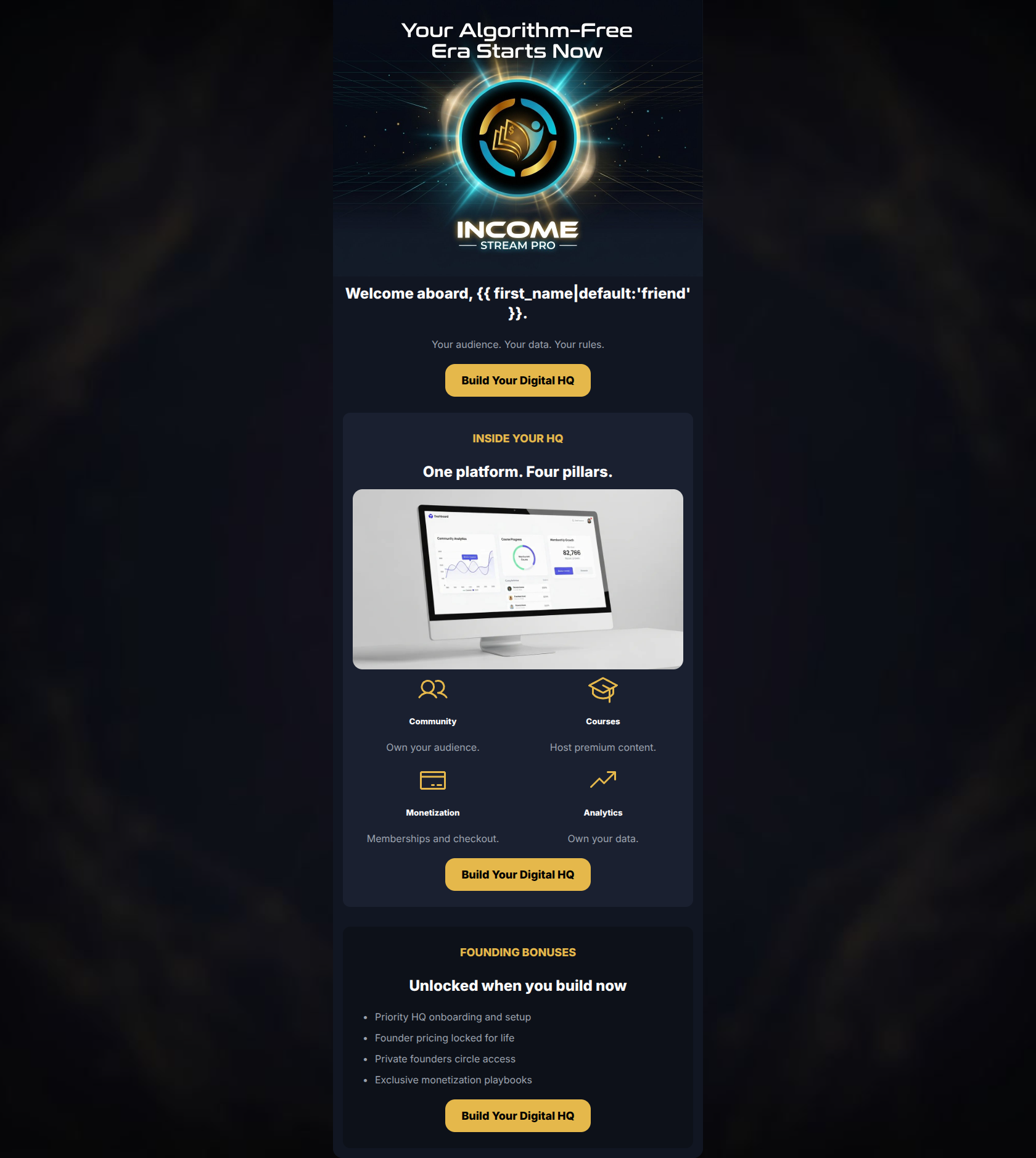
84/100A highly focused, visually striking welcome email that aligns perfectly with the brand's 'dark mode' cyberpunk aesthetic. The email excels in conciseness, visual hierarchy, and CTA consistency. By breaking the offering into four scannable pillars and closing with a compelling bonus offer, it creates a logical path to conversion. However, the copy is almost too sparse in the hero section—relying heavily on the graphic to explain the value—and misses an opportunity to directly agitate the core 'scattered tool hell' pain point before asking for the click.
Create Your Own
Generate professional email designs like this one in seconds with Kopi AI.
Email Details
- Subject Line
- Your algorithm-free era starts now.
- Brand
- Income Stream Pro
- Industry
- SaaS & Software
- Email Type
- Welcome
- Created
- May 29, 2026
Brand Colors
Email Copy
Welcome aboard, friend.
Your audience. Your data. Your rules.
→ Build Your Digital HQ
INSIDE YOUR HQ
One platform. Four pillars.
Community
Own your audience.
Courses
Host premium content.
Monetization
Memberships and checkout.
Analytics
Own your data.
→ Build Your Digital HQ
FOUNDING BONUSES
Unlocked when you build now
- Priority HQ onboarding and setup
- Founder pricing locked for life
- Private founders circle access
- Exclusive monetization playbooks
→ Build Your Digital HQ
Why This Email Works
A highly focused, visually striking welcome email that aligns perfectly with the brand's 'dark mode' cyberpunk aesthetic. The email excels in conciseness, visual hierarchy, and CTA consistency. By breaking the offering into four scannable pillars and closing with a compelling bonus offer, it creates a logical path to conversion. However, the copy is almost too sparse in the hero section—relying heavily on the graphic to explain the value—and misses an opportunity to directly agitate the core 'scattered tool hell' pain point before asking for the click.
Hero (top/initial part) Impact
70/100- Strong visual asset that immediately establishes the premium, tech-forward brand identity.
- Clear, punchy sub-headline ('Your audience. Your data. Your rules.') that hits core psychographic desires.
- Primary CTA is immediately visible above the fold (on desktop).
Content Structure & Flow
85/100- Clear division of content into distinct, manageable sections using background color cards.
- Logical narrative flow leading directly to the founding bonuses offer.
Visual Hierarchy & Layout
88/100- Excellent use of a 2x2 grid for the 'Four pillars' to make features easy to parse.
- Consistent padding and margins create a breathable, uncluttered design.
Call-to-Action Strength
95/100- High-contrast gold buttons (`#E5B84B`) draw the eye immediately.
- Action-oriented copy that aligns with the brand's 'building' and 'ownership' themes.
- Strict adherence to a single primary conversion goal.
Message Clarity & Tone
80/100- Confident, authoritative tone that speaks directly to the ambitious creator.
- Consistent use of 'You/Your' framing.
Readability & Scannability
92/100- No dense paragraphs or 'walls of text'.
- Bullet points used effectively in the bonus section to highlight value.
Offer & Value Proposition
85/100- Strong use of urgency without resorting to fake countdown timers.
- The bonuses directly address SaaS pain points (pricing, onboarding).
Personalization & Audience Fit
88/100- Directly targets the core desire for 'data ownership' and 'audience control'.
- Aesthetic perfectly matches the 'tech-savvy digital entrepreneur' profile.
Copy Conciseness & Word Economy
90/100- Ruthless word economy; the email communicates a complex SaaS offering with minimal text.
- Headings do the heavy lifting, making the email highly efficient.
Quick Wins
- Replace the generic 'Welcome aboard' HTML headline with a benefit-focused statement.
- Expand the single-line descriptions under the four feature icons to focus on the outcome rather than just repeating the feature name.
- Crop the dashboard UI image tighter so the data and graphs are actually visible on mobile devices.




Create Professional Email Designs
Generate beautiful, on-brand email designs in seconds. Just enter your brand URL and let AI do the rest.