SaaS & Software Announcement Email Template
“Why your offers aren't converting...”
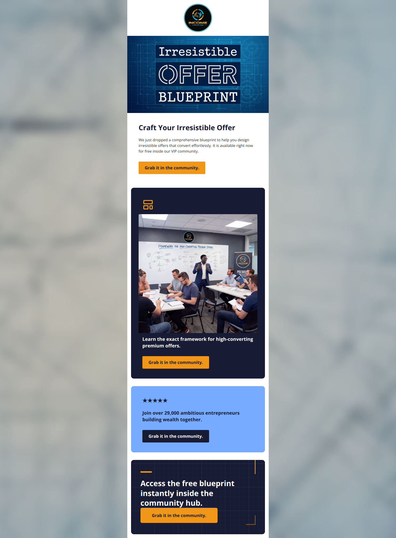
Design Score
75/100This email is visually punchy and successfully communicates a clear, low-friction offer (a free blueprint), but suffers from repetitive copy and a lack of depth regarding the actual value of the resource. While it effectively uses the brand's high-contrast color palette to drive attention, varying the calls-to-action and focusing more on the outcomes rather than just the deliverable will improve conversion rates.
Create Your Own
Generate professional email designs like this one in seconds with Kopi AI.
Email Details
- Subject Line
- Why your offers aren't converting...
- Brand
- Income Stream Pro
- Industry
- SaaS & Software
- Email Type
- Announcement
- Created
- March 12, 2026
Brand Colors
Email Copy
Craft Your Irresistible Offer
We just dropped a comprehensive blueprint to help you design irresistible offers that convert effortlessly. It is available right now for free inside our VIP community.
→ Grab it in the community.
Learn the exact framework for high-converting premium offers.
→ Grab it in the community.
★★★★★
Join over 29,000 ambitious entrepreneurs building wealth together.
→ Grab it in the community.
Why This Email Works
This email is visually punchy and successfully communicates a clear, low-friction offer (a free blueprint), but suffers from repetitive copy and a lack of depth regarding the actual value of the resource. While it effectively uses the brand's high-contrast color palette to drive attention, varying the calls-to-action and focusing more on the outcomes rather than just the deliverable will improve conversion rates.
Hero Impact
85/100- The hero image contains clear, bold text ('Irresistible OFFER BLUEPRINT') that acts as a secondary headline, instantly answering 'What is this about?'.
- The primary heading 'Craft Your Irresistible Offer' perfectly aligns with the imagery, creating a cohesive opening statement.
Content Structure & Flow
70/100- The use of distinct background colors (white, dark blue, light blue, dark blue) creates clear horizontal divisions, making the email easy to digest.
- The logical order of Offer -> Benefit -> Social Proof -> Final CTA is theoretically sound, even if the execution is a bit repetitive.
Visual Hierarchy & Layout
75/100- The use of the orange (#F0971A) for the primary buttons against the white and dark navy backgrounds creates excellent visual pop.
- Padding within the colored blocks (e.g., the 32px padding in the dark blue section) gives the text room to breathe and prevents a cluttered feel.
Call-to-Action Strength
65/100- CTAs are omnipresent; there is no point in the email where the user has to scroll far to figure out what to do next.
- The buttons are styled consistently as distinct, clickable elements (with the minor exception of the color change in the third block).
Message Clarity & Tone
72/100- The email completely avoids unnecessary fluff; it gets straight to the point within the first sentence.
- The confident, authoritative tone ('We just dropped a comprehensive blueprint') establishes trust and perceived value.
Readability & Scannability
88/100- No walls of text; the longest paragraph is only two sentences long.
- Effective use of an icon (the layout template icon) to break up text and add visual interest in the second section.
Offer & Value Proposition
75/100- The offer is entirely free, which removes financial friction and encourages high click-through rates.
- The inclusion of social proof ('Join over 29,000 ambitious entrepreneurs') validates the offer and the community it lives in.
Personalization & Audience Fit
65/100- The vocabulary ('blueprint', 'convert effortlessly', 'building wealth') is perfectly tailored to the aspiring internet entrepreneur demographic.
- The high-energy, direct approach resonates well with a fast-paced, results-oriented audience.
Quick Wins
- Change the CTA copy 'Grab it in the community.' to a more action-oriented phrase like 'Download Your Free Blueprint' across the email.
- Change the dark navy button color in the light blue '★★★★★' section to the vibrant orange (#F0971A) to establish a consistent, recognizable click-target color.
- Add 2-3 short bullet points under the main hero paragraph to clearly define what the blueprint actually teaches.

Create Professional Email Designs
Generate beautiful, on-brand email designs in seconds. Just enter your brand URL and let AI do the rest.