Electronics & Tech Promotional Email Template
“Why 3,000 chose PowerPort 70W last week ⚡”
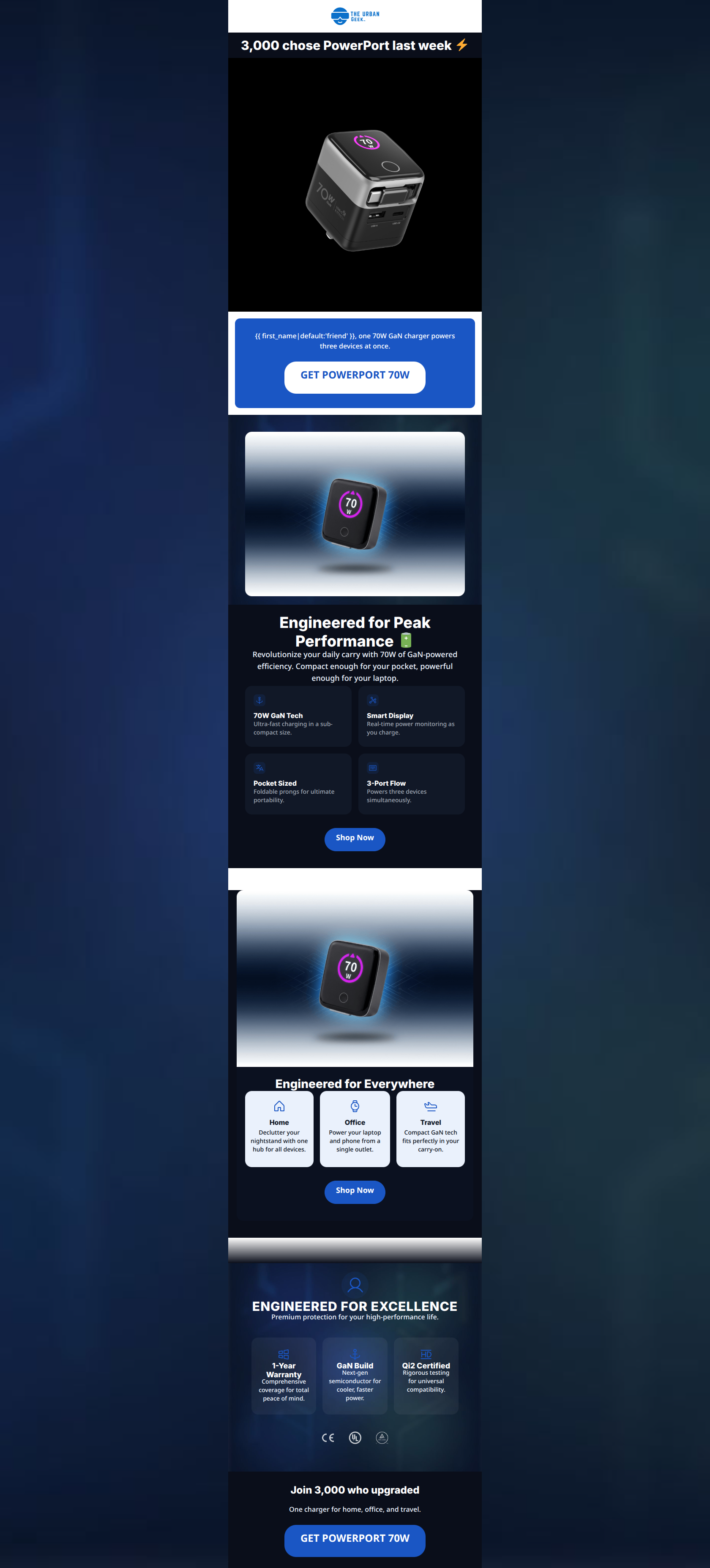
Design Score
86/100This promotional email for the PowerPort 70W executes on a high level, successfully blending technical authority with consumer-friendly benefits. The structural flow, scannability, and CTA clarity are top-tier, making it incredibly easy for the reader to understand the value proposition and take action. The email perfectly captures the brand's 'calm through order' aesthetic. The primary areas for improvement lie at the very top of the funnel: the hero headline relies heavily on social proof without clearly stating the product's function, and the core benefit is buried in visually weak text. Addressing the hero hierarchy and cleaning up a few visual transitions will elevate this from a strong email to a highly optimized conversion engine.
Create Your Own
Generate professional email designs like this one in seconds with Kopi AI.
Email Details
- Subject Line
- Why 3,000 chose PowerPort 70W last week ⚡
- Brand
- The Urban Geek
- Industry
- Electronics & Tech
- Email Type
- Promotional
- Created
- July 10, 2026
Brand Colors
Email Copy
Preview text: One 70W GaN charger, three devices, a built-in retractable cable, and a live power display. Here's why.
3,000 chose PowerPort last week ⚡
friend, one 70W GaN charger powers three devices at once.
→ GET POWERPORT 70W
Join 3,000 who upgraded
One charger for home, office, and travel.
→ GET POWERPORT 70W
Why This Email Works
This promotional email for the PowerPort 70W executes on a high level, successfully blending technical authority with consumer-friendly benefits. The structural flow, scannability, and CTA clarity are top-tier, making it incredibly easy for the reader to understand the value proposition and take action. The email perfectly captures the brand's 'calm through order' aesthetic. The primary areas for improvement lie at the very top of the funnel: the hero headline relies heavily on social proof without clearly stating the product's function, and the core benefit is buried in visually weak text. Addressing the hero hierarchy and cleaning up a few visual transitions will elevate this from a strong email to a highly optimized conversion engine.
1. Hero (top/initial part) Impact
75/100- Striking product photography clearly highlights the key differentiating feature (the LED screen).
- Immediate use of specific, numerical social proof builds instant credibility.
2. Content Structure & Flow
88/100- Excellent inverted pyramid flow from top to bottom.
- Clear demarcation of sections using brand-aligned background colors prevents the email from feeling like one long scroll.
3. Visual Hierarchy & Layout
82/100- CTAs dominate the visual hierarchy, ensuring the primary action is never lost.
- Ample white space in the features section makes the text highly digestible.
4. Call-to-Action Strength
96/100- Perfect consistency in button copy and destination URL.
- High-contrast tech-blue background on the buttons ensures they pop against both white and dark canvas backgrounds.
- Three strategically placed conversion opportunities accommodate different scrolling behaviors.
5. Message Clarity & Tone
86/100- Excellent translation of technical features into lifestyle benefits.
- Maintains a clean, professional, and functional brand voice throughout.
6. Readability & Scannability
90/100- Short, punchy bullet points ensure low cognitive load.
- Bold, concise subheadings act as an effective summary of the copy below them.
7. Offer & Value Proposition
85/100- Directly targets the core customer pain points (tangles, clutter, multiple adapters).
- The 'Services Triptych' perfectly maps the product's value to the customer's daily environments (Home, Office, Travel).
8. Personalization & Audience Fit
90/100- Highly relevant use-cases tailored specifically to the target psychographics.
- Trust signals (1-Year Warranty, Premium Build) address the objections of buyers burned by cheap, unreliable tech.
9. Copy Conciseness & Word Economy
92/100- Zero paragraphs or walls of text; relies entirely on digestible chunks.
- Action-oriented language ('pull it out', 'wind it back', 'slip into') makes the copy feel active and efficient.
Quick Wins
- Increase the typography size and weight of the hero subcopy ('one 70W GaN charger powers three devices at once') to clearly establish the value proposition above the fold.
- Remove the murky gradient shadow transition above the navy trust card, replacing it with a clean, hard color break to maintain a modern aesthetic.
- Drop the '{{ first_name|default:'Friend' }}' tag to maintain a consistently premium, authoritative tone without the risk of an impersonal fallback.



Create Professional Email Designs
Generate beautiful, on-brand email designs in seconds. Just enter your brand URL and let AI do the rest.