Finance & Fintech Win-Back Email Template
“When did we last talk about your coverage?”
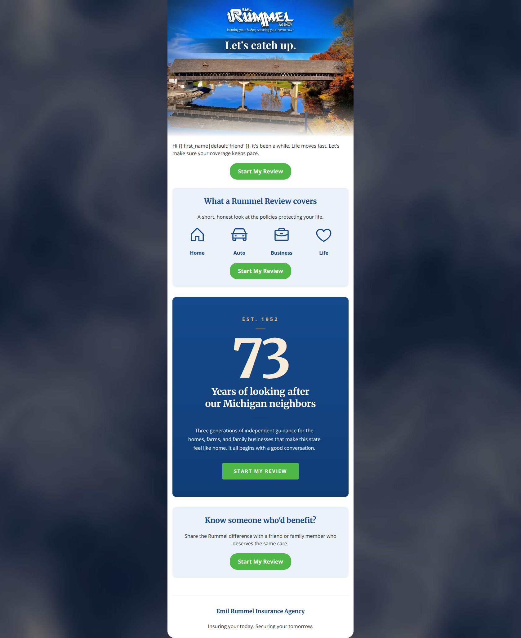
Design Score
81/100This email effectively utilizes the Emil Rummel brand's trusted, community-focused voice and strong visual heritage. The design is highly scannable, and the repetition of the primary CTA visually reinforces the conversion goal. However, the email leaves conversion potential on the table by relying on a somewhat passive value proposition and introducing a confusing referral section that directly conflicts with the primary 'Start My Review' CTA. Tightening the focus and highlighting concrete benefits will elevate this from a good touchpoint to a strong conversion driver.
Create Your Own
Generate professional email designs like this one in seconds with Kopi AI.
Email Details
- Subject Line
- When did we last talk about your coverage?
- Brand
- Emil Rummel Insurance Agency
- Industry
- Finance & Fintech
- Email Type
- Win-Back
- Created
- May 20, 2026
Brand Colors
Email Copy
Hi friend, it's been a while. Life moves fast. Let's make sure your coverage keeps pace.
→ Start My Review
What a Rummel Review covers
A short, honest look at the policies protecting your life.
Home
Auto
Business
Life
→ Start My Review
Know someone who'd benefit?
Share the Rummel difference with a friend or family member who deserves the same care.
→ Start My Review
Emil Rummel Insurance Agency
Insuring your today. Securing your tomorrow.
Why This Email Works
This email effectively utilizes the Emil Rummel brand's trusted, community-focused voice and strong visual heritage. The design is highly scannable, and the repetition of the primary CTA visually reinforces the conversion goal. However, the email leaves conversion potential on the table by relying on a somewhat passive value proposition and introducing a confusing referral section that directly conflicts with the primary 'Start My Review' CTA. Tightening the focus and highlighting concrete benefits will elevate this from a good touchpoint to a strong conversion driver.
Hero Impact
78/100- Warm, conversational opening that matches the brand's relationship-focused positioning.
- Strong localized imagery that resonates with the target demographic.
- Personalized greeting immediately draws the reader in.
Content Structure & Flow
82/100- Logical progression from the problem (life moves fast) to the solution (the review).
- Excellent use of a 4-column icon grid to quickly convey coverage types.
Visual Hierarchy & Layout
88/100- Excellent use of brand colors (navy and light blue) to delineate sections.
- Generous whitespace prevents cognitive overload.
- Strong visual symmetry aligns with the traditional, trustworthy brand identity.
Call-to-Action Strength
72/100- High-contrast green button pops perfectly against all background colors.
- Excellent repetition of the primary action (used 4 times).
- Consistent destination URL across all buttons.
Message Clarity & Tone
85/100- Highly conversational and empathetic tone.
- Positions the agency as a trusted advisor rather than just a salesperson.
- Avoids aggressive sales jargon in favor of clear, human language.
Readability & Scannability
90/100- Icon grid makes the core offering instantly scannable.
- Large, clear headings guide the eye down the page.
- Highly legible font color choices against their respective backgrounds.
Offer & Value Proposition
74/100- Sets clear expectations that the review is 'short' and 'honest'.
- Neatly categorizes what is covered without overwhelming the reader.
Personalization & Audience Fit
80/100- Strong regional resonance.
- Tone perfectly matches a demographic that values security and relationships.
Copy Conciseness & Word Economy
86/100- 'Life moves fast. Let's make sure your coverage keeps pace.' is an excellent, economical opening.
- Avoids long, dense paragraphs entirely.
Quick Wins
- Remove the 'Know someone who'd benefit?' section entirely to eliminate the contextual mismatch with the CTA and keep the email singularly focused.
- Add a short subheadline under 'Let's catch up' that states a concrete benefit of the review (e.g., 'Spot coverage gaps or find new savings').
- Shorten the body copy in the '73 Years' block to reduce reading friction and maintain the email's fast pace.
Create Professional Email Designs
Generate beautiful, on-brand email designs in seconds. Just enter your brand URL and let AI do the rest.