Automotive Promotional Email Template
“What painters actually say about the PRD-725”
Design Score
85/100This is a highly effective, conversion-focused email that perfectly nails the PORPHIS brand voice and target audience psychographics. The tone is authoritative, technical, and free of marketing fluff, speaking directly to pragmatic professionals. The visual hierarchy is generally strong, utilizing the brand's high-contrast aesthetic and bright blue CTAs effectively to guide the eye. While the copy is exceptionally tight and the repetitive CTA strategy is executed flawlessly, the email's structural flow could be optimized by reordering the technical features and social proof to build a stronger logical argument before the final pitch.
Create Your Own
Generate professional email designs like this one in seconds with Kopi AI.
Email Details
- Subject Line
- What painters actually say about the PRD-725
- Brand
- PORPHIS
- Industry
- Automotive
- Email Type
- Promotional
- Created
- August 17, 2026
Brand Colors
Email Copy
Preview text: Real reviews from painters who made the switch. See why they won't go back.
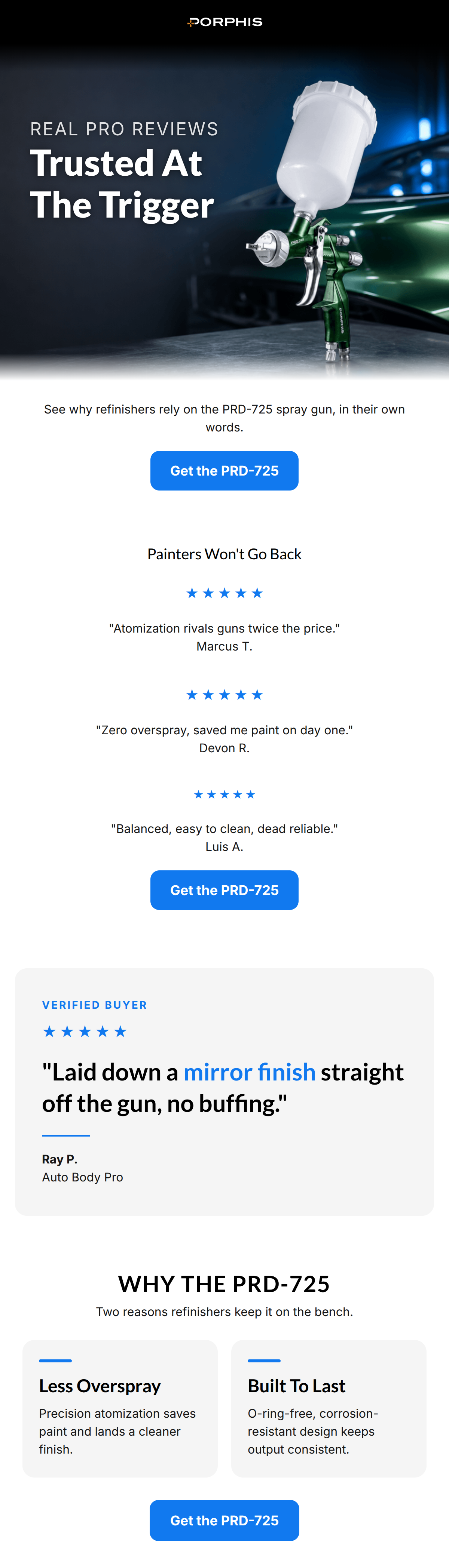
See why refinishers rely on the PRD-725 spray gun, in their own words.
→ Get the PRD-725
Painters Won't Go Back
★ ★ ★ ★ ★
"Atomization rivals guns twice the price." Marcus T.
★ ★ ★ ★ ★
"Zero overspray, saved me paint on day one." Devon R.
★ ★ ★ ★ ★
"Balanced, easy to clean, dead reliable." Luis A.
→ Get the PRD-725
Why This Email Works
This is a highly effective, conversion-focused email that perfectly nails the PORPHIS brand voice and target audience psychographics. The tone is authoritative, technical, and free of marketing fluff, speaking directly to pragmatic professionals. The visual hierarchy is generally strong, utilizing the brand's high-contrast aesthetic and bright blue CTAs effectively to guide the eye. While the copy is exceptionally tight and the repetitive CTA strategy is executed flawlessly, the email's structural flow could be optimized by reordering the technical features and social proof to build a stronger logical argument before the final pitch.
Hero (top/initial part) Impact
82/100- Excellent use of high-contrast, moody photography that aligns with the brand's visual identity.
- The headline 'Trusted At The Trigger' is engaging and speaks directly to the physical action of the user's trade.
Content Structure & Flow
78/100- Clear thematic focus on social proof and reliability.
- Smooth transition from brief, easily digestible review snippets to a more detailed, impactful testimonial.
Visual Hierarchy & Layout
80/100- Excellent contrast between the dark hero and the crisp white body, making the content easy to process.
- The electric blue (#1179EF) is used strategically as an accent color to draw the eye to key elements like stars and CTAs.
Call-to-Action Strength
95/100- The exact same phrase, 'Get the PRD-725', is used for all three buttons, leaving zero ambiguity about the destination.
- The bright blue buttons provide maximum contrast against both the white background and dark text, passing the squint test easily.
Message Clarity & Tone
88/100- Perfect alignment with the 'shop foreman' persona—direct, objective, and focused on results.
- Quotes selected for the reviews highlight specific, pragmatic benefits (saving paint, easy cleaning) rather than generic praise.
Readability & Scannability
85/100- Strategic use of the blue accent color to highlight 'mirror finish' in the main quote instantly communicates the primary benefit to scanners.
- Feature cards use a bold heading followed by a concise, single-sentence explanation, optimizing for quick reading.
Offer & Value Proposition
82/100- The value proposition is rooted in tangible outcomes (saving paint, consistent output) rather than abstract branding.
- Using customer voices to deliver the value proposition builds immediate trust and credibility.
Personalization & Audience Fit
88/100- Directly addresses the audience by their roles ('refinishers', 'Painters').
- Focuses on technical reliability ('O-ring-free'), a massive pain point for professionals who lose money during equipment downtime.
Copy Conciseness & Word Economy
92/100- The feature descriptions ('Precision atomization saves paint...') are masterclasses in benefit-driven, concise copywriting.
- Zero repetition of messaging between sections; the reviews provide the 'what', and the feature cards provide the 'how'.
Quick Wins
- Fix the heading level code in the third column of the review section so all stars are identical in size.
- Left-align the text within the three-column review section to improve readability of the quotes and attributions.
- Tighten the introductory subheadline to remove unnecessary words.
- Remove the very first 'Get the PRD-725' button to allow the user to read the social proof before being asked to convert.
Create Professional Email Designs
Generate beautiful, on-brand email designs in seconds. Just enter your brand URL and let AI do the rest.