Nonprofit Welcome Email Template
“Welcome — your giving journey starts here”
Design Score
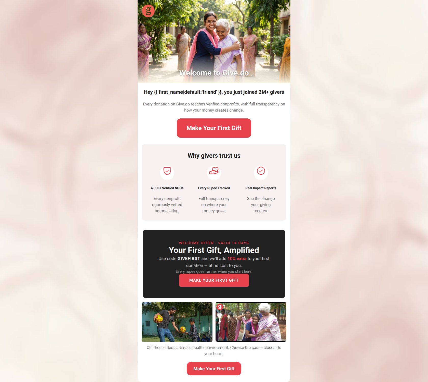
83/100This is a highly effective welcome email that deeply understands its target audience. It immediately tackles the primary pain point—trust and transparency—while maintaining strict discipline around a single conversion goal. The tone is empathetic and empowering, and the visual hierarchy effectively guides the reader. The primary flaw is burying the strongest conversion lever (the 10% donation match) halfway down the page. By elevating the offer and removing minor conversion leaks, this email could push into top-tier performance.
Create Your Own
Generate professional email designs like this one in seconds with Kopi AI.
Email Details
- Subject Line
- Welcome — your giving journey starts here
- Brand
- Give.do
- Industry
- Nonprofit
- Email Type
- Welcome
- Created
- April 10, 2026
Brand Colors
Email Copy
Hey friend, you just joined 2M+ givers
Every donation on Give.do reaches verified nonprofits, with full transparency on how your money creates change.
→ Make Your First Gift
Why givers trust us
4,000+ Verified NGOs
Every nonprofit rigorously vetted before listing.
Every Rupee Tracked
Full transparency on where your money goes.
Real Impact Reports
See the change your giving creates.
Children, elders, animals, health, environment. Choose the cause closest to your heart.
→ Make Your First Gift
Why This Email Works
This is a highly effective welcome email that deeply understands its target audience. It immediately tackles the primary pain point—trust and transparency—while maintaining strict discipline around a single conversion goal. The tone is empathetic and empowering, and the visual hierarchy effectively guides the reader. The primary flaw is burying the strongest conversion lever (the 10% donation match) halfway down the page. By elevating the offer and removing minor conversion leaks, this email could push into top-tier performance.
Hero (top/initial part) Impact
75/100- Strong, emotional imagery that aligns with the brand's documentary-style aesthetic.
- Effective use of a personalization token.
- High-contrast, prominent primary CTA placed above the fold.
Content Structure & Flow
82/100- Clear delineation between sections using alternating background colors.
- Follows the inverted pyramid model within individual sections.
- Ends on a strong, cause-oriented emotional note.
Visual Hierarchy & Layout
85/100- The dark charcoal background for the promo block creates excellent contrast and immediately signals importance.
- The three-column icon layout for the trust section is perfectly balanced and scannable.
- Consistent padding and margin usage creates a highly professional appearance.
Call-to-Action Strength
98/100- Flawless repetition of the primary CTA, reinforcing the desired action.
- Button text is clear, action-oriented, and sets an exact expectation.
- The coral-red (#E7424B) pops perfectly against all background variations (white, canvas, and dark).
Message Clarity & Tone
88/100- Directly addresses major industry pain points head-on ('Every Rupee Tracked', 'Real Impact Reports').
- Uses 'you' and 'your' effectively to keep the focus on the donor's agency.
- The promo block copy ('Your First Gift, Amplified') is compelling and benefit-driven.
Readability & Scannability
85/100- Excellent use of clear, utilitarian sans-serif typography.
- Bite-sized copy blocks prevent cognitive overload.
- Headings create a clear narrative scan path.
Offer & Value Proposition
80/100- The offer is highly relevant to the donor's core motivation (maximizing impact).
- The mechanics of the offer (using a code) are clearly explained.
- The urgency ('Valid 14 days') provides a reason to act now rather than later.
Personalization & Audience Fit
86/100- The 'Why givers trust us' section perfectly neutralizes the audience's primary objections.
- The photography feels authentic and documentary-style, matching the audience's preference for real impact over polished marketing.
- Basic name personalization adds a welcoming touch.
Copy Conciseness & Word Economy
90/100- Zero throat-clearing in the intro; gets straight to the point.
- Trust pillar descriptions are distilled to their absolute essence (e.g., 'See the change your giving creates').
- No repetitive sections; each block introduces new information.
Quick Wins
- Remove the embedded white text from the hero image to fix contrast issues.
- Remove the hrefs from the three trust icons to eliminate conversion leaks and keep users focused on the primary CTA.
- Tease the '10% Extra' offer in the hero text to increase immediate scroll motivation.




Create Professional Email Designs
Generate beautiful, on-brand email designs in seconds. Just enter your brand URL and let AI do the rest.