Other Welcome Email Template
“Welcome! Your 15% Off Awaits 🎉”
Design Score
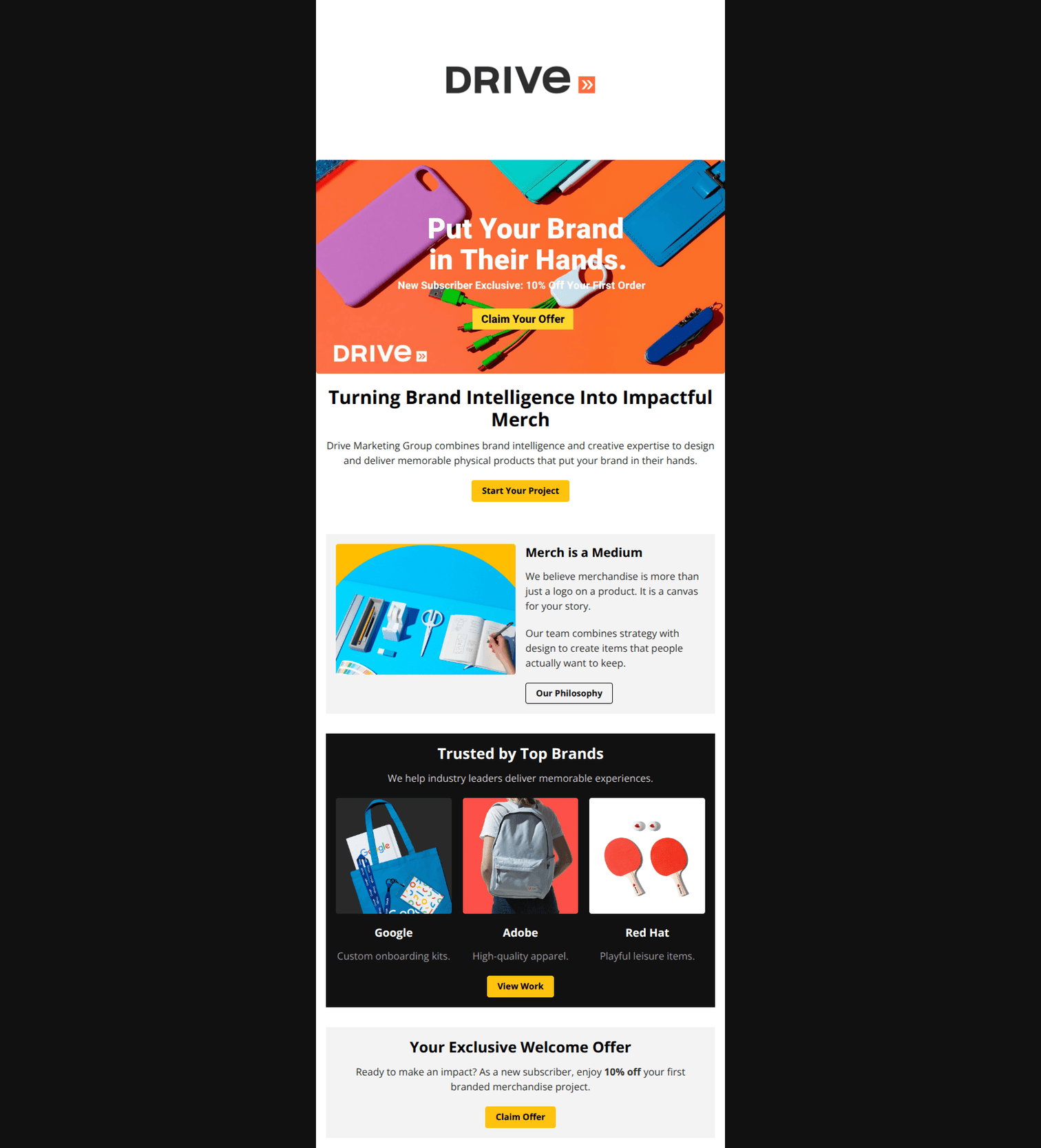
78/100This email features a visually striking design with strong color blocking and high-quality imagery that aligns perfectly with a premium creative agency. However, the hero section relies heavily on text embedded within images, which creates accessibility risks and mobile scaling issues. Additionally, the presence of a 'fake' button inside the hero image competes with the actual HTML button immediately below it, creating friction in the primary user journey.
Create Your Own
Generate professional email designs like this one in seconds with Kopi AI.
Email Details
- Subject Line
- Welcome! Your 15% Off Awaits 🎉
- Brand
- Drive Marketing Group
- Industry
- Other
- Email Type
- Welcome
- Created
- November 20, 2025
Brand Colors
Email Copy
Turning Brand Intelligence Into Impactful Merch
Drive Marketing Group combines brand intelligence and creative expertise to design and deliver memorable physical products that put your brand in their hands.
→ Start Your Project
Merch is a Medium
We believe merchandise is more than just a logo on a product. It is a canvas for your story.
Our team combines strategy with design to create items that people actually want to keep.
→ Our Philosophy
Trusted by Top Brands
We help industry leaders deliver memorable experiences.
Custom onboarding kits.
Adobe
High-quality apparel.
Red Hat
Playful leisure items.
→ View Work
Your Exclusive Welcome Offer
Ready to make an impact? As a new subscriber, enjoy 10% off your first branded merchandise project.
→ Claim Offer
Why This Email Works
This email features a visually striking design with strong color blocking and high-quality imagery that aligns perfectly with a premium creative agency. However, the hero section relies heavily on text embedded within images, which creates accessibility risks and mobile scaling issues. Additionally, the presence of a 'fake' button inside the hero image competes with the actual HTML button immediately below it, creating friction in the primary user journey.
Hero (top/initial part) Impact
65/100- The photography is high-quality, colorful, and immediately establishes the brand's creative capability.
- The background color transition from the image to the body text is seamless.
Content Structure & Flow
85/100- Distinct alternating sections keep the user engaged down the page.
- The hierarchy of information leads naturally to the final conversion point.
Visual Hierarchy & Layout
90/100- High contrast between sections aids scannability.
- The use of brand colors (yellow buttons) against different backgrounds is consistent and accessible.
Call-to-Action Strength
70/100- The buttons use a high-contrast yellow (#FFC20E) that stands out clearly against both light and dark backgrounds.
- Button labels are action-oriented ('Start', 'View', 'Claim').
Message Clarity & Tone
82/100- Headlines like 'Merch is a Medium' differenciates the brand from commodity suppliers.
- The language is consistently premium and authoritative.
Readability & Scannability
85/100- Short paragraphs and clear headings make the email easy to skim.
- Good use of whitespace/spacers between sections prevents visual clutter.
Offer & Value Proposition
75/100- The offer is tangible and valuable for high-ticket B2B orders.
- Framing it as a 'New Subscriber Exclusive' adds a layer of personalization.
Personalization & Audience Fit
75/100- The 'Trusted by Top Brands' section uses recognizable logos (Google, Adobe) that resonate immediately with corporate buyers.
- The copy speaks the language of marketers ('brand intelligence', 'canvas for your story').
Quick Wins
- Update the hero image alt text to include the specific offer details ('10% Off Your First Order') so it's not lost if images fail.
- Remove the 'Claim Your Offer' button graphic from the hero image to eliminate the 'fake button' UX issue.
- Lighten the subtext color in the dark 'Trusted by' section from #999999 to #CCCCCC to improve contrast and readability.


Create Professional Email Designs
Generate beautiful, on-brand email designs in seconds. Just enter your brand URL and let AI do the rest.