Media & Entertainment Welcome Email Template
“Welcome to the universe of Kurzgesagt (Inside: A Gift)”
Design Score
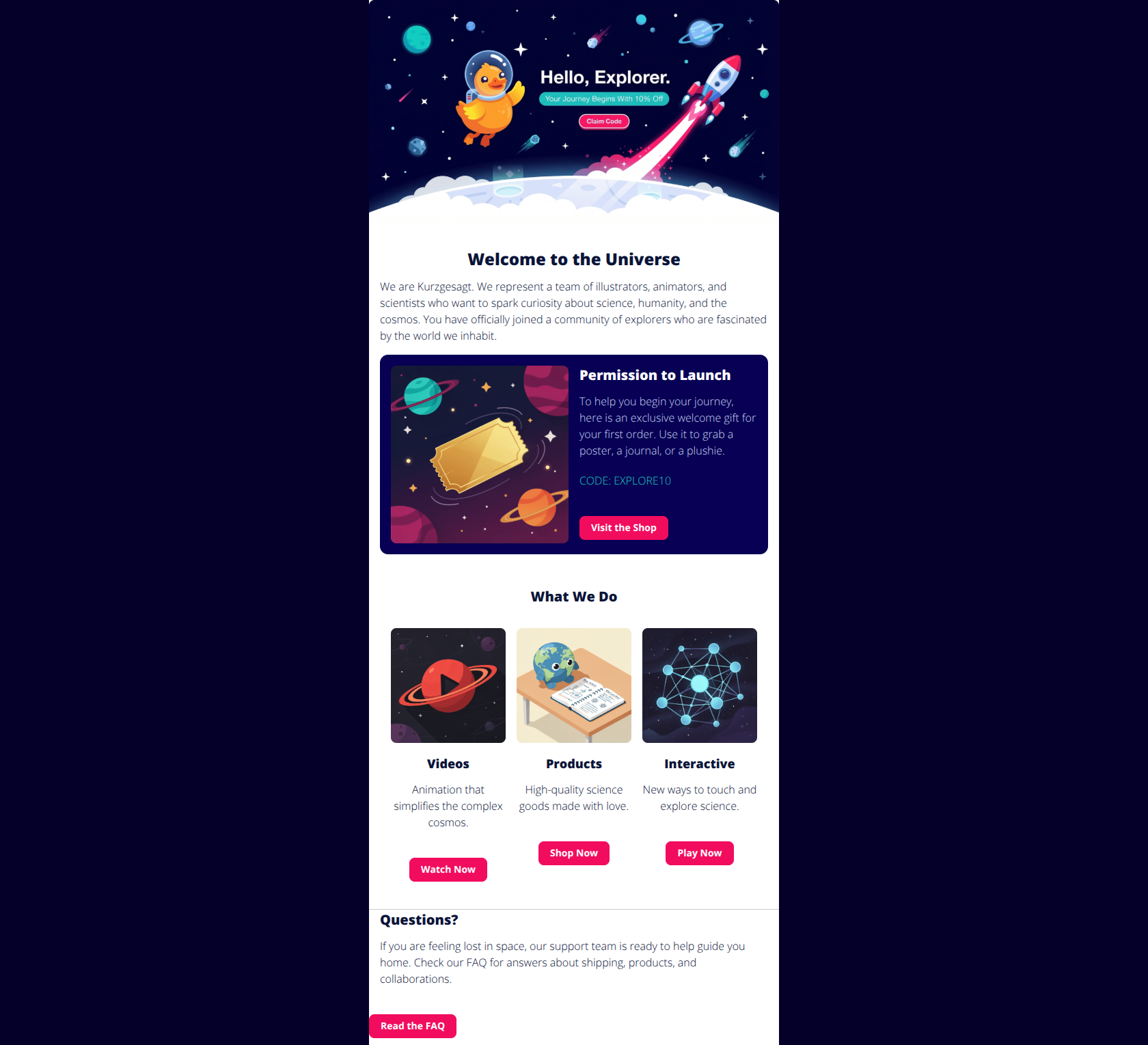
81/100This is a visually stunning, highly brand-aligned email that excels in tone and clarity. The primary weakness is conversion focus: the hero CTA is 'baked' into an image (accessibility risk), and the layout suffers from 'button bloat,' where secondary actions (watching videos, reading FAQs) visually compete with the primary goal of using the discount code.
Create Your Own
Generate professional email designs like this one in seconds with Kopi AI.
Email Details
- Subject Line
- Welcome to the universe of Kurzgesagt (Inside: A Gift)
- Brand
- Kurzgesagt
- Industry
- Media & Entertainment
- Email Type
- Welcome
- Created
- December 31, 2025
Brand Colors
Email Copy
Welcome to the Universe
We are Kurzgesagt. We represent a team of illustrators, animators, and scientists who want to spark curiosity about science, humanity, and the cosmos. You have officially joined a community of explorers who are fascinated by the world we inhabit.
Permission to Launch
To help you begin your journey, here is an exclusive welcome gift for your first order. Use it to grab a poster, a journal, or a plushie.
CODE: EXPLORE10
→ Visit the Shop
What We Do
Videos
Simplify the complex cosmos.
→ Watch Now
Products
High-quality science goods made with love.
→ Shop Now
Interactive
New ways to touch and explore science.
→ Play Now
Why This Email Works
This is a visually stunning, highly brand-aligned email that excels in tone and clarity. The primary weakness is conversion focus: the hero CTA is 'baked' into an image (accessibility risk), and the layout suffers from 'button bloat,' where secondary actions (watching videos, reading FAQs) visually compete with the primary goal of using the discount code.
Hero (top/initial part) Impact
85/100- Headline 'Hello, Explorer' perfectly frames the reader's identity.
- The value proposition '10% Off' is immediately visible in the visual center of the hero.
Content Structure & Flow
85/100- Distinct sections create a clear narrative journey.
- The transition from high-level brand intro to specific offer ('Permission to Launch') is smooth.
Visual Hierarchy & Layout
75/100- The dark blue card background effectively spotlights the offer against the white body.
- Consistent use of brand illustrations maintains high visual fidelity.
Call-to-Action Strength
70/100- The pink button color (#f20c5e) has excellent contrast against the dark backgrounds.
- Primary buttons are easy to spot in isolation.
Message Clarity & Tone
95/100- Terms like 'Explorer' and 'Universe' build a sense of community instantly.
- The FAQ section header 'Questions?' coupled with 'feeling lost in space' turns a boring utility section into a brand moment.
Readability & Scannability
88/100- Dark text on white background and white text on dark cards passes accessibility contrast checks easily.
- Headings clearly delineate topics.
Offer & Value Proposition
82/100- The 'Permission to Launch' ticket illustration visually reinforces the value of the offer.
- The offer is simple (flat 10%) and requires no complex math.
Personalization & Audience Fit
60/100- The 'Explorer' framing makes a generic email feel like an exclusive club invitation.
Quick Wins
- Remove the top navigation bar ('Home', 'About', 'Contact') to reduce distraction from the main CTA.
- Change the secondary buttons (Videos, Interactive, FAQ) to outline styles or text links so the 'Shop' buttons stand out.
- Rewrite the hero image alt text to include the offer details: 'Duck in space - Click to shop with 10% Off'.
- Change the 'Visit the Shop' button text to 'Shop New Arrivals' or 'Use My Discount' for higher urgency.



Create Professional Email Designs
Generate beautiful, on-brand email designs in seconds. Just enter your brand URL and let AI do the rest.