SaaS & Software Welcome Email Template
“Welcome to the programme”
Design Score
89/100This is an exceptionally strong, highly polished welcome email. It strictly adheres to best practices for visual hierarchy, word economy, and scannability. The inverted pyramid structure funnels the reader directly toward a consistent, clear primary action. The design utilizes the brand's sophisticated B2B color palette perfectly, using high-contrast cards to break up the flow. To push this into the top 1%, the email needs to leverage the rich data a B2B platform possesses—specifically, inserting personalization and directing the user toward a concrete first action rather than a generic homepage.
Create Your Own
Generate professional email designs like this one in seconds with Kopi AI.
Email Details
- Subject Line
- Welcome to the programme
- Brand
- Points at Work
- Industry
- SaaS & Software
- Email Type
- Welcome
- Created
- April 28, 2026
Brand Colors
Email Copy
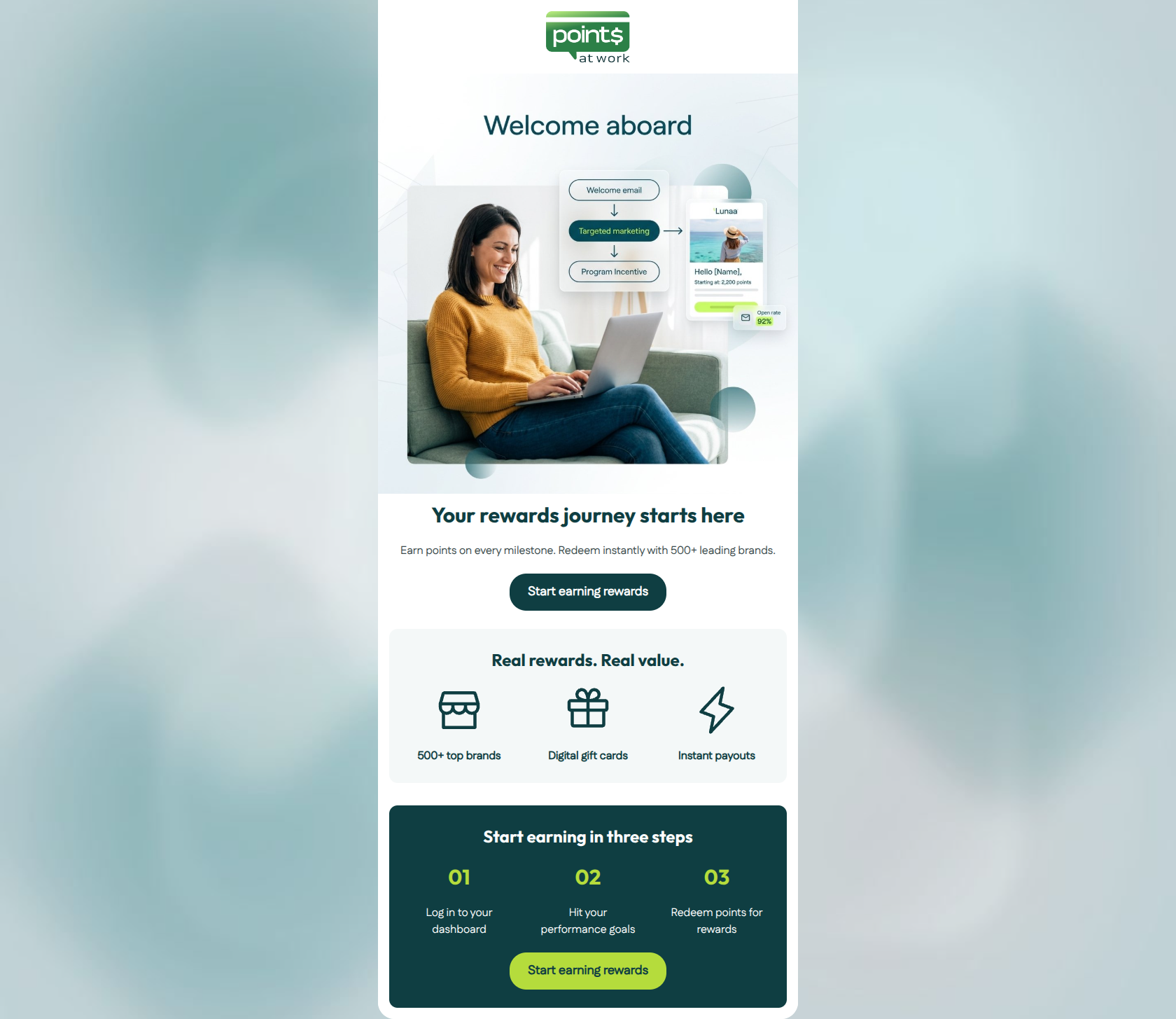
Your rewards journey starts here
Earn points on every milestone. Redeem instantly with 500+ leading brands.
→ Start earning rewards
Real rewards. Real value.
500+ top brands
Digital gift cards
Instant payouts
Start earning in three steps
01
Log in to your dashboard
02
Hit your performance goals
03
Redeem points for rewards
→ Start earning rewards
Why This Email Works
This is an exceptionally strong, highly polished welcome email. It strictly adheres to best practices for visual hierarchy, word economy, and scannability. The inverted pyramid structure funnels the reader directly toward a consistent, clear primary action. The design utilizes the brand's sophisticated B2B color palette perfectly, using high-contrast cards to break up the flow. To push this into the top 1%, the email needs to leverage the rich data a B2B platform possesses—specifically, inserting personalization and directing the user toward a concrete first action rather than a generic homepage.
Hero (top/initial part) Impact
85/100- High-quality imagery that effectively communicates the product's value proposition visually.
- Strong, benefit-driven subcopy ('Earn points on every milestone. Redeem instantly...').
Content Structure & Flow
90/100- Clear, distinct sections that guide the eye naturally down the page.
- Logical narrative progression from 'what you get' to 'how to get it'.
Visual Hierarchy & Layout
90/100- Excellent use of contrasting background colors to delineate sections.
- Ample white space prevents the email from feeling overwhelming.
Call-to-Action Strength
95/100- Consistent, repeated CTA copy reinforces the primary action.
- High-contrast color usage for the final CTA guarantees visibility.
Message Clarity & Tone
90/100- Direct, benefit-oriented language that centers the user.
- Tone matches the brand's sophisticated but empowering positioning.
Readability & Scannability
95/100- Heavy reliance on icons and large numerals to anchor the eye.
- Zero 'walls of text'; everything is chunked logically.
Offer & Value Proposition
90/100- Clear articulation of the tangible benefits of participation.
- Focus on 'instant' gratification appeals to the target audience's desire for efficiency.
Personalization & Audience Fit
75/100- The messaging fits the professional, goal-oriented mindset of the target audience.
Copy Conciseness & Word Economy
95/100- Ruthless elimination of filler phrases.
- Punchy, verb-led sentences.
Quick Wins
- Add dynamic {{first_name}} personalization to the main headline.
- Update the button URLs to link directly to the user dashboard/login portal instead of the marketing homepage.




Create Professional Email Designs
Generate beautiful, on-brand email designs in seconds. Just enter your brand URL and let AI do the rest.