Design Score
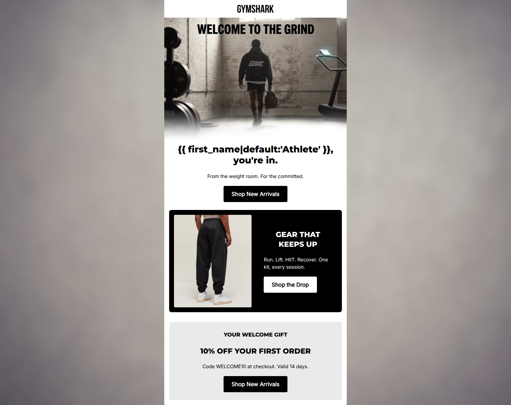
82/100This is a visually striking, highly on-brand welcome email that nails the Gymshark aesthetic and tone. The photography is excellent, the copy is refreshingly concise, and the primary CTA is repeated consistently to drive users to the new releases. However, from a conversion standpoint, it makes a classic mistake: it buries the primary conversion lever (the 10% off welcome offer) at the very bottom of the email. In a welcome flow, the incentive is the primary reason the user opened the email; making them scroll past generic product blocks to find it introduces unnecessary friction.
Create Your Own
Generate professional email designs like this one in seconds with Kopi AI.
Email Details
- Subject Line
- Welcome to the grind.
- Brand
- Gymshark
- Industry
- Fitness
- Email Type
- Welcome
- Created
- May 6, 2026
Brand Colors
Email Copy
Athlete, you're in.
From the weight room. For the committed.
→ Shop New Arrivals
GEAR THAT KEEPS UP
Run. Lift. HIIT. Recover. One kit, every session.
→ Shop the Drop
YOUR WELCOME GIFT
10% OFF YOUR FIRST ORDER
Code WELCOME10 at checkout. Valid 14 days.
→ Shop New Arrivals
Why This Email Works
This is a visually striking, highly on-brand welcome email that nails the Gymshark aesthetic and tone. The photography is excellent, the copy is refreshingly concise, and the primary CTA is repeated consistently to drive users to the new releases. However, from a conversion standpoint, it makes a classic mistake: it buries the primary conversion lever (the 10% off welcome offer) at the very bottom of the email. In a welcome flow, the incentive is the primary reason the user opened the email; making them scroll past generic product blocks to find it introduces unnecessary friction.
Hero (top/initial part) Impact
75/100- High-impact, on-brand imagery that instantly resonates with the target audience.
- Clear, high-contrast primary CTA button positioned well above the fold.
- Effective use of personalization in the headline.
Content Structure & Flow
72/100- Clean, distinct content blocks that prevent visual blending.
- Logical grouping of information within each block.
Visual Hierarchy & Layout
85/100- Excellent use of the brand's monochromatic palette to create contrast.
- High-quality, dynamic photography that draws attention.
- Generous use of negative space prevents the email from feeling cluttered.
Call-to-Action Strength
95/100- Consistent destination URL across all buttons.
- High-contrast button design (black on white, white on black) ensures they pass the squint test.
- Clear, action-oriented button copy.
Message Clarity & Tone
85/100- Authentic, community-driven tone ('For the committed').
- Short, declarative sentences that are easy to process.
Readability & Scannability
90/100- Excellent use of clear, bold headings (H1, H2) to establish hierarchy.
- Zero walls of text; copy is distilled to its absolute minimum.
- High contrast text-to-background ratios throughout.
Offer & Value Proposition
70/100- Clear, unambiguous offer terms.
- Transparent expiration timeframe.
Personalization & Audience Fit
85/100- Spot-on visual aesthetic for the target demographic.
- First-name personalization used in the most prominent text element.
Copy Conciseness & Word Economy
92/100- Lean, impactful sentences.
- Elimination of all redundant messaging.
Quick Wins
- Bold the promo code 'WELCOME10' to make it stand out from the surrounding terms and conditions text.
- Add a small 'Enjoy 10% off your first order' sub-headline directly beneath the main hero H1.




Create Professional Email Designs
Generate beautiful, on-brand email designs in seconds. Just enter your brand URL and let AI do the rest.