Design Score
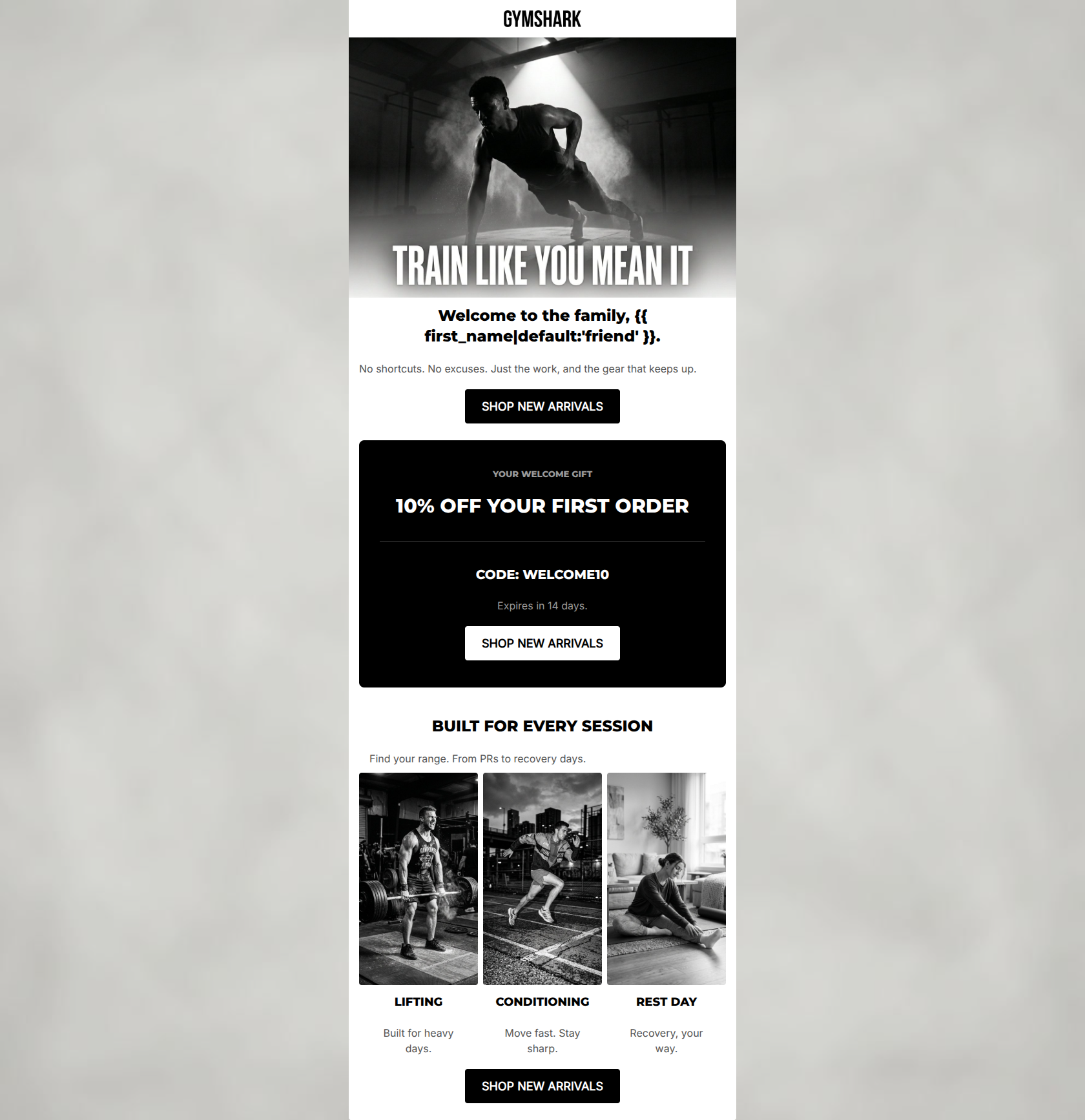
85/100This is a strong, highly on-brand welcome email that effectively utilizes Gymshark's gritty, minimalist aesthetic. The copy is tight, the tone is accurate, and the CTA strategy is textbook-perfect. The primary flaw preventing a top-tier score is burying the core conversion driver—the 10% welcome discount—below the initial viewport. The email asks the user to shop before reminding them they have an incentive to do so.
Create Your Own
Generate professional email designs like this one in seconds with Kopi AI.
Email Details
- Subject Line
- Welcome to the grind.
- Brand
- Gymshark
- Industry
- Fitness
- Email Type
- Welcome
- Created
- May 6, 2026
Brand Colors
Email Copy
Welcome to the family, friend.
No shortcuts. No excuses. Just the work, and the gear that keeps up.
→ SHOP NEW ARRIVALS
YOUR WELCOME GIFT
10% OFF YOUR FIRST ORDER
CODE: WELCOME10
Expires in 14 days.
→ SHOP NEW ARRIVALS
BUILT FOR EVERY SESSION
Find your range. From PRs to recovery days.
LIFTING
Built for heavy days.
CONDITIONING
Move fast. Stay sharp.
REST DAY
Recovery, your way.
→ SHOP NEW ARRIVALS
Why This Email Works
This is a strong, highly on-brand welcome email that effectively utilizes Gymshark's gritty, minimalist aesthetic. The copy is tight, the tone is accurate, and the CTA strategy is textbook-perfect. The primary flaw preventing a top-tier score is burying the core conversion driver—the 10% welcome discount—below the initial viewport. The email asks the user to shop before reminding them they have an incentive to do so.
Hero Impact
75/100- Excellent use of high-impact, brand-aligned photography.
- Clear, immediate primary CTA placement.
Content Structure & Flow
80/100- Distinct, well-defined sections prevent visual clutter.
- The three-column product category structure cleanly organizes the catalog.
Visual Hierarchy & Layout
85/100- Brilliant use of an inverted color block to highlight the core offer.
- Clean, symmetrical grid layout for the product categories.
Call-to-Action Strength
95/100- Perfect consistency in CTA copy and destination.
- High-contrast button styling ensures they are impossible to miss.
- Strategic repetition reinforces the primary conversion goal.
Message Clarity & Tone
85/100- Authentic, gritty brand voice that resonates with the core demographic.
- Confident, punchy sentences.
Readability & Scannability
90/100- Excellent use of varied heading levels (H1, H2, H3, H4, H5) to establish scale and scanning paths.
- Short, punchy copy blocks prevent user fatigue.
Offer & Value Proposition
82/100- Clear, unambiguous discount code presentation.
- Effective use of urgency with the 14-day expiration notice.
Personalization & Audience Fit
85/100- Imagery perfectly captures the aspirational intensity of the target audience.
- Lifestyle categorization (Lifting vs. Rest Day) directly addresses the customer's daily routines.
Copy Conciseness & Word Economy
92/100- Ruthless word economy; highly distilled messaging.
- Zero filler adjectives.
Quick Wins
- Add a small '10% Off Inside' teaser text above the hero image or within the first H2.
- Ensure the hero image has alt text that includes the discount teaser, in case images are turned off.




Create Professional Email Designs
Generate beautiful, on-brand email designs in seconds. Just enter your brand URL and let AI do the rest.