SaaS & Software Welcome Email Template
“Welcome to the family! 🎉”
Design Score
84/100This is a visually polished, highly competent onboarding email that effectively uses brand assets and gamification ('Perk Unlocked') to drive clicks. The primary strength is the visual curiosity gap in the hero; the primary weakness is the generic nature of the secondary copy and CTAs, which miss an opportunity to drive specific product actions beyond just 'exploring'.
Create Your Own
Generate professional email designs like this one in seconds with Kopi AI.
Email Details
- Subject Line
- Welcome to the family! 🎉
- Brand
- Trello
- Industry
- SaaS & Software
- Email Type
- Welcome
- Created
- December 27, 2025
Brand Colors
Email Copy
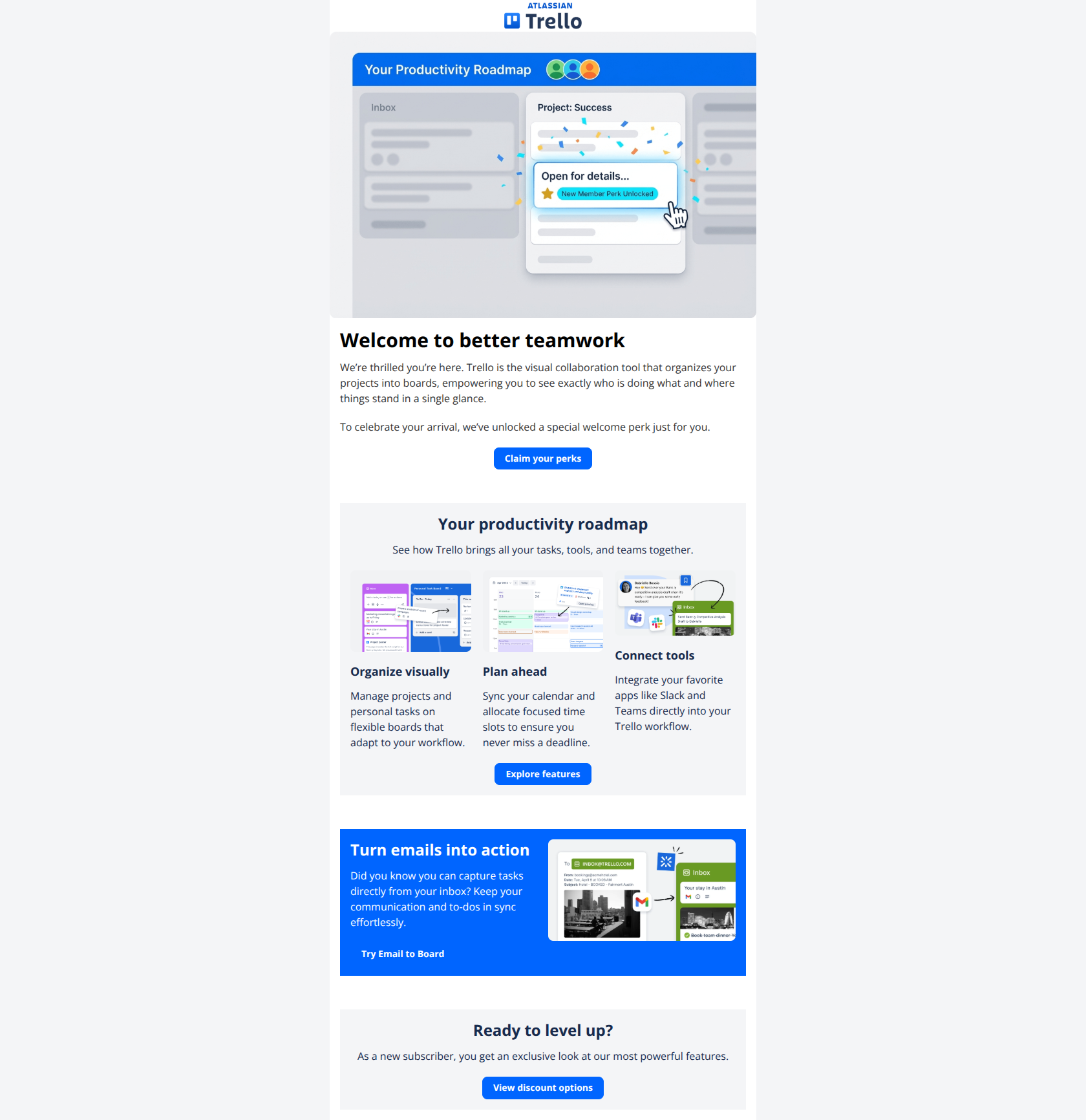
Welcome to better teamwork
We’re thrilled you’re here. Trello is the visual collaboration tool that organizes your projects into boards, empowering you to see exactly who is doing what and where things stand in a single glance.
To celebrate your arrival, we’ve unlocked a special welcome perk just for you.
→ Claim your perks
Your productivity roadmap
See how Trello brings all your tasks, tools, and teams together.
Organize visually
Manage projects and personal tasks on flexible boards that adapt to your workflow.
Plan ahead
Sync your calendar and allocate focused time slots to ensure you never miss a deadline.
Connect tools
Integrate your favorite apps like Slack and Teams directly into your Trello workflow.
→ Explore features
Turn emails into action
Did you know you can capture tasks directly from your inbox? Keep your communication and to-dos in sync effortlessly.
→ Try Email to Board
Ready to level up?
As a new subscriber, you get an exclusive look at our most powerful features.
→ View discount options
Why This Email Works
This is a visually polished, highly competent onboarding email that effectively uses brand assets and gamification ('Perk Unlocked') to drive clicks. The primary strength is the visual curiosity gap in the hero; the primary weakness is the generic nature of the secondary copy and CTAs, which miss an opportunity to drive specific product actions beyond just 'exploring'.
Hero (top/initial part) Impact
88/100- The 'New Member Perk Unlocked' graphic acts as a compelling 'interrupt' pattern that grabs attention immediately.
- The primary CTA 'Claim your perks' is action-oriented and creates a strong curiosity gap.
Content Structure & Flow
85/100- Sections are clearly demarcated using alternating background colors (White/Grey/Blue), making the scroll depth easy to manage.
- The flow moves correctly from high-level brand promise to specific feature application.
Visual Hierarchy & Layout
90/100- The three-column feature grid uses clear icons and concise text, maintaining balance without overcrowding.
- High contrast headers make skimming for value very easy.
Call-to-Action Strength
82/100- Primary CTA 'Claim your perks' uses benefit-driven copy rather than generic 'Click here'.
- Buttons are large, clearly clickable, and isolate the action well.
Message Clarity & Tone
85/100- Headlines like 'Turn emails into action' are excellent because they describe the outcome, not just the feature.
- Language is accessible and jargon-free.
Readability & Scannability
90/100- Use of distinct background cards (#F4F5F7 vs #FFFFFF) visually groups related content effectively.
- Font sizes for body copy are generous and legible.
Offer & Value Proposition
75/100- Gamifying the onboarding with an 'Unlocked' status is a smart psychological trigger.
- The feature value props (Organize, Plan, Connect) clearly explain *why* a user should care.
Personalization & Audience Fit
70/100- Acknowledges the user as a 'new subscriber', setting the right context.
Quick Wins
- **Rename the 'Explore features' CTA** to 'See Trello in Action' to promise a demonstration rather than just a browsing experience.
- **Enhance the Blue Section CTA:** Change the 'Try Email to Board' button to a solid white pill-shape with blue text. This creates a 'pop' effect on the dark blue background.
- **Bridge the gap:** Add a small line of copy under 'Claim your perks' that clarifies the category of the perk (e.g., 'Exclusive offer inside'), ensuring users know it's worth the click.




Create Professional Email Designs
Generate beautiful, on-brand email designs in seconds. Just enter your brand URL and let AI do the rest.