Home & Garden Welcome Email Template
“Welcome to the cool side of bed”
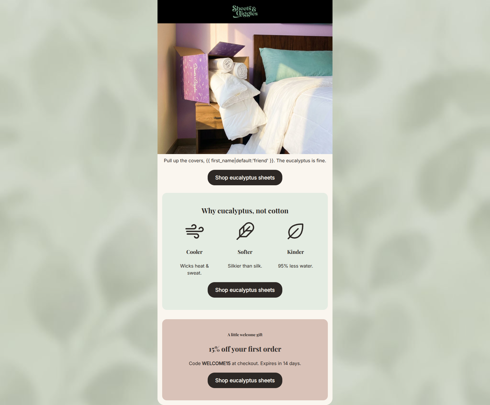
Design Score
81/100This welcome email excels in scannability, concise copywriting, and CTA execution, but is severely hampered by a weak hero section. The intended headline ('Welcome to cooler nights') is missing from the hero image, leaving the opening text without context and failing to immediately grab the reader's attention. Furthermore, burying the 15% welcome offer at the very bottom forces the user to work to find the primary incentive for opening the email. Once past the top section, the email does a fantastic job of succinctly communicating the brand's value propositions in an on-brand, aesthetically pleasing layout.
Create Your Own
Generate professional email designs like this one in seconds with Kopi AI.
Email Details
- Subject Line
- Welcome to the cool side of bed
- Brand
- Sheets & Giggles
- Industry
- Home & Garden
- Email Type
- Welcome
- Created
- May 19, 2026
Brand Colors
Email Copy
Pull up the covers, friend. The eucalyptus is fine.
→ Shop eucalyptus sheets
Why eucalyptus, not cotton
Cooler
Wicks heat & sweat.
Softer
Silkier than silk.
Kinder
95% less water.
→ Shop eucalyptus sheets
A little welcome gift
15% off your first order
Code WELCOME15 at checkout. Expires in 14 days.
→ Shop eucalyptus sheets
Why This Email Works
This welcome email excels in scannability, concise copywriting, and CTA execution, but is severely hampered by a weak hero section. The intended headline ('Welcome to cooler nights') is missing from the hero image, leaving the opening text without context and failing to immediately grab the reader's attention. Furthermore, burying the 15% welcome offer at the very bottom forces the user to work to find the primary incentive for opening the email. Once past the top section, the email does a fantastic job of succinctly communicating the brand's value propositions in an on-brand, aesthetically pleasing layout.
Hero Impact
45/100- The image successfully shows the unboxing experience and the product in a real-world context.
Content Structure & Flow
85/100- Distinct background blocks clearly separate different conceptual sections.
- The flow naturally guides the eye down the page toward the final offer.
Visual Hierarchy & Layout
80/100- Excellent use of whitespace and padding to reduce cognitive load.
- The three-column layout for benefits makes them instantly digestible.
Call-to-Action Strength
98/100- No competing destinations or diluted messaging; singular focus on getting the user to the sheets collection.
- Button contrast is excellent, making the CTAs pop against every background color used.
Message Clarity & Tone
88/100- Strong 'benefit over feature' translation ('Cooler' -> 'Wicks heat & sweat').
- The tone feels like a knowledgeable friend, perfectly matching the psychographic profile.
Readability & Scannability
92/100- Typography is large, clear, and high-contrast.
- Icons serve as excellent visual anchors for the scanning eye.
Offer & Value Proposition
85/100- Clear articulation of why eucalyptus is better than cotton (cooler, softer, kinder).
- The inclusion of an expiration date on the discount code drives action.
Personalization & Audience Fit
90/100- Uses basic dynamic personalization smoothly in the opening copy.
- Directly addresses the dual desires of the target audience: comfort and eco-consciousness.
Copy Conciseness & Word Economy
95/100- Zero filler words or throat-clearing sentences.
- Extremely punchy and impactful benefit statements.
Quick Wins
- Add an HTML <h1> headline above the first paragraph (e.g., 'Welcome to cooler nights.') to provide immediate context that the image is currently failing to deliver.
- Move the mention of the 15% off welcome offer to the top of the email, either as a text callout above the image or integrated into the first text block.




Create Professional Email Designs
Generate beautiful, on-brand email designs in seconds. Just enter your brand URL and let AI do the rest.