Beauty & Skincare Welcome Email Template
“Welcome to Soteri Skin — 15% off inside”
Design Score
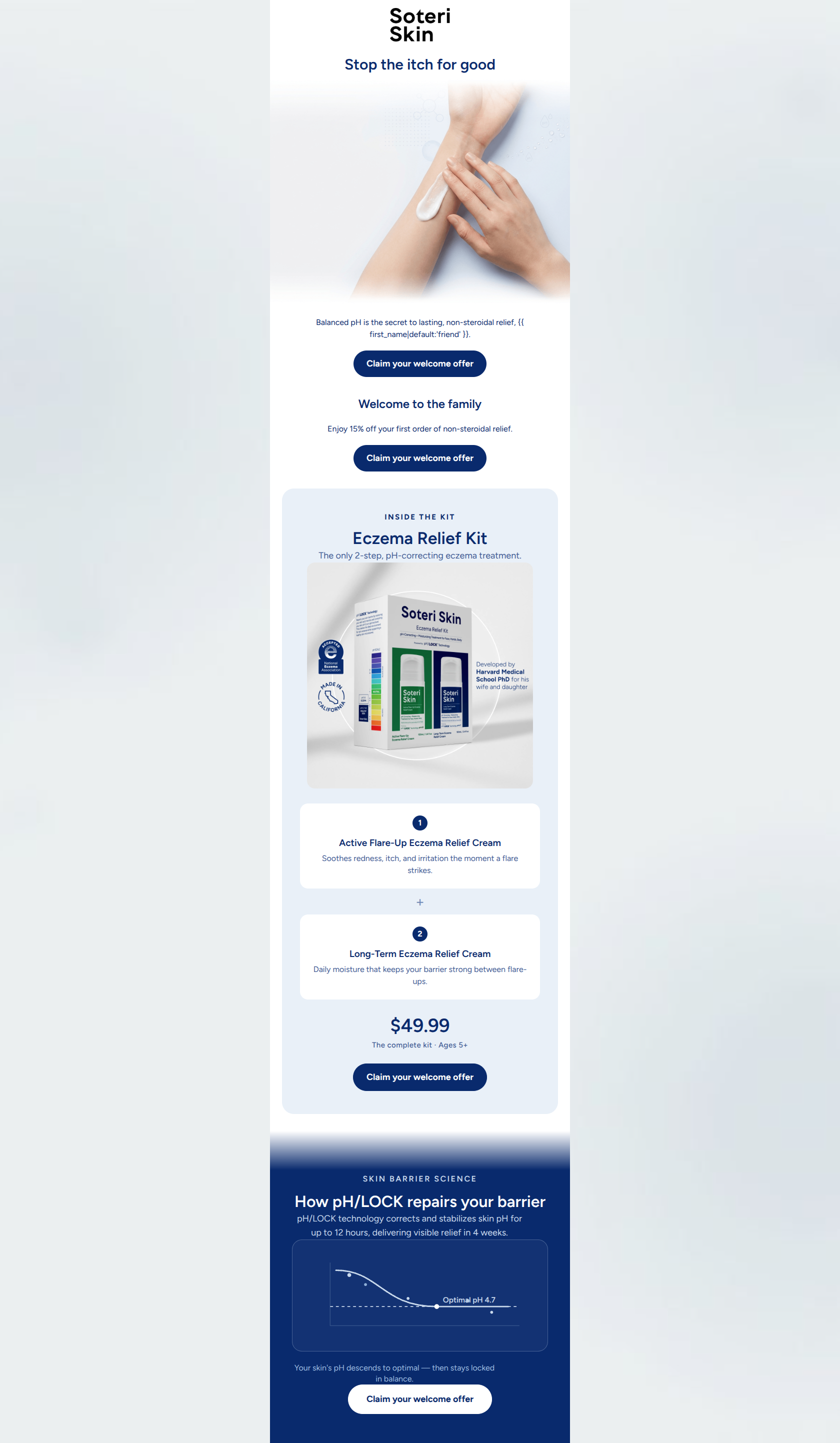
87/100This is a highly effective, visually impressive welcome email that clearly communicates Soteri Skin's unique value proposition. The aesthetic perfectly balances clinical authority with empathetic relief, establishing trust immediately. The copy is tight, benefit-driven, and highly relevant to the target audience's pain points. Furthermore, the commitment to a single primary CTA destination across multiple prominent buttons is excellent for driving clicks. The primary opportunity for improvement lies in the narrative flow of the top third of the email, where the main headline and the introductory offer are split into two disjointed sections, causing a slight disconnect between the initial value proposition and the user's first opportunity to act.
Create Your Own
Generate professional email designs like this one in seconds with Kopi AI.
Email Details
- Subject Line
- Welcome to Soteri Skin — 15% off inside
- Brand
- Soteri Skin
- Industry
- Beauty & Skincare
- Email Type
- Welcome
- Created
- July 9, 2026
Brand Colors
Email Copy
Preview text: The pH-balancing science that stops the itch for good — plus 15% off your first order.
Stop the itch for good
Balanced pH is the secret to lasting, non-steroidal relief, friend.
→ Claim your welcome offer
Welcome to the family
Enjoy 15% off your first order of non-steroidal relief.
→ Claim your welcome offer
Why This Email Works
This is a highly effective, visually impressive welcome email that clearly communicates Soteri Skin's unique value proposition. The aesthetic perfectly balances clinical authority with empathetic relief, establishing trust immediately. The copy is tight, benefit-driven, and highly relevant to the target audience's pain points. Furthermore, the commitment to a single primary CTA destination across multiple prominent buttons is excellent for driving clicks. The primary opportunity for improvement lies in the narrative flow of the top third of the email, where the main headline and the introductory offer are split into two disjointed sections, causing a slight disconnect between the initial value proposition and the user's first opportunity to act.
Hero (top/initial part) Impact
82/100- Incredibly strong, benefit-led H1 that speaks directly to the audience's primary struggle.
- High-quality, relevant imagery that feels both clinical and human.
- Immediate introduction of the brand's unique mechanism ('Balanced pH').
Content Structure & Flow
80/100- Clear progression of information that builds trust as the user scrolls.
- Distinct visual sections prevent the email from feeling like one long sales pitch.
- The science section at the bottom acts as a strong logical closer for users who need more proof.
Visual Hierarchy & Layout
85/100- Excellent use of the product card layout to separate the 'Kit' components.
- The 1 and 2 step indicators create an effortless visual path.
- Strong contrast between the background colors and the text/buttons.
Call-to-Action Strength
95/100- Unambiguous button copy ('Claim your welcome offer').
- High-contrast navy and white buttons that pop against their respective backgrounds.
- Excellent repetition of the primary action throughout the scroll depth.
Message Clarity & Tone
90/100- Consistent use of brand-specific terminology (pH/LOCK, non-steroidal).
- Empathetic framing that acknowledges the frustration of eczema.
- Clear, confident assertions ('The only 2-step...').
Readability & Scannability
88/100- Bite-sized paragraphs and single-sentence statements.
- Excellent use of a diagram to explain a complex scientific concept visually.
- Clear, bold headings for every section.
Offer & Value Proposition
85/100- The core mechanism of action (pH balance) is clearly tied to the outcome (lasting relief).
- The offer is straightforward with no complex conditions.
Personalization & Audience Fit
90/100- Directly addresses the parent demographic by clarifying age usage.
- Focuses heavily on the 'non-steroidal' aspect, a known primary pain point.
Copy Conciseness & Word Economy
92/100- Zero walls of text; highly economical use of words.
- Features are immediately translated into benefits ('Soothes redness... the moment a flare strikes').
Quick Wins
- Combine the first two text sections so the 15% offer is introduced alongside the hero messaging, validating the first CTA button.
- Add a visual indicator near the $49.99 kit price reminding the user that their 15% welcome discount applies to this amount.
- Remove the 'friend' fallback in the intro copy, as it slightly undercuts the clinical, premium brand tone.



Create Professional Email Designs
Generate beautiful, on-brand email designs in seconds. Just enter your brand URL and let AI do the rest.