SaaS & Software Welcome Email Template
“Welcome to Shortlist. Let's stop the ghosting.”
Design Score
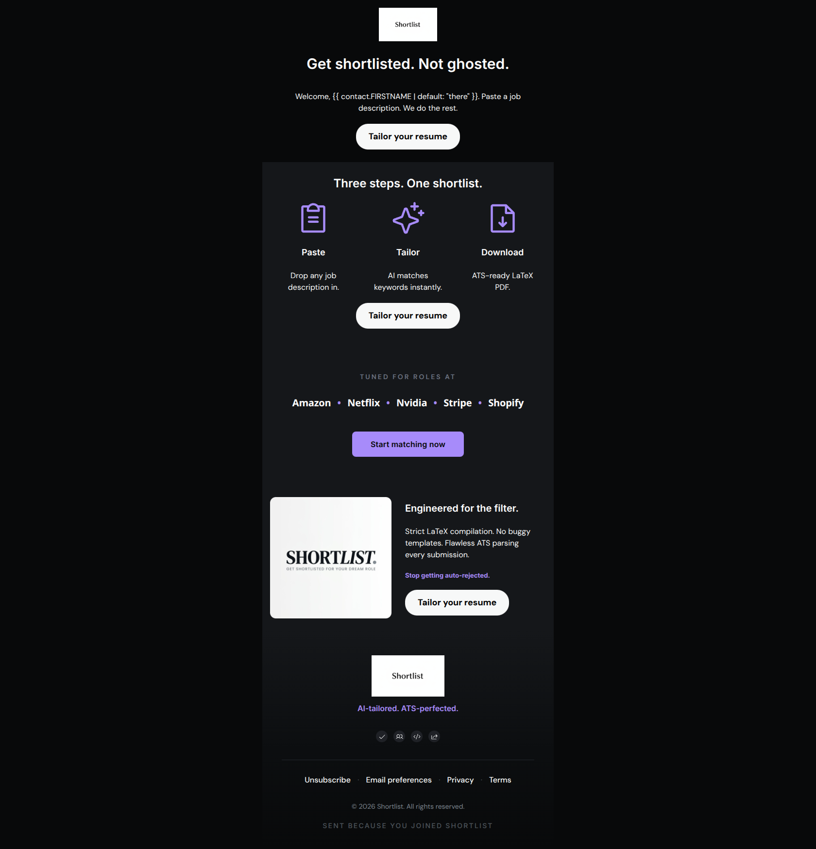
83/100This welcome email delivers a strong, highly concise message that perfectly matches the authoritative tone of the Shortlist brand. The copy is tight, the value proposition is clear, and the CTA strategy is relentless and focused, directing all traffic to a single objective. However, the visual execution at the top of the email severely hampers its initial impact. A jarring white header and a massive, low-value hero image disrupt the premium dark-mode aesthetic and push critical conversion elements out of immediate view. Fixing the hero layout will elevate this from a competent email to a highly converting asset.
Create Your Own
Generate professional email designs like this one in seconds with Kopi AI.
Email Details
- Subject Line
- Welcome to Shortlist. Let's stop the ghosting.
- Brand
- Shortlist
- Industry
- SaaS & Software
- Email Type
- Welcome
- Created
- June 9, 2026
Brand Colors
Email Copy
Preview text: Your applications, precision-matched to the role. Paste a job description and watch it hap
Get shortlisted. Not ghosted.
Welcome, there. Paste a job description. We do the rest.
→ Tailor your resume
Three steps. One shortlist.
Paste
Drop any job description in.
Tailor
AI matches keywords instantly.
Download
ATS-ready LaTeX PDF.
→ Tailor your resume
Engineered for the filter.
Strict LaTeX compilation. No buggy templates. Flawless ATS parsing every submission.
Stop getting auto-rejected.
→ Tailor your resume
Why This Email Works
This welcome email delivers a strong, highly concise message that perfectly matches the authoritative tone of the Shortlist brand. The copy is tight, the value proposition is clear, and the CTA strategy is relentless and focused, directing all traffic to a single objective. However, the visual execution at the top of the email severely hampers its initial impact. A jarring white header and a massive, low-value hero image disrupt the premium dark-mode aesthetic and push critical conversion elements out of immediate view. Fixing the hero layout will elevate this from a competent email to a highly converting asset.
Hero Impact
55/100- The H1 headline 'Get shortlisted. Not ghosted.' directly attacks the user's primary pain point.
- Establishes a dark, technical aesthetic immediately (aside from the very top header).
Content Structure & Flow
80/100- Clear linear progression that builds a case for the product.
- Strategically places the 'Three steps' section early to demonstrate ease of use.
Visual Hierarchy & Layout
75/100- The three-column icon layout for the steps creates a highly scannable, low-cognitive-load section.
- The target companies block uses muted text to serve as social proof without competing with the CTAs.
Call-to-Action Strength
95/100- All four buttons lead to the exact same destination, creating zero friction or confusion.
- The copy 'Tailor your resume' is specific and verb-led.
- Excellent frequency and placement of CTAs throughout the scroll depth.
Message Clarity & Tone
88/100- Uses industry-specific terminology correctly and confidently.
- Avoids generic marketing fluff in favor of direct, feature-to-benefit statements.
Readability & Scannability
90/100- Excellent use of stark white text on a dark canvas for maximum contrast.
- Information is chunked into easily digestible bites.
Offer & Value Proposition
85/100- Clearly communicates exactly what the tool does within the first few lines.
- Highlights the technical differentiator (LaTeX vs. buggy templates) effectively.
Personalization & Audience Fit
88/100- The 'Built for candidates targeting...' section is brilliant implicit personalization.
- The unapologetically technical language honors the intelligence of the audience.
Copy Conciseness & Word Economy
98/100- Communicates complex technical concepts in very few words.
- Eliminates all 'we are excited to' style filler.
Quick Wins
- Delete or drastically shrink the giant 'S' logo in the hero section to pull the subcopy and primary CTA higher up.
- Remove the glaring white background from the top header block to maintain a seamless, premium dark-mode aesthetic.
- Standardize the background color of all CTA buttons to ensure the user learns exactly what a clickable action looks like.
- Change the first-name fallback in the opening line from 'friend' to a more professional term.




Create Professional Email Designs
Generate beautiful, on-brand email designs in seconds. Just enter your brand URL and let AI do the rest.