Other Welcome Email Template
“Welcome to Sharpie + Your 10% Off inside”
Design Score
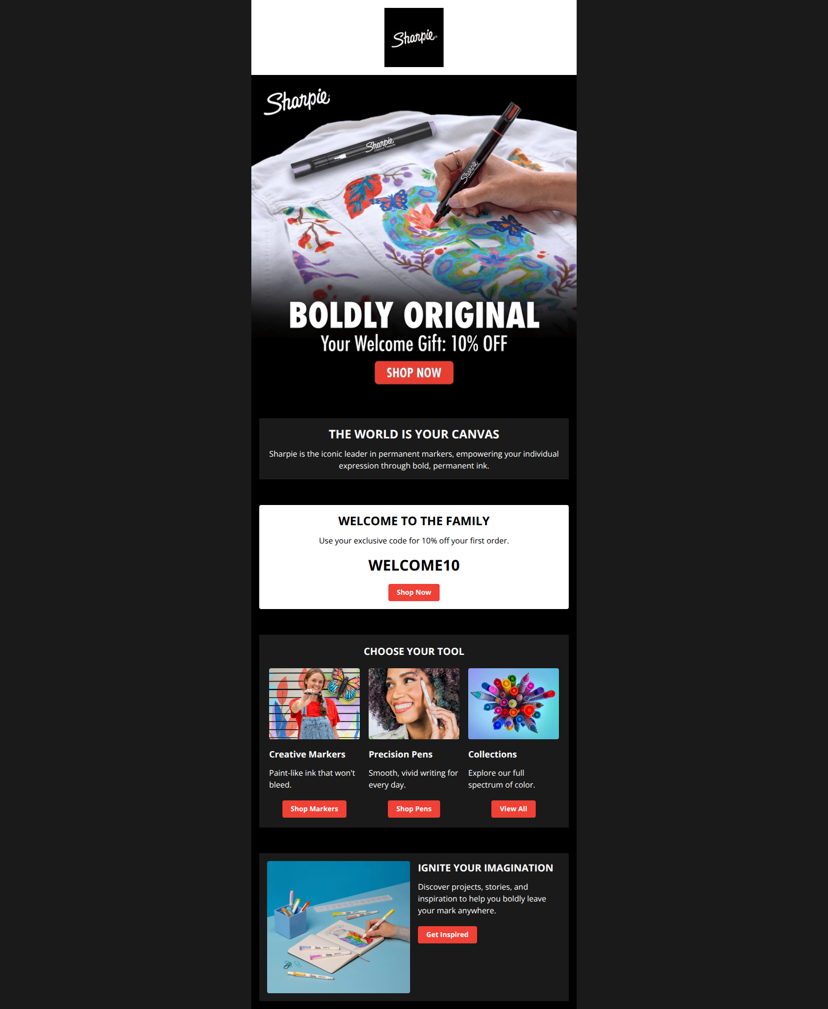
85/100This is a strong, visually striking welcome email that effectively uses high-contrast design to highlight the core offer. The 'spotlight' technique (using a white card on a dark background) for the discount code is excellent. However, the narrative flow is interrupted by a generic brand statement between the hero and the redemption details, adding unnecessary friction to the primary conversion goal.
Create Your Own
Generate professional email designs like this one in seconds with Kopi AI.
Email Details
- Subject Line
- Welcome to Sharpie + Your 10% Off inside
- Brand
- Sharpie
- Industry
- Other
- Email Type
- Welcome
- Created
- January 1, 2026
Brand Colors
Email Copy
THE WORLD IS YOUR CANVAS
Sharpie is the iconic leader in permanent markers, empowering your individual expression through bold, permanent ink.
WELCOME TO THE FAMILY
Use your exclusive code for 10% off your first order.
WELCOME10
→ Shop Now
CHOOSE YOUR TOOL
Creative Markers
Paint-like ink that won't bleed.
→ Shop Markers
Precision Pens
Smooth, vivid writing for every day.
→ Shop Pens
Collections
Explore our full spectrum of color.
→ View All
IGNITE YOUR IMAGINATION
Discover projects, stories, and inspiration to help you boldly leave your mark anywhere.
→ Get Inspired
Why This Email Works
This is a strong, visually striking welcome email that effectively uses high-contrast design to highlight the core offer. The 'spotlight' technique (using a white card on a dark background) for the discount code is excellent. However, the narrative flow is interrupted by a generic brand statement between the hero and the redemption details, adding unnecessary friction to the primary conversion goal.
Hero Impact
90/100- High-quality lifestyle imagery that demonstrates product capability (drawing on denim).
- Offer (10% Off) is stated clearly in the top visual area.
Content Structure & Flow
80/100- Logical progression from Offer → Products → Inspiration.
- Clear demarcation between sections using background color changes.
Visual Hierarchy & Layout
95/100- Excellent 'Spotlight' effect: The white background for the code section instantly grabs attention.
- Clean 3-column grid that doesn't feel cluttered due to ample padding.
Call-to-Action Strength
85/100- Primary brand color (Red) is used consistently for interactive elements.
- Button shapes are consistent and look clickable.
Message Clarity & Tone
90/100- The headline 'Welcome to the Family' strikes a warm, community-focused tone.
- Product descriptions in the grid (e.g., 'Paint-like ink that won't bleed') are excellent—concise and benefit-led.
Readability & Scannability
95/100- Short, punchy paragraphs.
- High contrast ratios throughout ensure accessibility for most users.
Offer & Value Proposition
85/100- The code 'WELCOME10' is large, bold, and easy to copy.
- The offer is the first thing the user sees in the hero.
Personalization & Audience Fit
60/100- The content generally fits the broad 'Creator' audience well.
Quick Wins
- Move the white 'Welcome to the Family' section immediately below the Hero image to reduce friction.
- Change the Hero CTA text from 'Shop Now' to 'Claim My Gift'.
- Add a 'Copy Code' functionality or simply make the text selectable (if image-based) to ensure mobile users can easily grab the code.
- Edit the 'World is Your Canvas' text to be 50% shorter so it acts as a bridge, not a barrier.




Create Professional Email Designs
Generate beautiful, on-brand email designs in seconds. Just enter your brand URL and let AI do the rest.