Kids & Baby Welcome Email Template
“Welcome to Selfarama! Enjoy 15% off your first boo”
Design Score
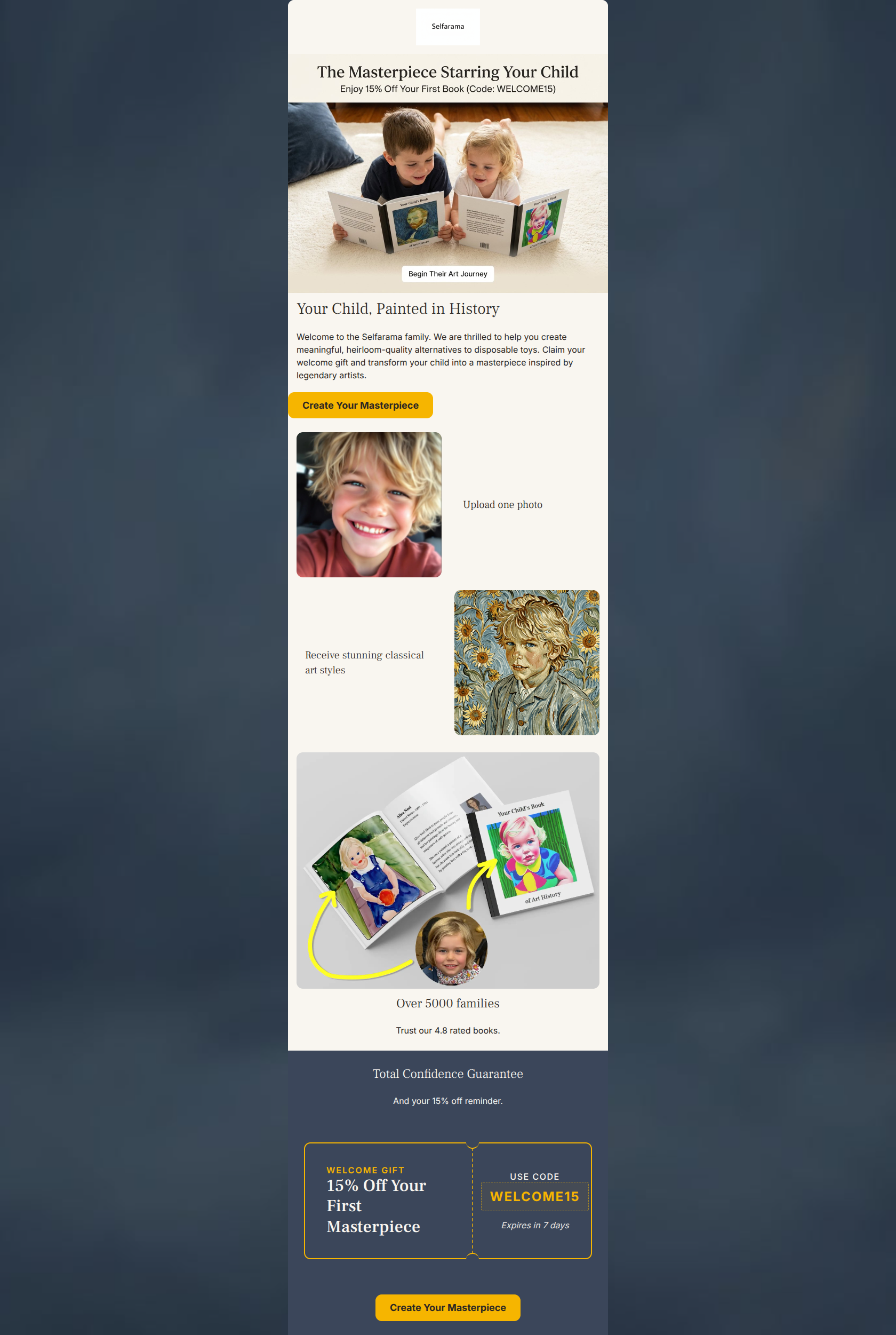
83/100Executive Summary: This email functions as a strong, visually appealing introduction to the Selfarama brand, effectively communicating the unique value proposition with excellent scannability. Its biggest strength is the frictionless 'how it works' visual sequence, while its biggest weakness is a disjointed hero section with a low-contrast primary CTA. Color & Contrast Notes: The brand's color palette is used cohesively, heavily leaning on the cream background to create a premium, editorial feel. The dark slate blue footer anchors the email beautifully. However, the first CTA ('Begin Their Art Journey') is a white/pale pill over a light image, causing it to fail the squint test. The bright yellow (#f6b500) used for the lower CTAs is excellent and should be applied to the top CTA for immediate visual hierarchy.
Create Your Own
Generate professional email designs like this one in seconds with Kopi AI.
Email Details
- Subject Line
- Welcome to Selfarama! Enjoy 15% off your first boo
- Brand
- Selfarama
- Industry
- Kids & Baby
- Email Type
- Welcome
- Created
- March 7, 2026
Brand Colors
Email Copy
Your Child, Painted in History
Welcome to the Selfarama family. We are thrilled to help you create meaningful, heirloom-quality alternatives to disposable toys. Claim your welcome gift and transform your child into a masterpiece inspired by legendary artists.
→ Create Your Masterpiece
Upload one photo
Receive stunning classical art styles
Over 5000 families
Trust our 4.8 rated books.
Total Confidence Guarantee
And your 15% off reminder.
→ Create Your Masterpiece
Why This Email Works
Executive Summary: This email functions as a strong, visually appealing introduction to the Selfarama brand, effectively communicating the unique value proposition with excellent scannability. Its biggest strength is the frictionless 'how it works' visual sequence, while its biggest weakness is a disjointed hero section with a low-contrast primary CTA. Color & Contrast Notes: The brand's color palette is used cohesively, heavily leaning on the cream background to create a premium, editorial feel. The dark slate blue footer anchors the email beautifully. However, the first CTA ('Begin Their Art Journey') is a white/pale pill over a light image, causing it to fail the squint test. The bright yellow (#f6b500) used for the lower CTAs is excellent and should be applied to the top CTA for immediate visual hierarchy.
Hero Impact
75/100- The headline 'The Masterpiece Starring Your Child' is inherently benefit-driven and immediately explains the product.
- The hero image effectively shows the product in the hands of the target demographic (joyful children).
Content Structure & Flow
85/100- The transition from the emotional hook to the functional 'how it works' steps is seamless.
- Placing the ticket-style coupon code at the very end rewards scrollers and serves as a strong final conversion hook.
Visual Hierarchy & Layout
78/100- The two-column zig-zag layout for 'Upload one photo' and 'Receive stunning classical art' effectively pulls the reader down the page.
- The color blocking at the bottom (transitioning to dark slate blue) creates a strong visual anchor for the final offer.
Call-to-Action Strength
82/100- 'Create Your Masterpiece' is a highly specific, emotional, and brand-aligned CTA that out-performs generic 'Shop Now' copy.
- The bright yellow buttons on the cream and dark blue backgrounds provide excellent contrast.
Message Clarity & Tone
88/100- The use of 'heirloom-quality alternatives to disposable toys' explicitly addresses the primary pain point of the target audience.
- The tone feels like a knowledgeable, warm curator guiding the customer.
Readability & Scannability
90/100- The 'how it works' section is executed flawlessly with minimal text and high-impact before/after imagery.
- Font sizes and line heights are generous, making skimming effortless.
Offer & Value Proposition
85/100- The museum-ticket style graphic for the promo code is brilliant—it elevates a standard discount into a brand-building visual asset.
- The explicit callout of 'Expires in 7 days' introduces necessary urgency.
Personalization & Audience Fit
92/100- Showing a modern, everyday photo of a child transforming into classical art perfectly illustrates the magic of the product to parents.
- The inclusion of a Trustpilot rating (4.8) immediately builds trust with an audience that cares deeply about quality.
Quick Wins
- Change the hero 'Begin Their Art Journey' button background to #f6b500 for immediate visibility.
- Center-align the 'Your Child, Painted in History' section to create a cohesive center-aligned reading path down the top half of the email.
- Add a brief one-sentence explanation under 'Total Confidence Guarantee' (e.g., 'If you don't love it, we'll reprint it for free').




Create Professional Email Designs
Generate beautiful, on-brand email designs in seconds. Just enter your brand URL and let AI do the rest.