Kids & Baby Welcome Email Template
“Welcome to Selfarama! Enjoy 10% off your first boo”
Design Score
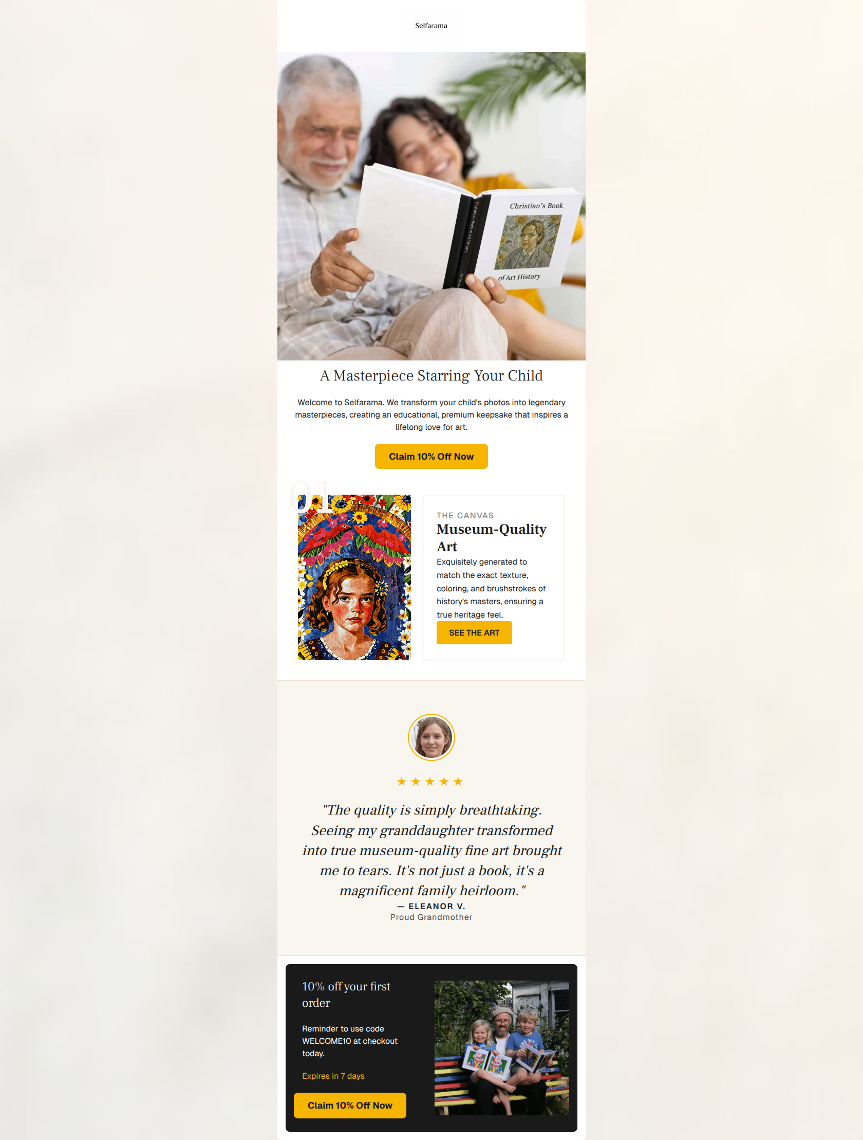
83/100This is a strong welcome email that effectively communicates the brand's premium, heartfelt value proposition while driving a clear 10% off offer. Its biggest strength is the compelling, audience-aligned imagery and copy, while its main weakness lies in minor visual inconsistencies like the unexplained '01' graphic and buried promo code. Color and Contrast Notes: The palette is highly cohesive. The #F6B500 (yellow/gold) acts as an excellent accent color that draws the eye directly to the CTAs and the 5-star rating. Contrast is strong throughout, particularly with the final dark card (#1A1A1A) which makes the yellow button pop effectively.
Create Your Own
Generate professional email designs like this one in seconds with Kopi AI.
Email Details
- Subject Line
- Welcome to Selfarama! Enjoy 10% off your first boo
- Brand
- Selfarama
- Industry
- Kids & Baby
- Email Type
- Welcome
- Created
- March 7, 2026
Brand Colors
Email Copy
A Masterpiece Starring Your Child
Welcome to Selfarama. We transform your child's photos into legendary masterpieces, creating an educational, premium keepsake that inspires a lifelong love for art.
→ Claim 10% Off Now
10% off your first order
Reminder to use code WELCOME10 at checkout today.
Expires in 7 days
→ Claim 10% Off Now
Why This Email Works
This is a strong welcome email that effectively communicates the brand's premium, heartfelt value proposition while driving a clear 10% off offer. Its biggest strength is the compelling, audience-aligned imagery and copy, while its main weakness lies in minor visual inconsistencies like the unexplained '01' graphic and buried promo code. Color and Contrast Notes: The palette is highly cohesive. The #F6B500 (yellow/gold) acts as an excellent accent color that draws the eye directly to the CTAs and the 5-star rating. Contrast is strong throughout, particularly with the final dark card (#1A1A1A) which makes the yellow button pop effectively.
Hero Impact
85/100- Headline is benefit-driven and immediately establishes the core product ('A Masterpiece Starring Your Child').
- Hero image clearly depicts the target audience (grandparent and child) engaging with the physical product.
Content Structure & Flow
80/100- Clear progression from value proposition (hero) to feature detail (museum quality) to social proof (testimonial).
- The final dark card creates a strong visual anchor and a definitive end point for the email flow.
Visual Hierarchy & Layout
75/100- The dark footer card effectively breaks up the layout and draws attention to the final urgency reminder.
- Image-to-text ratios are balanced, preventing the email from feeling overwhelming.
Call-to-Action Strength
82/100- The yellow buttons contrast beautifully against both the white and dark backgrounds, passing the squint test easily.
- The copy 'Claim 10% Off Now' is specific, action-oriented, and emphasizes the benefit.
Message Clarity & Tone
88/100- The concept of 'museum-quality art' and 'legendary masterpieces' elevates the product above standard personalized books.
- The copy remains you-centric, focusing on the child and the family's legacy.
Readability & Scannability
85/100- Font choices (serif for headers, sans-serif for body) reinforce the premium brand feel while remaining highly readable.
- Paragraphs are kept short and punchy, ideal for skimming.
Offer & Value Proposition
80/100- The 'Expires in 7 days' text adds effective, concrete urgency to the welcome offer.
- The value proposition of a non-disposable, premium keepsake is strongly articulated throughout the copy.
Personalization & Audience Fit
90/100- The inclusion of a testimonial specifically from a 'Proud Grandmother' directly speaks to a primary buyer persona.
- Imagery features intergenerational bonding, perfectly aligning with the brand's 'legacy gift' positioning.
Quick Wins
- Remove the floating '01' graphic from the middle section as it implies a list that doesn't exist.
- Update the 'See The Art' button to have rounded corners matching the main CTAs for visual consistency.
- Bold the promo code 'WELCOME10' in the bottom card text to make it instantly scannable.




Create Professional Email Designs
Generate beautiful, on-brand email designs in seconds. Just enter your brand URL and let AI do the rest.