Beauty & Skincare Welcome Email Template
“Welcome to relief — 15% off your first order”
Design Score
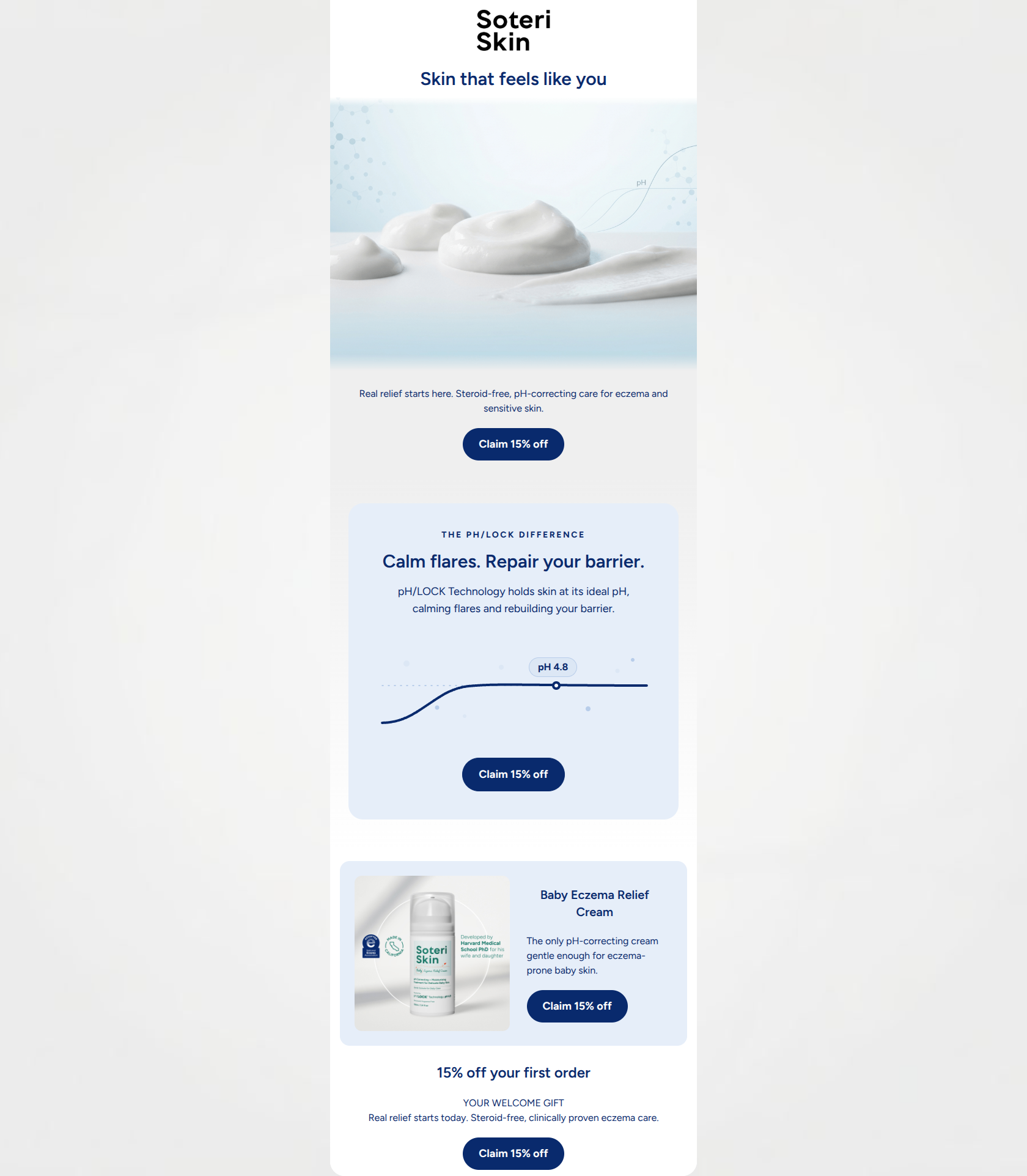
81/100This welcome email effectively establishes Soteri Skin's clinical yet empathetic brand identity, utilizing a clean layout and a perfectly executed, repetitive CTA strategy. However, it leaves conversions on the table by hiding the primary CTA below a large hero image, featuring a highly specific product (baby cream) in a general welcome flow, and failing to provide a strong visual anchor at the bottom of the email. Addressing these structural and targeting issues will elevate this from a good email to a highly converting one.
Create Your Own
Generate professional email designs like this one in seconds with Kopi AI.
Email Details
- Subject Line
- Welcome to relief — 15% off your first order
- Brand
- Soteri Skin
- Industry
- Beauty & Skincare
- Email Type
- Welcome
- Created
- July 10, 2026
Brand Colors
Email Copy
Preview text: Discover the pH-balancing science behind steroid-free eczema relief. Enjoy 15% off your first order.
Skin that feels like you
Real relief starts here. Steroid-free, pH-correcting care for eczema and sensitive skin.
→ Claim 15% off
Baby Eczema Relief Cream
The only pH-correcting cream gentle enough for eczema-prone baby skin.
→ Claim 15% off
15% off your first order
YOUR WELCOME GIFT Real relief starts today. Steroid-free, clinically proven eczema care.
→ Claim 15% off
Why This Email Works
This welcome email effectively establishes Soteri Skin's clinical yet empathetic brand identity, utilizing a clean layout and a perfectly executed, repetitive CTA strategy. However, it leaves conversions on the table by hiding the primary CTA below a large hero image, featuring a highly specific product (baby cream) in a general welcome flow, and failing to provide a strong visual anchor at the bottom of the email. Addressing these structural and targeting issues will elevate this from a good email to a highly converting one.
Hero Impact
75/100- Emotionally resonant H1 that speaks to the user's desire for normalcy.
- Hero image successfully bridges tactile skincare with scientific authority.
Content Structure & Flow
82/100- Logical progression from brand introduction to scientific proof to product application.
- Distinct visual bands effectively separate the different stages of the narrative.
Visual Hierarchy & Layout
78/100- Excellent use of generous whitespace to reduce cognitive load.
- The pH/LOCK diagram card is visually distinct and effectively highlights the core differentiator.
Call-to-Action Strength
98/100- Flawless consistency in CTA copy across all buttons.
- Excellent color contrast (navy on white/light blue) ensures buttons pass the squint test.
Message Clarity & Tone
88/100- Tone perfectly matches the brand's positioning as a trusted, scientific authority.
- Clear, jargon-free explanation of the proprietary pH/LOCK technology.
Readability & Scannability
80/100- Exceptional text-to-background color contrast.
- Bite-sized copy blocks prevent reading fatigue.
Offer & Value Proposition
82/100- Offer is front-and-center in every CTA.
- Core value proposition (steroid-free relief) is clearly communicated in the opening text.
Personalization & Audience Fit
70/100- Directly addresses the audience's primary desires: calming flares and rebuilding the skin barrier.
Copy Conciseness & Word Economy
78/100- No walls of text; copy is distilled and intentional.
- The science section effectively explains a complex concept in just two sentences.
Quick Wins
- Move the primary subcopy and CTA above the hero image.
- Change the background of the final offer block to deep navy (#092A6D) to create a visual anchor.
- Remove the repetitive 'Real relief starts today' copy from the final block.



Create Professional Email Designs
Generate beautiful, on-brand email designs in seconds. Just enter your brand URL and let AI do the rest.