Beauty & Skincare Welcome Email Template
“Welcome to Rcaliph — your 15% off is inside”
Design Score
89/100This is an exceptionally strong, conversion-focused welcome email that clearly understands its audience and value proposition. It effectively utilizes the inverted pyramid structure, concise copy, and distinct visual blocking to guide the reader toward a single, unified action. The repetition of the primary CTA is perfectly executed. To elevate this from an A- to an A+, the email should reduce friction by introducing the promo code and crucial risk-reversal elements (free shipping, free samples) earlier in the funnel, rather than burying them at the bottom.
Create Your Own
Generate professional email designs like this one in seconds with Kopi AI.
Email Details
- Subject Line
- Welcome to Rcaliph — your 15% off is inside
- Brand
- Rcaliph
- Industry
- Beauty & Skincare
- Email Type
- Welcome
- Created
- May 21, 2026
Brand Colors
Email Copy
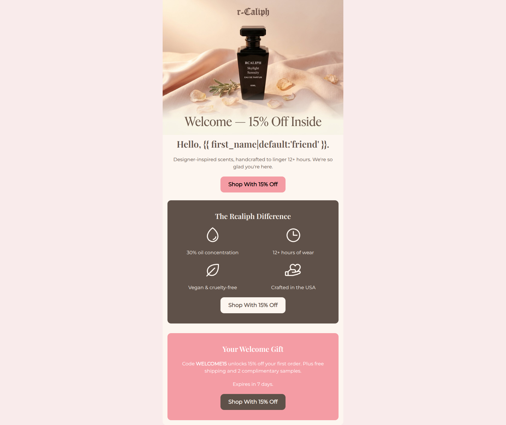
Hello, friend.
Designer-inspired scents, handcrafted to linger 12+ hours. We're so glad you're here.
→ Shop With 15% Off
The Rcaliph Difference
30% oil concentration
12+ hours of wear
Vegan & cruelty-free
Crafted in the USA
→ Shop With 15% Off
Your Welcome Gift
Code WELCOME15 unlocks 15% off your first order. Plus free shipping and 2 complimentary samples.
Expires in 7 days.
→ Shop With 15% Off
Why This Email Works
This is an exceptionally strong, conversion-focused welcome email that clearly understands its audience and value proposition. It effectively utilizes the inverted pyramid structure, concise copy, and distinct visual blocking to guide the reader toward a single, unified action. The repetition of the primary CTA is perfectly executed. To elevate this from an A- to an A+, the email should reduce friction by introducing the promo code and crucial risk-reversal elements (free shipping, free samples) earlier in the funnel, rather than burying them at the bottom.
Hero (top/initial part) Impact
82/100- High-quality, aspirational product photography that matches the brand's visual identity.
- Offer is immediately visible in the hero image text.
- Subcopy efficiently highlights the two most important differentiators: designer-inspired and 12+ hour wear.
Content Structure & Flow
90/100- Logical narrative progression that builds trust before asking for the final sale.
- Excellent use of color blocking to visually separate the 'Why Us' section from the 'Welcome Gift' section.
- No unnecessary sections or filler content; every block serves a distinct purpose.
Visual Hierarchy & Layout
88/100- The icon grid in the middle section is perfectly executed, making the value propositions instantly digestible without reading full sentences.
- Generous padding and margin create a clean, uncluttered layout.
- Consistent and elegant typography usage that aligns with the luxury positioning.
Call-to-Action Strength
96/100- Strict adherence to a single primary goal.
- Excellent repetition of the CTA across different sections of the email.
- The CTA copy is specific and benefit-driven ('Shop With 15% Off') rather than generic ('Shop Now').
Message Clarity & Tone
92/100- Nails the 'accessible luxury' voice—refined but not intimidating.
- Directly addresses key customer pain points (longevity, price, ethics) with absolute clarity.
- Maintains a consistent voice from the headline to the footer.
Readability & Scannability
95/100- Zero walls of text; relies on bullet-style formatting and icons.
- High contrast in the dark brown section makes the white text incredibly readable.
- Centering the text works well here because line lengths are kept very short.
Offer & Value Proposition
88/100- Clear, multi-faceted offer that directly incentivizes a first purchase.
- Explicitly states the product's main competitive advantages (30% oil, 12+ hours).
- Includes a time constraint (7 days) to drive immediate action.
Personalization & Audience Fit
84/100- Highlights cruelty-free and vegan attributes, which are highly relevant to the target demographic.
- Focuses heavily on the '12+ hours' claim, addressing the primary pain point of premium fragrance buyers.
Copy Conciseness & Word Economy
96/100- Value props are delivered in punchy, 3-4 word phrases.
- No redundant sentences or repetitive messaging.
- Gets straight to the point while maintaining a luxurious feel.
Quick Wins
- Change the fallback word in the first name tag from 'friend' to something more elevated, or remove the tag entirely in favor of a strong brand statement.
- Change the first CTA button color to dark brown (#5F5149) so it stands out prominently against the light cream background.
- Add 'Use code WELCOME15' as small text immediately above or below the first CTA button so eager clickers have the code ready.



Create Professional Email Designs
Generate beautiful, on-brand email designs in seconds. Just enter your brand URL and let AI do the rest.