SaaS & Software Welcome Email Template
“Welcome to organized living, beautifully.”
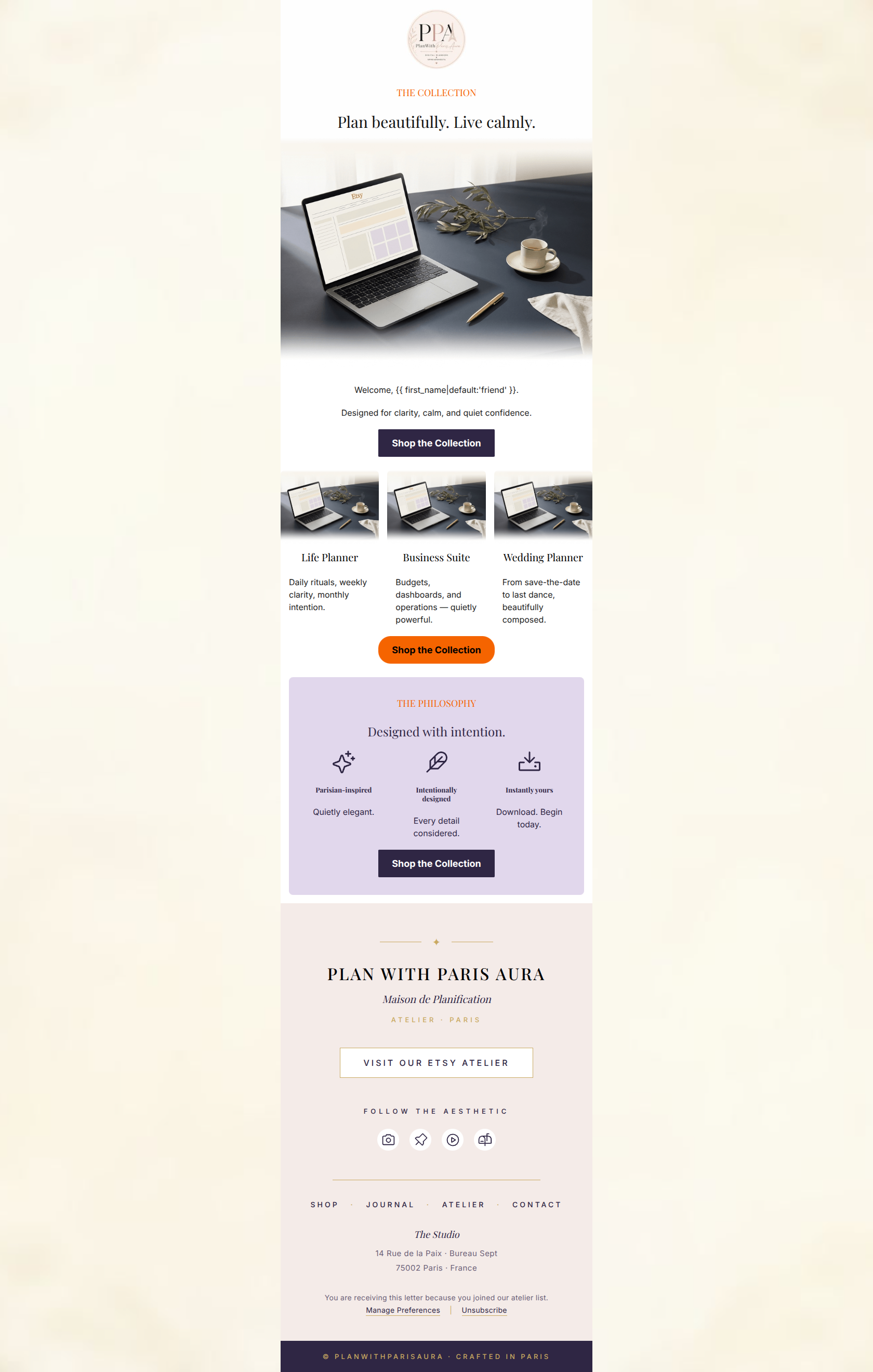
Design Score
82/100This email is a strong, visually cohesive piece that beautifully captures the brand's 'Parisian Simplicity' aesthetic. It feels premium, calm, and aspirational. However, it leans so heavily into its 'quietly elegant' vibe that it slightly neglects direct-response fundamentals. The copy is highly conceptual and lacks a functional grounding of what the products actually are (digital templates), and the email lacks any urgency or specific reason to click today. By grounding the lofty aesthetic with clearer functional benefits and fixing a few visual consistency issues, this can become a high-converting asset.
Create Your Own
Generate professional email designs like this one in seconds with Kopi AI.
Email Details
- Subject Line
- Welcome to organized living, beautifully.
- Brand
- PlanWithParisAura
- Industry
- SaaS & Software
- Email Type
- Welcome
- Created
- June 8, 2026
Brand Colors
Email Copy
THE COLLECTION
Plan beautifully. Live calmly.
Welcome, friend.
Designed for clarity, calm, and quiet confidence.
→ Shop the Collection
Life Planner
Daily rituals, weekly clarity, monthly intention.
Business Suite
Budgets, dashboards, and operations — quietly powerful.
Wedding Planner
From save-the-date to last dance, beautifully composed.
→ Shop the Collection
THE PHILOSOPHY
Designed with intention.
Parisian-inspired
Quietly elegant.
Intentionally designed
Every detail considered.
Instantly yours
Download. Begin today.
→ Shop the Collection
Why This Email Works
This email is a strong, visually cohesive piece that beautifully captures the brand's 'Parisian Simplicity' aesthetic. It feels premium, calm, and aspirational. However, it leans so heavily into its 'quietly elegant' vibe that it slightly neglects direct-response fundamentals. The copy is highly conceptual and lacks a functional grounding of what the products actually are (digital templates), and the email lacks any urgency or specific reason to click today. By grounding the lofty aesthetic with clearer functional benefits and fixing a few visual consistency issues, this can become a high-converting asset.
Hero (top/initial part) Impact
75/100- High-quality, aspirational imagery that perfectly matches the target lifestyle.
- The H1 immediately speaks to the core emotional desire of the target audience (calmness).
Content Structure & Flow
85/100- Clear, linear progression from high-level brand promise to specific product categories.
- Excellent use of the 'Philosophy' section to reinforce value propositions right before the final CTA.
Visual Hierarchy & Layout
78/100- Clean, symmetrical product grid that is easy to digest.
- Great use of a soft background color (#E1D7EC) in the philosophy section to visually separate it from the main shopping block.
Call-to-Action Strength
88/100- Consistent CTA copy that leaves no ambiguity about the destination.
- Strategic placement of CTAs at the top, middle, and bottom of the email.
Message Clarity & Tone
82/100- Tone perfectly matches the desired 'calm and sophisticated' brand persona.
- Avoids cheap, aggressive sales language, maintaining the premium feel.
Readability & Scannability
90/100- Excellent word economy; no massive walls of text to intimidate the reader.
- Strong use of distinct headings to guide the scanning eye down the page.
Offer & Value Proposition
75/100- The core differentiators (Parisian-inspired, instant download) are clearly isolated and easy to read.
Personalization & Audience Fit
82/100- The visual styling speaks directly to the aspirational desires of the target demographic.
- Basic personalization is present and used naturally.
Copy Conciseness & Word Economy
88/100- Zero fluff or throat-clearing in the introductions.
- Product descriptions ('Daily rituals, weekly clarity...') are beautifully distilled.
Quick Wins
- Change the middle 'Shop the Collection' button from orange to the dark purple (#2F2644) used elsewhere to ensure a unified, visually consistent conversion path.
- Add a brief subheadline below the main H1 'Plan beautifully. Live calmly.' that explicitly states you are selling digital templates/spreadsheets.
- Replace the solid orange divider lines with simple white space to maintain the elegant, seamless aesthetic.




Create Professional Email Designs
Generate beautiful, on-brand email designs in seconds. Just enter your brand URL and let AI do the rest.