Finance & Fintech Welcome Email Template
“Welcome to JioBlackRock (Special offer inside)”
Design Score
82/100This is a polished, high-trust email that effectively leverages the brand equity of its parent companies. The visual hierarchy is strong, guiding the eye logically from emotional appeal to technical proof and finally to a hard incentive. However, the hero copy relies on generic fintech platitudes rather than a sharp hook, and the disconnect between the visual offer badge in the header and the actual details at the bottom creates unnecessary friction.
Create Your Own
Generate professional email designs like this one in seconds with Kopi AI.
Email Details
- Subject Line
- Welcome to JioBlackRock (Special offer inside)
- Brand
- JioBlackRock
- Industry
- Finance & Fintech
- Email Type
- Welcome
- Created
- January 28, 2026
Brand Colors
Email Copy
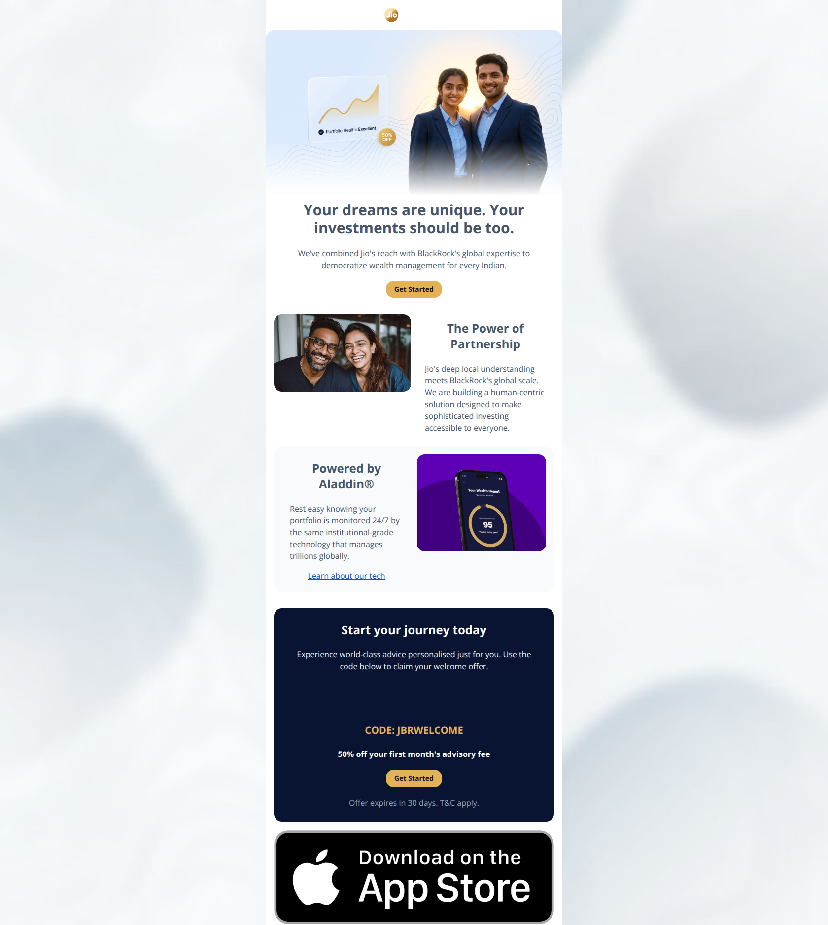
Your dreams are unique. Your investments should be too.
We've combined Jio's reach with BlackRock's global expertise to democratize wealth management for every Indian.
→ Get Started
The Power of Partnership
Jio's deep local understanding meets BlackRock's global scale. We are building a human-centric solution designed to make sophisticated investing accessible to everyone.
Powered by Aladdin®
Rest easy knowing your portfolio is monitored 24/7 by the same institutional-grade technology that manages trillions globally.
Learn about our tech
Start your journey today
Experience world-class advice personalised just for you. Use the code below to claim your welcome offer.
CODE: JBRWELCOME
50% off your first month's advisory fee
→ Get Started
Offer expires in 30 days. T&C apply.
Why This Email Works
This is a polished, high-trust email that effectively leverages the brand equity of its parent companies. The visual hierarchy is strong, guiding the eye logically from emotional appeal to technical proof and finally to a hard incentive. However, the hero copy relies on generic fintech platitudes rather than a sharp hook, and the disconnect between the visual offer badge in the header and the actual details at the bottom creates unnecessary friction.
Hero (top/initial part) Impact
80/100- High-quality imagery that effectively blends human emotion (smiling couple) with product context (graphs).
- Clear brand attribution with the logo (though small) and distinct color palette.
Content Structure & Flow
90/100- Logical progression from 'Why us' to 'How it works' to 'Do this now'.
- Effective use of alternating layouts (Left-Right, Right-Left) to maintain scanning interest.
Visual Hierarchy & Layout
85/100- The dark navy background for the offer section (bottom) creates a perfect 'stop' signal for the reader.
- Good balance of text and imagery; no section feels text-heavy.
Call-to-Action Strength
75/100- The primary brand color (Jio Gold) is reserved for CTAs and key highlights, creating a consistent click path.
- The promo code is clearly presented with high contrast.
Message Clarity & Tone
80/100- The partnership story (Jio + BlackRock) is told succinctly without overwhelming the user with history.
- Tone strikes the right balance between 'accessible' and 'serious'.
Readability & Scannability
90/100- Short paragraphs (2-3 lines max) prevent cognitive fatigue.
- Good contrast on all main text elements.
Offer & Value Proposition
70/100- The offer section is visually distinct, making it impossible to miss if scrolling to the bottom.
- The code 'JBRWELCOME' is easy to remember and implies a special status.
Personalization & Audience Fit
75/100- The 'Unique dreams' angle attempts to acknowledge individual goals, even if the execution is generic.
Quick Wins
- Rename the final CTA from 'Get Started' to 'Claim 50% Off' to increase click urgency.
- Add a sub-headline in the Hero section that explicitly mentions 'Welcome Offer Inside' to match the image badge.
- Reduce the visual size of the App Store badge in the footer so it doesn't overpower the main CTA.
- Change the Hero H1 to something more active/benefit-driven than 'Your dreams are unique.'




Create Professional Email Designs
Generate beautiful, on-brand email designs in seconds. Just enter your brand URL and let AI do the rest.