SaaS & Software Promotional Email Template
“Welcome to Flywheel. Start predicting churn today”

Design Score
74/100This email effectively establishes the brand's 'DevTool Chic' aesthetic and clearly communicates its core value proposition around proactive MRR protection. However, its conversion potential is hampered by overly transactional, repetitive CTAs and an opening paragraph that centers on the brand rather than the customer's needs.
Create Your Own
Generate professional email designs like this one in seconds with Kopi AI.
Email Details
- Subject Line
- Welcome to Flywheel. Start predicting churn today
- Brand
- Flywheel
- Industry
- SaaS & Software
- Email Type
- Promotional
- Created
- February 28, 2026
Brand Colors
Email Copy
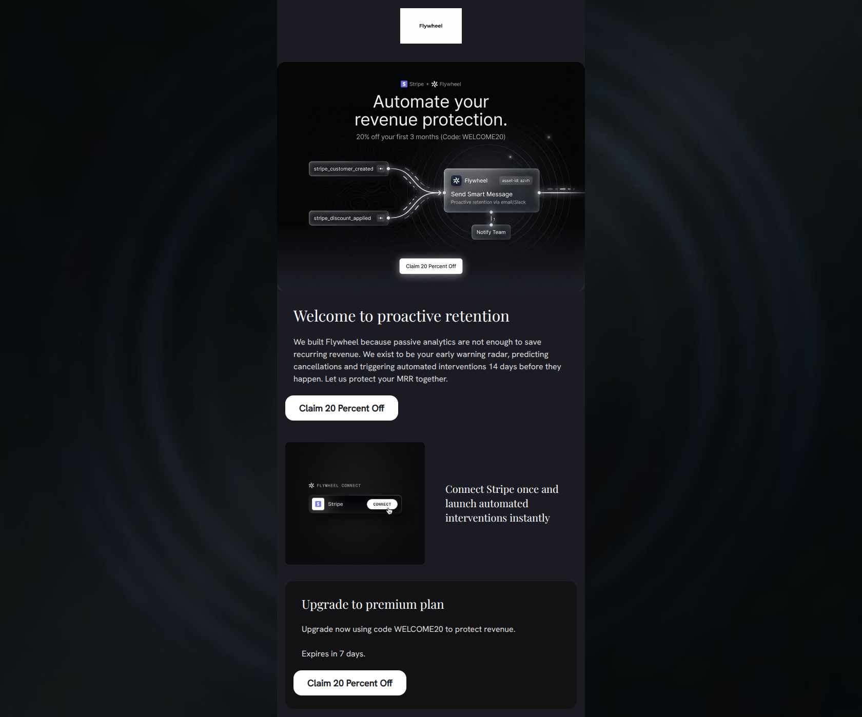
Welcome to proactive retention
We built Flywheel because passive analytics are not enough to save recurring revenue. We exist to be your early warning radar, predicting cancellations and triggering automated interventions 14 days before they happen. Let us protect your MRR together.
→ Claim 20 Percent Off
Connect Stripe once and launch automated interventions instantly
Upgrade to premium plan
Upgrade now using code WELCOME20 to protect revenue. Expires in 7 days.
→ Claim 20 Percent Off
Why This Email Works
This email effectively establishes the brand's 'DevTool Chic' aesthetic and clearly communicates its core value proposition around proactive MRR protection. However, its conversion potential is hampered by overly transactional, repetitive CTAs and an opening paragraph that centers on the brand rather than the customer's needs.
Hero (top/initial part) Impact
75/100- Instantly answers what the product does with the 'Automate your revenue protection' headline inside the image.
- The workflow graphic clearly demonstrates the integration (Stripe -> Flywheel -> Slack/Email).
Content Structure & Flow
80/100- Logical top-to-bottom flow that builds the case for the product before asking for the hard upgrade.
- Clear delineation between the conceptual pitch and the feature highlight (Stripe integration).
Visual Hierarchy & Layout
78/100- Excellent use of contrasting card backgrounds (e.g., #121215 for the final card) to naturally draw the eye down the page.
- The side-by-side alternating layout for the Stripe section breaks up the vertical flow nicely.
Call-to-Action Strength
65/100- High contrast buttons (white on dark background) ensure they are impossible to miss.
Message Clarity & Tone
72/100- Use of specific timelines ('14 days before they happen') adds credibility and clarity to the claim.
- Strong, authoritative industry vocabulary ('passive analytics', 'MRR').
Readability & Scannability
82/100- Effective use of a sub-heading next to the Stripe image to convey a key feature without requiring paragraph reading.
- Generous line height and spacing prevent the dark mode design from feeling claustrophobic.
Offer & Value Proposition
75/100- Clear, explicit promo code provided inline.
- Strong use of urgency ('Expires in 7 days') in the final conversion block.
Personalization & Audience Fit
70/100- The visual language ('DevTool Chic') perfectly matches the expectations of technical founders and PMs.
- Speaks directly to specific pain points of the target audience (passive analytics vs. action).
Quick Wins
- Change the button copy from 'Claim 20 Percent Off' to use the '%' symbol: 'Claim 20% Off'.
- Vary the CTA copy so all three buttons do not say the exact same thing.
- Rewrite the first sentence of the 'Welcome' paragraph to focus on the customer's problem rather than the company's origin ('We built...').
Create Professional Email Designs
Generate beautiful, on-brand email designs in seconds. Just enter your brand URL and let AI do the rest.