Fitness Welcome Email Template
“Welcome to CAP. Let's build.”
Design Score
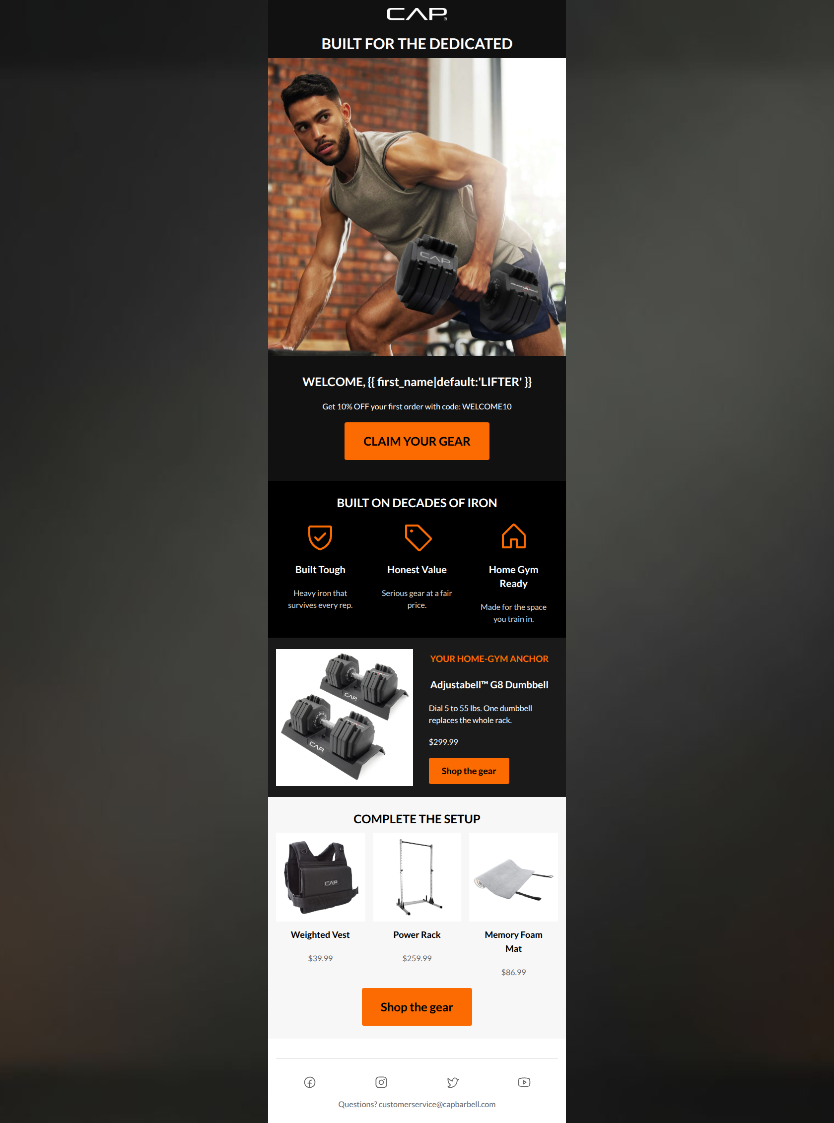
81/100This welcome email establishes a strong, utilitarian brand aesthetic with excellent copy economy and a textbook approach to CTA consistency. The high-contrast palette and direct tone perfectly match CAP Barbell's uncompromising brand positioning. However, it falters at the very top of the funnel: the hero visual features a low-value accessory rather than an aspirational core product, and the lack of a specific welcome incentive limits the email's immediate conversion potential. It is a visually competent email that requires a stronger initial hook to reliably turn new subscribers into buyers.
Create Your Own
Generate professional email designs like this one in seconds with Kopi AI.
Email Details
- Subject Line
- Welcome to CAP. Let's build.
- Brand
- CAP Barbell
- Industry
- Fitness
- Email Type
- Welcome
- Created
- June 19, 2026
Brand Colors
Email Copy
Preview text: Unapologetic iron for the dedicated. Here is your welcome offer.
BUILT FOR THE DEDICATED
WELCOME, LIFTER
Get 10% OFF your first order with code: WELCOME10
→ CLAIM YOUR GEAR
BUILT ON DECADES OF IRON
Built Tough
Heavy iron that survives every rep.
Honest Value
Serious gear at a fair price.
Home Gym Ready
Made for the space you train in.
YOUR HOME-GYM ANCHOR
Adjustabell™ G8 Dumbbell
Dial 5 to 55 lbs. One dumbbell replaces the whole rack.
$299.99
→ Shop the gear
COMPLETE THE SETUP
Weighted Vest
$39.99
Power Rack
$259.99
Memory Foam Mat
$86.99
→ Shop the gear
Questions? customerservice@capbarbell.com
Why This Email Works
This welcome email establishes a strong, utilitarian brand aesthetic with excellent copy economy and a textbook approach to CTA consistency. The high-contrast palette and direct tone perfectly match CAP Barbell's uncompromising brand positioning. However, it falters at the very top of the funnel: the hero visual features a low-value accessory rather than an aspirational core product, and the lack of a specific welcome incentive limits the email's immediate conversion potential. It is a visually competent email that requires a stronger initial hook to reliably turn new subscribers into buyers.
Hero Impact
65/100- Clean initial layout with no distractions.
- Immediately establishes the stark black/white/orange brand color palette.
Content Structure & Flow
75/100- Clear compartmentalization of ideas makes the email easy to parse.
- Logical funnel moving from broad brand introduction down to specific product recommendations.
Visual Hierarchy & Layout
78/100- Excellent use of the high-contrast palette to draw the eye down the page.
- The dark section effectively highlights the brand pillars and breaks up the layout.
Call-to-Action Strength
95/100- Perfect consistency in CTA destination and copy.
- High-contrast orange on white/grey ensures the buttons are unmissable.
- Clear, action-oriented verb choice.
Message Clarity & Tone
85/100- Strong, confident brand voice throughout the body copy.
- Avoids fluffy wellness jargon in favor of direct, utilitarian statements.
Readability & Scannability
88/100- Excellent text contrast across all sections.
- Bulleted/icon layout for brand pillars drastically reduces reading friction.
Offer & Value Proposition
70/100- Clear articulation of specific product benefits ('One dumbbell replaces the whole rack').
- Transparent pricing on featured products reduces hesitation.
Personalization & Audience Fit
80/100- Product curation perfectly matches the 'Home Gym Ready' value proposition.
- Direct, empowering language appeals to the target demographic's mindset.
Copy Conciseness & Word Economy
90/100- Zero filler words or generic openers.
- 'One dumbbell replaces the whole rack' is a perfect example of concise, benefit-driven copywriting.
Quick Wins
- Change the first-name merge tag fallback from 'friend' to a more brand-aligned term like 'Lifter'.
- Replace the puzzle mat product image with a clean photo that does not include illegible, baked-in marketing text.
- Consolidate the H1, hero image, welcome text, and primary button into a single, cohesive container to prevent a disjointed first impression.




Create Professional Email Designs
Generate beautiful, on-brand email designs in seconds. Just enter your brand URL and let AI do the rest.