SaaS & Software Welcome Email Template
“Welcome — scanning that never leaves your phone.”
Design Score
85/100This is a strong, highly focused email that effectively communicates ScanPages' core value proposition: secure, on-device document scanning. The visual hierarchy is generally clear, and the repetition of the primary CTA is excellent for driving conversion. To push this into the 90+ range, minor adjustments are needed to tighten the hero structure, unify text alignment for a smoother scanning path, and refine the tone of the personalization to better align with the brand's 'secure and professional' persona.
Create Your Own
Generate professional email designs like this one in seconds with Kopi AI.
Email Details
- Subject Line
- Welcome — scanning that never leaves your phone.
- Brand
- ScanPages
- Industry
- SaaS & Software
- Email Type
- Welcome
- Created
- June 15, 2026
Brand Colors
Email Copy
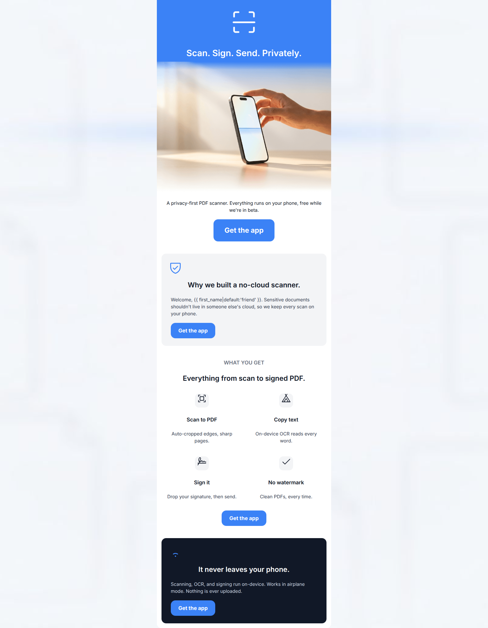
Preview text: Scan, sign, and send sensitive documents — all on your phone, nothing uploaded. Free while we're in beta.
Scan. Sign. Send. Privately.
A privacy-first PDF scanner. Everything runs on your phone, free while we're in beta.
→ Get the app
Why we built a no-cloud scanner.
Welcome, friend. Sensitive documents shouldn't live in someone else's cloud, so we keep every scan on your phone.
→ Get the app
WHAT YOU GET
Everything from scan to signed PDF.
Scan to PDF
Auto-cropped edges, sharp pages.
Copy text
On-device OCR reads every word.
Sign it
Drop your signature, then send.
No watermark
Clean PDFs, every time.
→ Get the app
It never leaves your phone.
Scanning, OCR, and signing run on-device. Works in airplane mode. Nothing is ever uploaded.
→ Get the app
Why This Email Works
This is a strong, highly focused email that effectively communicates ScanPages' core value proposition: secure, on-device document scanning. The visual hierarchy is generally clear, and the repetition of the primary CTA is excellent for driving conversion. To push this into the 90+ range, minor adjustments are needed to tighten the hero structure, unify text alignment for a smoother scanning path, and refine the tone of the personalization to better align with the brand's 'secure and professional' persona.
Hero Impact
85/100- Punchy, action-oriented headline ('Scan. Sign. Send. Privately.').
- High-quality product image that immediately provides context.
- Clear color contrast in the top block draws the eye.
Content Structure & Flow
82/100- Excellent use of the inverted pyramid strategy.
- Logical grouping of features in a scannable grid.
- Strong closing section that reinforces the main selling point.
Visual Hierarchy & Layout
78/100- Good use of contrasting background colors (white, light grey, dark slate) to separate distinct sections.
- The 2x2 icon grid is highly digestible.
- Icons are sized appropriately and support the copy well.
Call-to-Action Strength
95/100- Consistent button copy across all CTAs.
- All buttons point to the exact same href, reducing cognitive friction.
- High-contrast brand blue ensures the buttons stand out clearly against all background colors used.
Message Clarity & Tone
85/100- Directly calls out the competitor flaw ('someone else's cloud').
- Clear, benefit-driven subheads ('Scan to PDF in seconds').
- Reassuring closing message ('Nothing is ever uploaded').
Readability & Scannability
88/100- Excellent use of icons to anchor text blocks.
- Short paragraph lengths prevent walls of text.
- Clear typographical hierarchy between H2s, H4s, and body copy.
Offer & Value Proposition
85/100- Focuses heavily on the 'why' (privacy) rather than just the 'what' (scanning).
- Clearly states the price (free in beta) upfront.
Personalization & Audience Fit
80/100- Uses language that appeals directly to the audience's fears ('someone else's cloud').
- Highlights features specific to their use case ('Works in airplane mode').
Copy Conciseness & Word Economy
90/100- No filler adjectives or throat-clearing sentences.
- Feature descriptions are distilled to their core benefits.
- Strong, action-oriented verbs.
Quick Wins
- Move the subheadline 'A privacy-first PDF scanner...' immediately below the H1 in the blue hero section.
- Change the fallback text 'friend' in the dynamic greeting to something more professional, or remove the greeting entirely.
- Remove the 'WHAT YOU GET' pre-header to tighten the transition into the features grid.
- Unify text alignment across all modules (either all center-aligned or all left-aligned) to create a cleaner scrolling path.




Create Professional Email Designs
Generate beautiful, on-brand email designs in seconds. Just enter your brand URL and let AI do the rest.