Beauty & Skincare Welcome Email Template
“Welcome in — here's 15% off”
Design Score
86/100This is a strong, highly effective welcome email that clearly communicates the brand's core value propositions and offer. The layout is incredibly scannable, utilizing iconography and brief copy to minimize cognitive load. The primary CTA is consistent and clear. The main area for improvement is optimizing the hero section's copy to lead with a stronger value hook rather than a generic greeting.
Create Your Own
Generate professional email designs like this one in seconds with Kopi AI.
Email Details
- Subject Line
- Welcome in — here's 15% off
- Brand
- Rcaliph
- Industry
- Beauty & Skincare
- Email Type
- Welcome
- Created
- May 21, 2026
Brand Colors
Email Copy
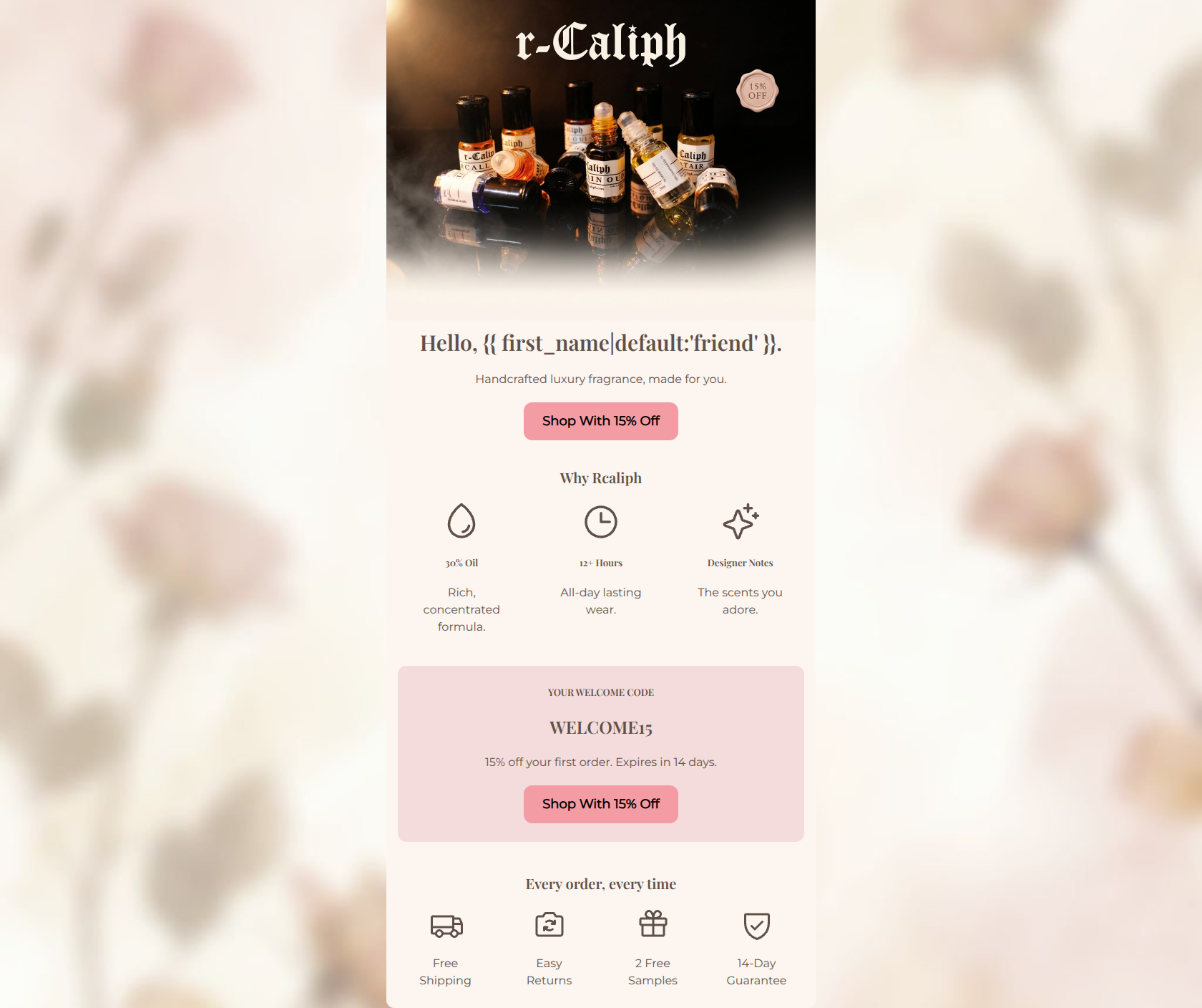
Hello, friend.
Handcrafted luxury fragrance, made for you.
→ Shop With 15% Off
Why Rcaliph
30% Oil
Rich, concentrated formula.
12+ Hours
All-day lasting wear.
Designer Notes
The scents you adore.
YOUR WELCOME CODE
WELCOME15
15% off your first order. Expires in 14 days.
→ Shop With 15% Off
Every order, every time
Free Shipping
Easy Returns
2 Free Samples
14-Day Guarantee
Why This Email Works
This is a strong, highly effective welcome email that clearly communicates the brand's core value propositions and offer. The layout is incredibly scannable, utilizing iconography and brief copy to minimize cognitive load. The primary CTA is consistent and clear. The main area for improvement is optimizing the hero section's copy to lead with a stronger value hook rather than a generic greeting.
1. Hero (top/initial part) Impact
70/100- High-quality hero image that immediately showcases the product.
- Clear, visible 15% off badge on the image.
2. Content Structure & Flow
85/100- Logical progression of information.
- Excellent bookending with trust signals at the bottom.
3. Visual Hierarchy & Layout
88/100- Strategic use of background colors to highlight the main offer.
- Clean, balanced grid structures for icons.
4. Call-to-Action Strength
95/100- Consistent button copy that clearly sets expectations.
- Repetition of the primary goal.
- No competing secondary actions distracting from the main goal.
5. Message Clarity & Tone
85/100- Tone aligns perfectly with accessible luxury.
- Clear translation of technical specs into tangible benefits.
6. Readability & Scannability
92/100- Excellent use of icons to break up text.
- Bite-sized copy blocks.
7. Offer & Value Proposition
95/100- Comprehensive presentation of all trust signals and perks.
- Clear, prominent discount code.
8. Personalization & Audience Fit
85/100- Messaging directly targets the core audience's pain points (longevity, price).
- Use of dynamic tags.
9. Copy Conciseness & Word Economy
92/100- Zero filler words.
- Highly distilled messaging.
Quick Wins
- Change the hero headline from 'Hello, {{ first_name }}.' to a stronger value proposition like 'Welcome to Accessible Luxury.'
- Change the 'Designer Notes' heading to 'Designer Inspired' for immediate clarity.



Create Professional Email Designs
Generate beautiful, on-brand email designs in seconds. Just enter your brand URL and let AI do the rest.