Food & Beverage Promotional Email Template
“Vrijdag, op het nippertje gered 🍊”
Design Score
84/100This is a strong, conversion-focused promotional email that effectively leverages a narrative structure to build value before revealing a highly compelling price anchor. The strict adherence to a single, repeated CTA is a masterclass in driving focused action. However, the email is held back from an elite score by a glaring product-image mismatch in the third section, minor visual alignment inconsistencies, and redundant copy in the opening sections.
Create Your Own
Generate professional email designs like this one in seconds with Kopi AI.
Email Details
- Subject Line
- Vrijdag, op het nippertje gered 🍊
- Brand
- Veggiebox
- Industry
- Food & Beverage
- Email Type
- Promotional
- Created
- May 19, 2026
Brand Colors
Email Copy
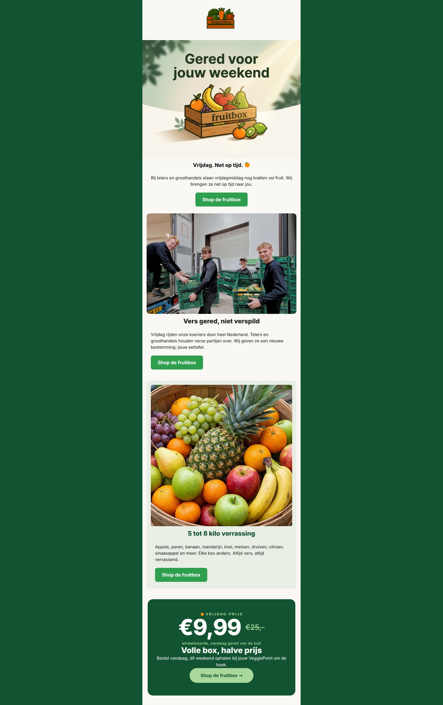
Vrijdag. Net op tijd. 🍊
Bij telers en groothandels staan vrijdagmiddag nog kratten vol fruit. Wij brengen ze net op tijd naar jou.
→ Shop de fruitbox
Vers gered, niet verspild
Vrijdag rijden onze koeriers door heel Nederland. Telers en groothandels houden verse partijen over. Wij geven ze een nieuwe bestemming: jouw eettafel.
→ Shop de fruitbox
5 tot 8 kilo verrassing
Appels, peren, banaan, mandarijn, kiwi, meloen, druiven, citroen, sinaasappel en meer. Elke box anders. Altijd vers, altijd verrassend.
→ Shop de fruitbox
Why This Email Works
This is a strong, conversion-focused promotional email that effectively leverages a narrative structure to build value before revealing a highly compelling price anchor. The strict adherence to a single, repeated CTA is a masterclass in driving focused action. However, the email is held back from an elite score by a glaring product-image mismatch in the third section, minor visual alignment inconsistencies, and redundant copy in the opening sections.
Hero (top/initial part) Impact
85/100- Immediate establishment of the 'weekend rescue' premise.
- Clear, high-contrast primary CTA above the fold.
Content Structure & Flow
90/100- Logical progression that builds desire before asking for the sale based on price.
- The final promo card acts as a strong visual anchor and definitive closing argument.
Visual Hierarchy & Layout
68/100- Good use of distinct background colors (white, pale green, dark green) to separate conceptual sections.
- The final dark green card creates excellent visual contrast to draw the eye to the final offer.
Call-to-Action Strength
95/100- Zero ambiguity about what the user is supposed to do.
- Excellent repetition creates multiple conversion opportunities as the user scrolls.
- The final button in 'leaf green' on the dark background passes the squint test perfectly.
Message Clarity & Tone
92/100- Authentic translation of the brand's 'Samen tegen voedselverspilling' mission into promotional copy.
- Tone is energetic and community-focused ('jouw eettafel').
Readability & Scannability
88/100- Short, punchy paragraphs.
- Strong typographic hierarchy between headings and body text.
Offer & Value Proposition
96/100- Strong price anchoring (€25 strikethrough).
- Clear quantification of the value (5 tot 8 kilo).
Personalization & Audience Fit
85/100- Highly relevant timing (Friday rescue for the weekend).
- Aligns perfectly with the audience's desire to save money while acting sustainably.
Copy Conciseness & Word Economy
70/100- No fluffy adjectives or 'throat-clearing' introductory phrases.
- Direct, action-oriented language.
Quick Wins
- Swap the image in the '5 tot 8 kilo verrassing' section to actually show fruit instead of vegetables to prevent cognitive dissonance.
- Unify text and button alignments in sections 2 and 3 so they visually match their centered headings.
- Edit the body copy in section 2 so it doesn't repeat the exact same 'growers have leftovers' premise already established in the hero.


Create Professional Email Designs
Generate beautiful, on-brand email designs in seconds. Just enter your brand URL and let AI do the rest.