Health & Wellness Product Launch Email Template
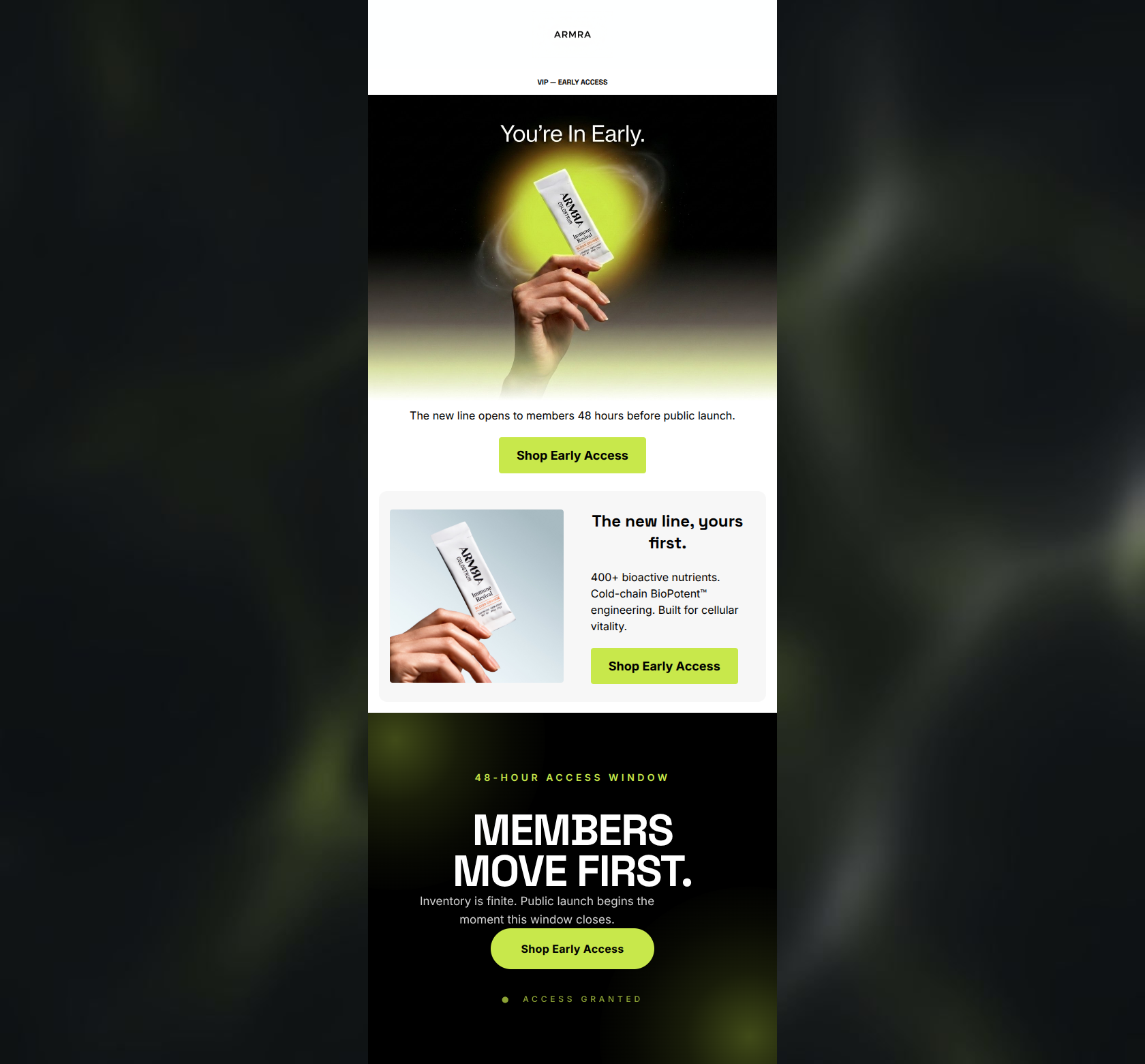
“VIPs first: early access is open.”
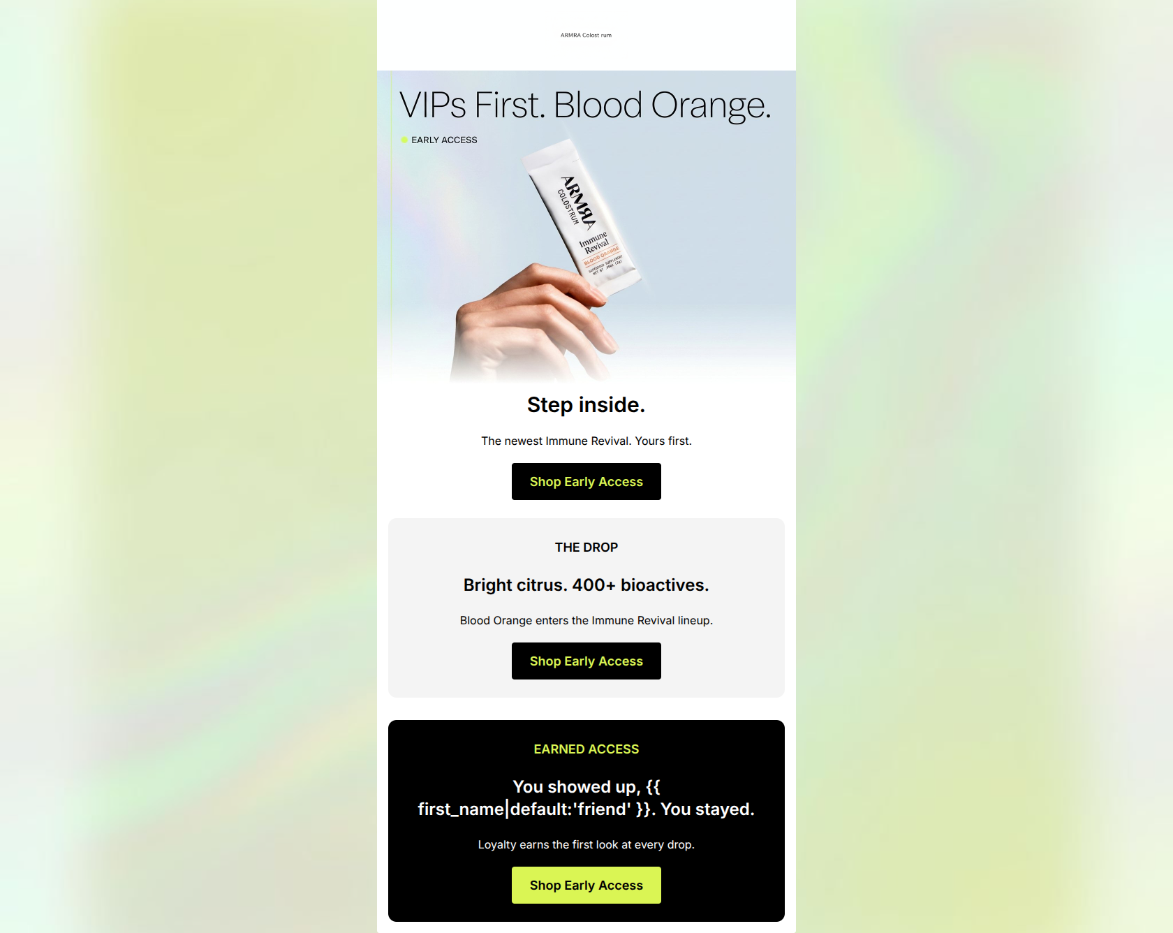
Design Score
81/100This email effectively leverages an exclusive 'VIP' angle to launch a new product flavor, utilizing the brand's distinct bio-tech aesthetic and high-contrast color palette. The execution is highly scannable and adheres strictly to best practices for Call-to-Action clarity and repetition. However, the copy leans too heavily on abstract, melodramatic phrasing ('Step inside', 'You showed up... You stayed') rather than concrete value propositions or sensory descriptions of the new flavor. While visually striking, the email's structure feels slightly fragmented due to three very short, distinct blocks stacked closely together.
Create Your Own
Generate professional email designs like this one in seconds with Kopi AI.
Email Details
- Subject Line
- VIPs first: early access is open.
- Brand
- ARMRA [eval-prod 2026-06-04]
- Industry
- Health & Wellness
- Email Type
- Product Launch
- Created
- June 4, 2026
Brand Colors
Email Copy
Preview text: Before the world sees it, you do. Step inside the new line.
Step inside.
The newest Immune Revival. Yours first.
→ Shop Early Access
THE DROP
Bright citrus. 400+ bioactives.
Blood Orange enters the Immune Revival lineup.
→ Shop Early Access
EARNED ACCESS
You showed up, friend. You stayed.
Loyalty earns the first look at every drop.
→ Shop Early Access
Why This Email Works
This email effectively leverages an exclusive 'VIP' angle to launch a new product flavor, utilizing the brand's distinct bio-tech aesthetic and high-contrast color palette. The execution is highly scannable and adheres strictly to best practices for Call-to-Action clarity and repetition. However, the copy leans too heavily on abstract, melodramatic phrasing ('Step inside', 'You showed up... You stayed') rather than concrete value propositions or sensory descriptions of the new flavor. While visually striking, the email's structure feels slightly fragmented due to three very short, distinct blocks stacked closely together.
Hero (top/initial part) Impact
75/100- The hero image is high-quality, features the product prominently, and establishes the 'VIP' context immediately.
- The CTA is placed high up, minimizing the need to scroll for the primary action.
Content Structure & Flow
78/100- The logical progression from 'What it is' to 'Why you are getting it' makes sense sequentially.
- The use of alternating background colors (White, Light Gray, Black) clearly delineates the sections.
Visual Hierarchy & Layout
85/100- Excellent use of high-contrast brand colors to make key elements pop.
- Ample white space (and negative space in the black block) prevents the email from feeling cluttered.
Call-to-Action Strength
98/100- Unwavering focus on a single primary destination.
- High-contrast button styling (chartreuse text on black, black text on chartreuse) guarantees visibility.
- Consistent button copy reinforces the action at every scroll depth.
Message Clarity & Tone
72/100- The overarching theme of exclusivity is maintained throughout the email.
- The inclusion of '400+ bioactives' anchors the message back to the brand's scientific credibility.
Readability & Scannability
92/100- Zero dense paragraphs; completely avoids the 'wall of text' problem.
- High-contrast text pairings ensure legibility across all sections.
Offer & Value Proposition
76/100- The early access perk is a strong, proven driver for click-through rates among loyal segments.
- Briefly reminds the user of the core '400+ bioactives' differentiator.
Personalization & Audience Fit
85/100- Highly targeted messaging that rewards customer loyalty.
- The 'VIPs First' angle aligns perfectly with the brand's premium positioning.
Copy Conciseness & Word Economy
88/100- Gets straight to the point.
- Every text block is short enough to hold attention.
Quick Wins
- Change the H1 'Step inside.' to something more descriptive like 'Your Early Access: Blood Orange.'
- Revise the melodramatic 'You showed up... You stayed.' copy to a more professional acknowledgment of loyalty.
Create Professional Email Designs
Generate beautiful, on-brand email designs in seconds. Just enter your brand URL and let AI do the rest.