Automotive Promotional Email Template
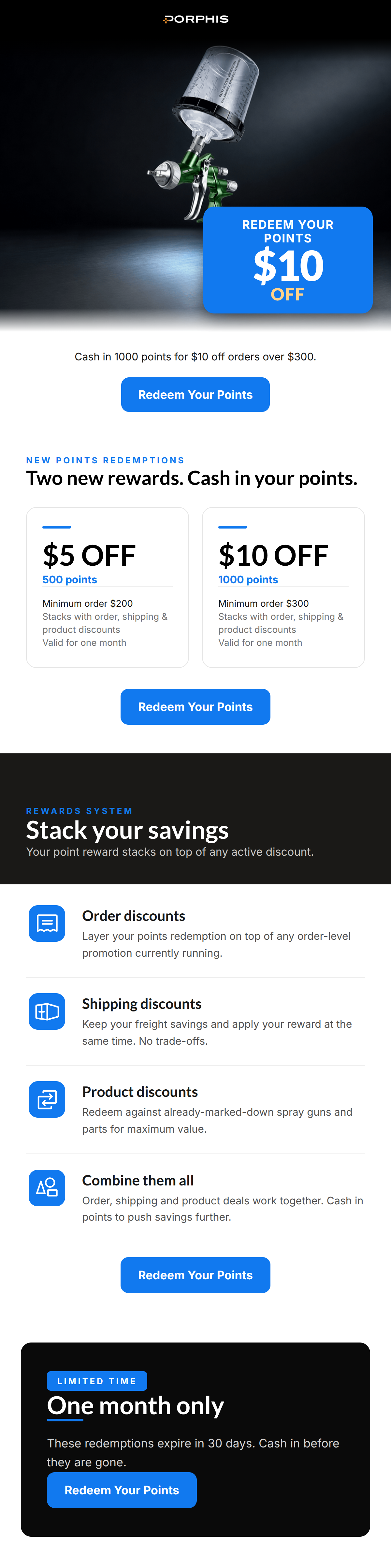
“Two new rewards. Cash in your points.”
Design Score
88/100This is a highly effective, well-structured promotional email that clearly communicates its value proposition and drives the user toward a single, unambiguous action. The visual hierarchy is exceptional, utilizing the brand's dark, technical aesthetic combined with high-contrast electric blue accents to guide the reader's eye seamlessly from the hero offer down to the urgency-driven footer. The email successfully translates a potentially complex topic (loyalty program redemptions and discount stacking) into easily digestible, skimmable chunks. The primary weakness lies not in the execution, but potentially in the underlying offer mechanics—the perceived value of $10 off a $300 minimum order may not motivate high-ticket professional buyers—but the communication of that offer is nearly flawless.
Create Your Own
Generate professional email designs like this one in seconds with Kopi AI.
Email Details
- Subject Line
- Two new rewards. Cash in your points.
- Brand
- PORPHIS
- Industry
- Automotive
- Email Type
- Promotional
- Created
- August 19, 2026
Brand Colors
Email Copy
Preview text: $5 OFF for 500 points, $10 OFF for 1000. Limited-time redemptions, stackable with other discounts.
Cash in 1000 points for $10 off orders over $300.
→ Redeem Your Points
Why This Email Works
This is a highly effective, well-structured promotional email that clearly communicates its value proposition and drives the user toward a single, unambiguous action. The visual hierarchy is exceptional, utilizing the brand's dark, technical aesthetic combined with high-contrast electric blue accents to guide the reader's eye seamlessly from the hero offer down to the urgency-driven footer. The email successfully translates a potentially complex topic (loyalty program redemptions and discount stacking) into easily digestible, skimmable chunks. The primary weakness lies not in the execution, but potentially in the underlying offer mechanics—the perceived value of $10 off a $300 minimum order may not motivate high-ticket professional buyers—but the communication of that offer is nearly flawless.
Hero (top/initial part) Impact
88/100- High-quality, moody product photography instantly establishes brand identity and premium feel.
- The bright blue badge provides phenomenal contrast and immediately communicates the core offer.
Content Structure & Flow
92/100- The progression from 'What is the offer' to 'Here are the details' to 'Why it's a great deal' (stacking) to 'Do it now' (urgency) is textbook conversion architecture.
- Alternating light and dark backgrounds perfectly segment the information into digestible chapters.
Visual Hierarchy & Layout
90/100- The side-by-side '$5 OFF' and '$10 OFF' cards create an immediate, visually balanced comparison.
- The consistent use of electric blue for accents, icons, and buttons creates a strong, unified visual scan path.
Call-to-Action Strength
95/100- Relentless focus on a single action: 'Redeem Your Points'.
- High-contrast, pill-shaped buttons are impossible to miss against both light and dark backgrounds.
- The repetition reinforces the user journey rather than confusing it.
Message Clarity & Tone
88/100- The phrase 'Keep your freight savings and apply your reward at the same time. No trade-offs' is fantastic, benefit-driven copy.
- The terminology ('Stack your savings', 'Cash in') resonates well with a results-oriented demographic.
Readability & Scannability
92/100- The use of large, bold numbers ('$5 OFF', '$10 OFF') in the pricing cards allows for instant comprehension.
- The left-aligned icon list in the 'Stack your savings' section breaks down complex terms and conditions into a highly scannable format.
Offer & Value Proposition
80/100- The explicit clarification that these rewards stack with other discounts massively increases the utility of the offer.
- Presenting two distinct tiers gives the user a sense of choice and control.
Personalization & Audience Fit
85/100- The 'no trade-offs' messaging speaks directly to a demographic that is hyper-aware of bottom-line costs.
- The stark, technical aesthetic perfectly matches the workshop environment of the end user.
Copy Conciseness & Word Economy
86/100- No throat-clearing openers ('We are excited to announce...'). The email gets straight to the point.
- Bullet points are concise, delivering the feature and the benefit in a single, short sentence.
Quick Wins
- Remove the redundant fourth icon row ('Combine them all') to tighten the 'Stack your savings' section and reduce vertical scrolling.
- Inject the user's dynamic point balance into the opening text (e.g., 'You have {{points}} points. Cash in 1000...').
- Add '1000 Pts = ' to the top of the blue hero badge so the 'cost' of the reward is immediately visible alongside the '$10 OFF' benefit.
Create Professional Email Designs
Generate beautiful, on-brand email designs in seconds. Just enter your brand URL and let AI do the rest.