Food & Beverage Promotional Email Template
“Snoeptomaatjes: zoet, knapperig, klaar.”
Design Score
88/100This is a highly effective, tightly written promotional email that correctly leverages the inverted pyramid structure. It respects the reader's time by getting straight to the point: what the product is, why it's good, and what it costs. The copy is exceptionally concise, and the repetition of the primary Call to Action is executed perfectly. However, the email leaves a significant conversion gap by omitting the weight/volume of the product, making it impossible for a budget-conscious audience to evaluate the true value of the €5,99 price point. Additionally, there are minor contrast issues with white text on the brand's primary green.
Create Your Own
Generate professional email designs like this one in seconds with Kopi AI.
Email Details
- Subject Line
- Snoeptomaatjes: zoet, knapperig, klaar.
- Brand
- Veggiebox
- Industry
- Food & Beverage
- Email Type
- Promotional
- Created
- May 18, 2026
Brand Colors
Email Copy
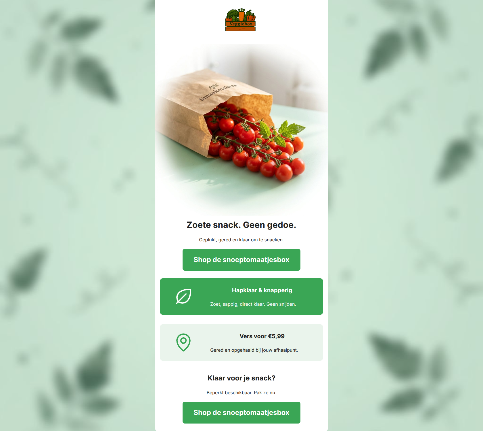
Zoete snack. Geen gedoe.
Geplukt, gered en klaar om te snacken.
→ Shop de snoeptomaatjesbox
Hapklaar & knapperig
Zoet, sappig, direct klaar. Geen snijden.
Vers voor €5,99
Gered en opgehaald bij jouw afhaalpunt.
Klaar voor je snack?
Beperkt beschikbaar. Pak ze nu.
→ Shop de snoeptomaatjesbox
Why This Email Works
This is a highly effective, tightly written promotional email that correctly leverages the inverted pyramid structure. It respects the reader's time by getting straight to the point: what the product is, why it's good, and what it costs. The copy is exceptionally concise, and the repetition of the primary Call to Action is executed perfectly. However, the email leaves a significant conversion gap by omitting the weight/volume of the product, making it impossible for a budget-conscious audience to evaluate the true value of the €5,99 price point. Additionally, there are minor contrast issues with white text on the brand's primary green.
Hero Impact
90/100- Exceptional use of short, punchy copy ('Zoete snack. Geen gedoe.').
- High-quality, organic-feeling imagery that perfectly matches the brand aesthetic.
- Clear, high-contrast primary CTA immediately visible above the fold.
Content Structure & Flow
94/100- Flawless progression from emotional hook (sweet snack) to logical justification (price/pickup).
- Alternating background colors on the benefit cards create clear, distinct cognitive steps.
- The final section successfully re-engages the user with a question and urgency.
Visual Hierarchy & Layout
85/100- Excellent use of the brand's mint and green colors to differentiate sections.
- Icons are sized appropriately to draw attention without overwhelming the copy.
- CTAs are given plenty of breathing room.
Call-to-Action Strength
98/100- Repetition of a single primary action reinforces the conversion goal.
- Button text is highly specific to the offer, moving beyond generic 'Buy Now' language.
- Buttons have excellent visual prominence.
Message Clarity & Tone
90/100- On-brand, conversational tone.
- Consistently frames features as benefits ('Geen snijden').
Readability & Scannability
80/100- Bullet-point brevity makes the email exceptionally easy to skim.
- Clear hierarchy between H1, H3, and body text sizes.
Offer & Value Proposition
68/100- Price is stated clearly upfront rather than hidden behind the click.
- Pickup logistics are clearly communicated.
Personalization & Audience Fit
82/100- Directly addresses the audience pain point of wanting healthy food without hassle.
- Highlights the community pickup model as a feature.
Copy Conciseness & Word Economy
100/100- Zero throat-clearing openers or filler adjectives.
- Ultra-short, impactful sentences ('Zoet, sappig, direct klaar.').
- No repetition of concepts between sections.
Quick Wins
- Add the weight/quantity of the tomatoes directly next to the €5,99 price point so the user can evaluate the deal.
- Left-align the text within the 75% columns of the benefit cards to improve scanning alongside the left-aligned icons.
- Change the text color on the green benefit card to a darker shade, or darken the green background slightly to improve contrast.


Create Professional Email Designs
Generate beautiful, on-brand email designs in seconds. Just enter your brand URL and let AI do the rest.