Food & Beverage Promotional Email Template
“Snoepen zonder schuldgevoel 🍅”
Design Score
92/100This is an exceptionally strong promotional email that executes the fundamentals of conversion optimization brilliantly. The copy is punchy, the structure follows a perfect inverted pyramid (Hook -> Benefits -> Price -> Urgency), and the primary CTA is repeated consistently without dilution. It captures the brand's joyful and pragmatic tone perfectly. The only minor areas for improvement involve visual variety and adding specific details to the offer.
Create Your Own
Generate professional email designs like this one in seconds with Kopi AI.
Email Details
- Subject Line
- Snoepen zonder schuldgevoel 🍅
- Brand
- Veggiebox
- Industry
- Food & Beverage
- Email Type
- Promotional
- Created
- May 19, 2026
Brand Colors
Email Copy
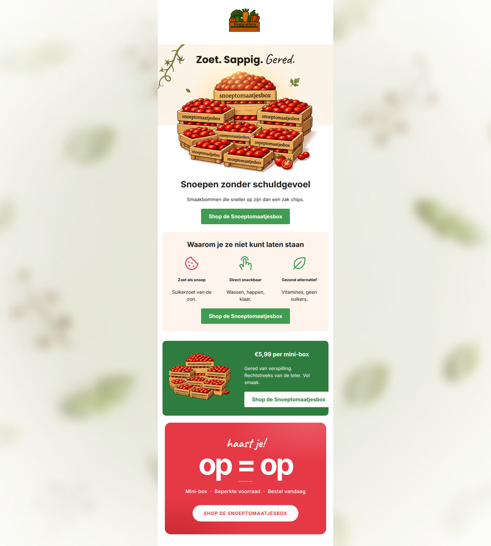
Snoepen zonder schuldgevoel
Smaakbommen die sneller op zijn dan een zak chips.
→ Shop de Snoeptomaatjesbox
Waarom je ze niet kunt laten staan
Zoet als snoep
Suikerzoet van de zon.
Direct snackbaar
Wassen, happen, klaar.
Gezond alternatief
Vitamines, geen suikers.
→ Shop de Snoeptomaatjesbox
€5,99 per mini-box
Gered van verspilling. Rechtstreeks van de teler. Vol smaak.
→ Shop de Snoeptomaatjesbox
Why This Email Works
This is an exceptionally strong promotional email that executes the fundamentals of conversion optimization brilliantly. The copy is punchy, the structure follows a perfect inverted pyramid (Hook -> Benefits -> Price -> Urgency), and the primary CTA is repeated consistently without dilution. It captures the brand's joyful and pragmatic tone perfectly. The only minor areas for improvement involve visual variety and adding specific details to the offer.
1. Hero (top/initial part) Impact
92/100- Highly engaging, benefit-driven headline.
- Clear, high-contrast primary CTA immediately visible without scrolling.
- Vibrant imagery that aligns with the brand's joyful aesthetic.
2. Content Structure & Flow
95/100- Perfect execution of the inverted pyramid framework.
- Smooth transition from emotional appeal (guilt-free snacking) to logical justification (price and scarcity).
3. Visual Hierarchy & Layout
85/100- Excellent use of color blocking to separate distinct messaging areas.
- The three-column benefit layout is highly scannable.
- The urgency block visually dominates the bottom of the email, driving action.
4. Call-to-Action Strength
100/100- Consistent reinforcement of the primary goal.
- Excellent color contrast on every button instance.
- Action-oriented, specific button copy rather than a generic 'Klik hier'.
5. Message Clarity & Tone
95/100- Nails the conversational, friendly neighbor brand voice.
- Benefits are stated clearly and without jargon.
- Mission-driven positioning is present but doesn't overshadow the product appeal.
6. Readability & Scannability
96/100- Iconography paired with short text chunks.
- High contrast typography throughout.
- Absence of dense 'walls of text'.
7. Offer & Value Proposition
90/100- Price is isolated in its own distinct visual block.
- Value is framed both economically and ethically ('Gered van verspilling').
8. Personalization & Audience Fit
80/100- Accurately addresses the customer pain point of wanting healthy snacks that rival junk food.
- Aligns with the audience's budget-conscious mindset.
9. Copy Conciseness & Word Economy
98/100- Extremely tight phrasing.
- High impact-to-word-count ratio.
Quick Wins
- Add the specific weight/volume to the '€5,99 per mini-box' headline (e.g., '€5,99 voor 500g') to clarify the offer's value.
- Change the 'cookie' icon under 'Zoet als snoep' to a sun icon or candy icon, as a cookie visually contradicts the 'healthy alternative' messaging.


Create Professional Email Designs
Generate beautiful, on-brand email designs in seconds. Just enter your brand URL and let AI do the rest.