Other Promotional Email Template
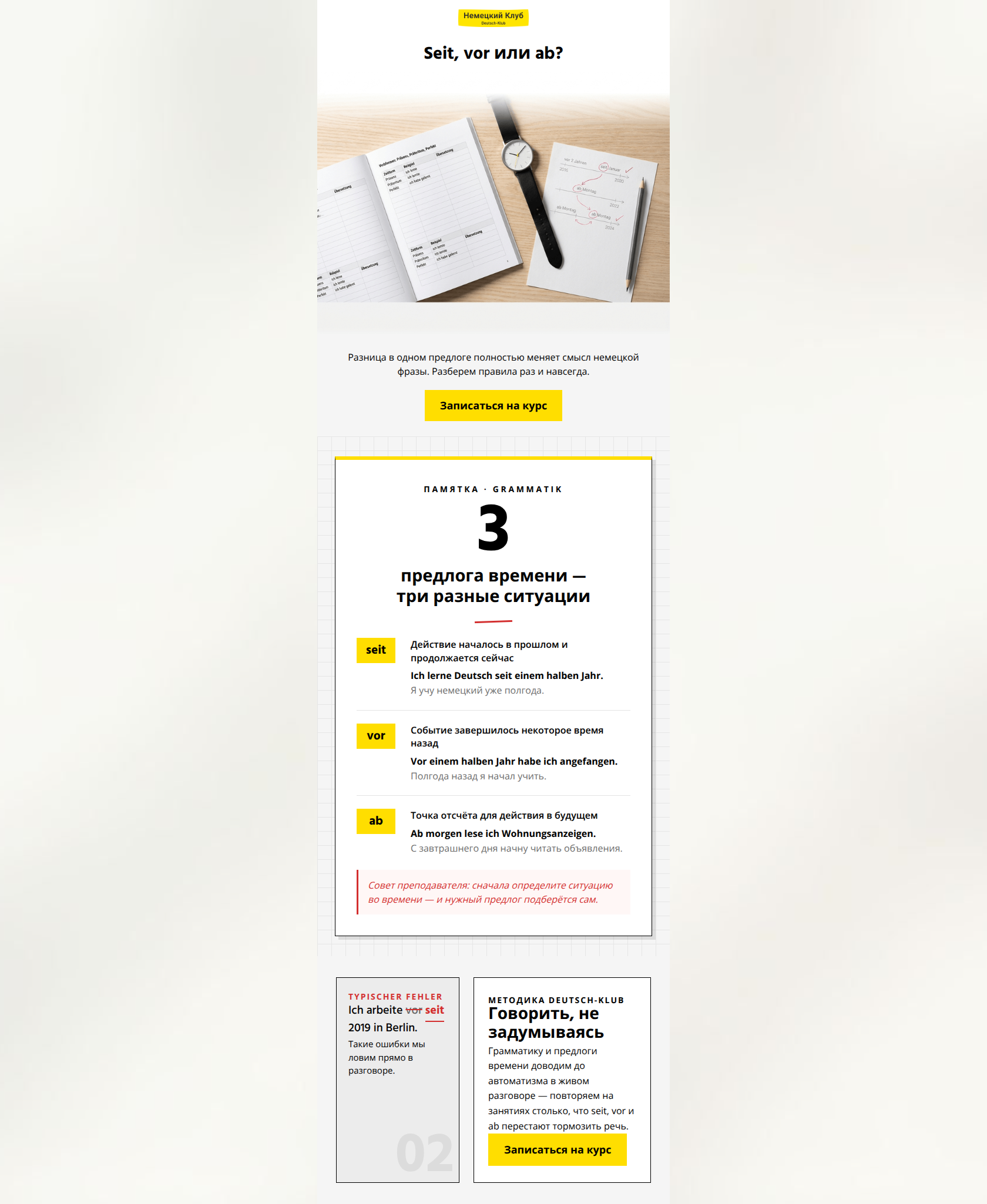
“Seit или vor? Перестаем путаться во времени”
Design Score
89/100This email is a masterclass in 'Value-First' marketing for the education sector. It perfectly captures the Deutsch-Klub editorial/academic aesthetic while using a classic curiosity-gap hook ('Seit, vor или ab?'). By providing immediate educational value through the grammar cheat sheet, it establishes authority and trust before pivoting to the sales pitch. The visual hierarchy is exceptionally strong, mimicking a clean textbook layout that appeals to the target's goal-oriented, professional psychographic. Conversion is driven by high-contrast primary CTAs that are repeated strategically to reinforce the single desired action.
Create Your Own
Generate professional email designs like this one in seconds with Kopi AI.
Email Details
- Subject Line
- Seit или vor? Перестаем путаться во времени
- Brand
- Deutsch-Klub
- Industry
- Other
- Email Type
- Promotional
- Created
- July 10, 2026
Brand Colors
Email Copy
Preview text: Короткая шпаргалка по тем самым предлогам времени в немецком, которые постоянно меняют смысл ваших фраз.
Seit, vor или ab?
Разница в одном предлоге полностью меняет смысл немецкой фразы. Разберем правила раз и навсегда.
→ Записаться на курс
Why This Email Works
This email is a masterclass in 'Value-First' marketing for the education sector. It perfectly captures the Deutsch-Klub editorial/academic aesthetic while using a classic curiosity-gap hook ('Seit, vor или ab?'). By providing immediate educational value through the grammar cheat sheet, it establishes authority and trust before pivoting to the sales pitch. The visual hierarchy is exceptionally strong, mimicking a clean textbook layout that appeals to the target's goal-oriented, professional psychographic. Conversion is driven by high-contrast primary CTAs that are repeated strategically to reinforce the single desired action.
Hero Impact
92/100- Perfect alignment between headline and brand identity.
- High-quality, relevant imagery that feels premium and authentic.
Content Structure & Flow
90/100- Uses the Inverted Pyramid to drive attention toward the first CTA.
- Educational content acts as a powerful lead magnet within the email body.
Visual Hierarchy & Layout
94/100- Strong editorial feel that distinguishes the brand from competitors.
- Excellent use of whitespace and high-contrast elements.
Call-to-Action Strength
95/100- Consistent button copy and destination (HREF) across the entire email.
- High-contrast color usage ensures buttons are unmissable.
Message Clarity & Tone
88/100- Honest and professional brand voice.
- Avoids marketing fluff in favor of educational utility.
Readability & Scannability
96/100- Expert use of bolding and visual groupings.
- Short, punchy sentences that respect the reader's time.
Offer & Value Proposition
84/100- Authority-based selling rather than discount-based selling.
- Directly connects the teaching method to 'speaking without thinking'.
Personalization & Audience Fit
80/100- Avoids the 'childish' look of many language apps, leaning into the professional/academic niche.
Copy Conciseness & Word Economy
95/100- Tight, disciplined writing style.
- Excellent distillation of complex grammar rules into three lines.
Quick Wins
- Add the next available course start date near the final CTA to create urgency.
- Bolding the specific prepositions (seit, vor, ab) within the Russian explanation text to further aid scannability.



Create Professional Email Designs
Generate beautiful, on-brand email designs in seconds. Just enter your brand URL and let AI do the rest.