Food & Beverage Promotional Email Template
“Refresh with Watermelon – 15% Off”
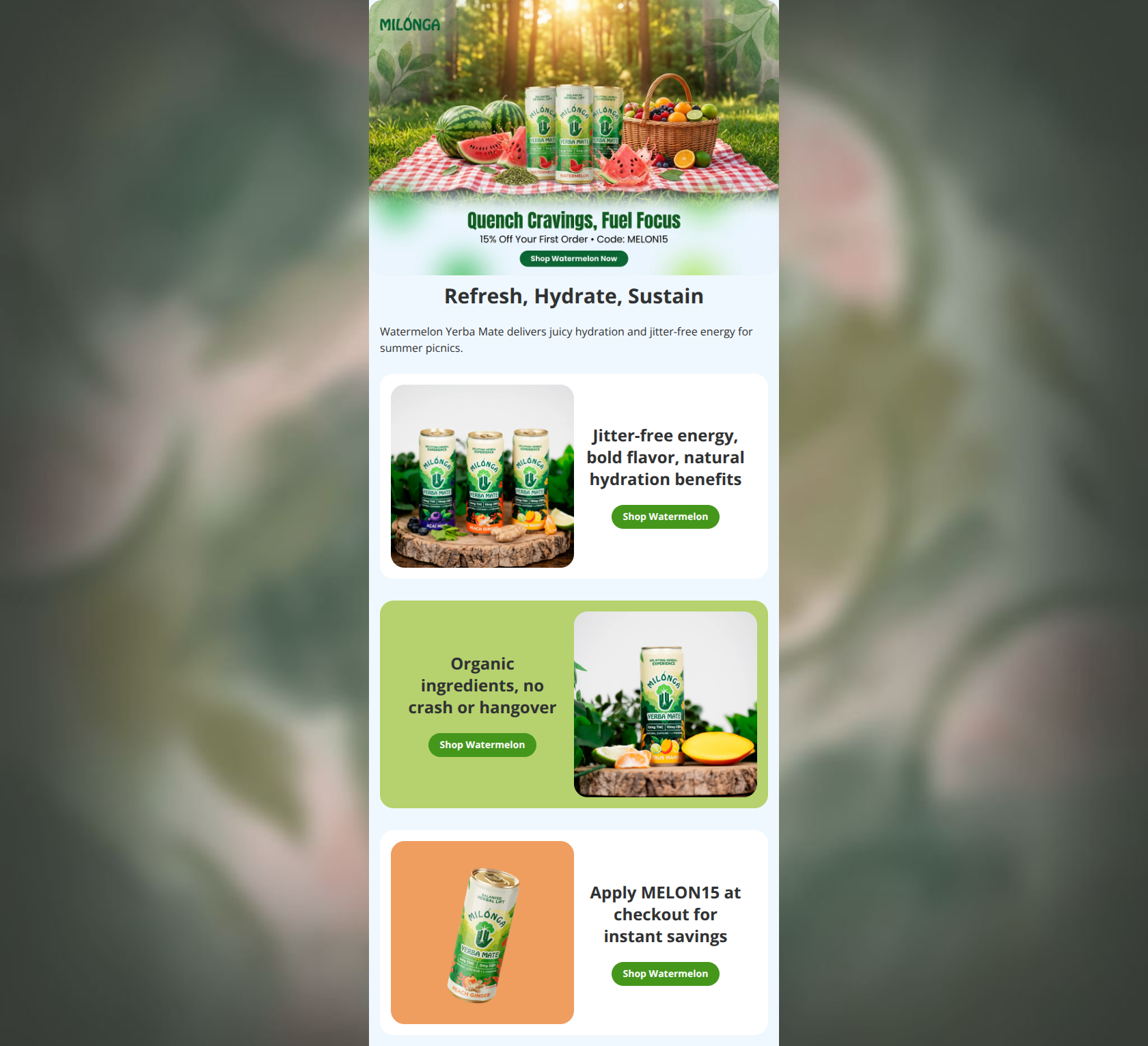
Design Score
81/100This promotional email effectively showcases the Watermelon Yerba Mate with vibrant imagery and benefit-driven copy that aligns well with Milonga's wellness-focused brand, creating strong visual appeal and scannability to encourage clicks. The biggest strength is the hero section's immediate communication of seasonal value (juicy hydration for picnics), while the biggest weakness is repetitive, generic CTAs all linking to the full collection instead of a specific product page, diluting urgency and relevance.
Create Your Own
Generate professional email designs like this one in seconds with Kopi AI.
Email Details
- Subject Line
- Refresh with Watermelon – 15% Off
- Brand
- Milonga Yerba Mate (Fork)
- Industry
- Food & Beverage
- Email Type
- Promotional
- Created
- February 20, 2026
Brand Colors
Email Copy
Refresh, Hydrate, Sustain
Watermelon Yerba Mate delivers juicy hydration and jitter-free energy for summer picnics.
Jitter-free energy, bold flavor, natural hydration benefits
→ Shop Watermelon
Organic ingredients, no crash or hangover
→ Shop Watermelon
Apply MELON15 at checkout for instant savings
→ Shop Watermelon
Why This Email Works
This promotional email effectively showcases the Watermelon Yerba Mate with vibrant imagery and benefit-driven copy that aligns well with Milonga's wellness-focused brand, creating strong visual appeal and scannability to encourage clicks. The biggest strength is the hero section's immediate communication of seasonal value (juicy hydration for picnics), while the biggest weakness is repetitive, generic CTAs all linking to the full collection instead of a specific product page, diluting urgency and relevance.
Hero (top/initial part) Impact
85/100- Hero image clearly features Milonga cans with summer picnic context, reinforced by 'Refresh, Hydrate, Sustain' headline and benefit copy tying to jitter-free energy.
- Immediately answers 'what' (Watermelon Yerba Mate) and 'why care' (juicy hydration for picnics), with image alt text supporting accessibility.
Content Structure & Flow
75/100- Logical progression from hero product intro to supporting benefits (energy, ingredients, savings).
- Clear section breaks via colored cards prevent blurring.
Visual Hierarchy & Layout
85/100- Card-based sections with alternating image/text create rhythmic flow and clear breaks.
- Hero image dominates top viewport effectively.
Call-to-Action Strength
70/100- Buttons are visually distinct, centered, and present in every section.
- Copy is action-oriented and product-specific.
Message Clarity & Tone
90/100- Clear value prop: 'jitter-free energy, bold flavor, natural hydration' directly addresses pain points like crashes.
- Consistent summer refreshment theme ties to audience's active lifestyle.
Readability & Scannability
95/100- Short paragraphs, prominent headings, and centered text enable quick skimming.
- No walls of text; benefits scan easily.
Offer & Value Proposition
80/100- Explicit code reduces friction; ties savings to product.
- Benefits like 'no crash or hangover' clearly show reader gain.
Personalization & Audience Fit
50/100- Content fits wellness seekers with natural/organic emphasis.
Quick Wins
- Change all CTA links from /collections/all to a specific Watermelon product page for higher relevance.
- Specify '15% off' in the offer heading: 'Get 15% off Watermelon – Apply MELON15'.
- Vary CTA copy: 'Shop Watermelon Flavors' in second card, 'Grab Organic Now' in third.
- Add discount timer: 'Limited time – MELON15 ends soon!' above final CTA.


Create Professional Email Designs
Generate beautiful, on-brand email designs in seconds. Just enter your brand URL and let AI do the rest.