Food & Beverage Promotional Email Template
“Red, White & Rosé: America at 250”
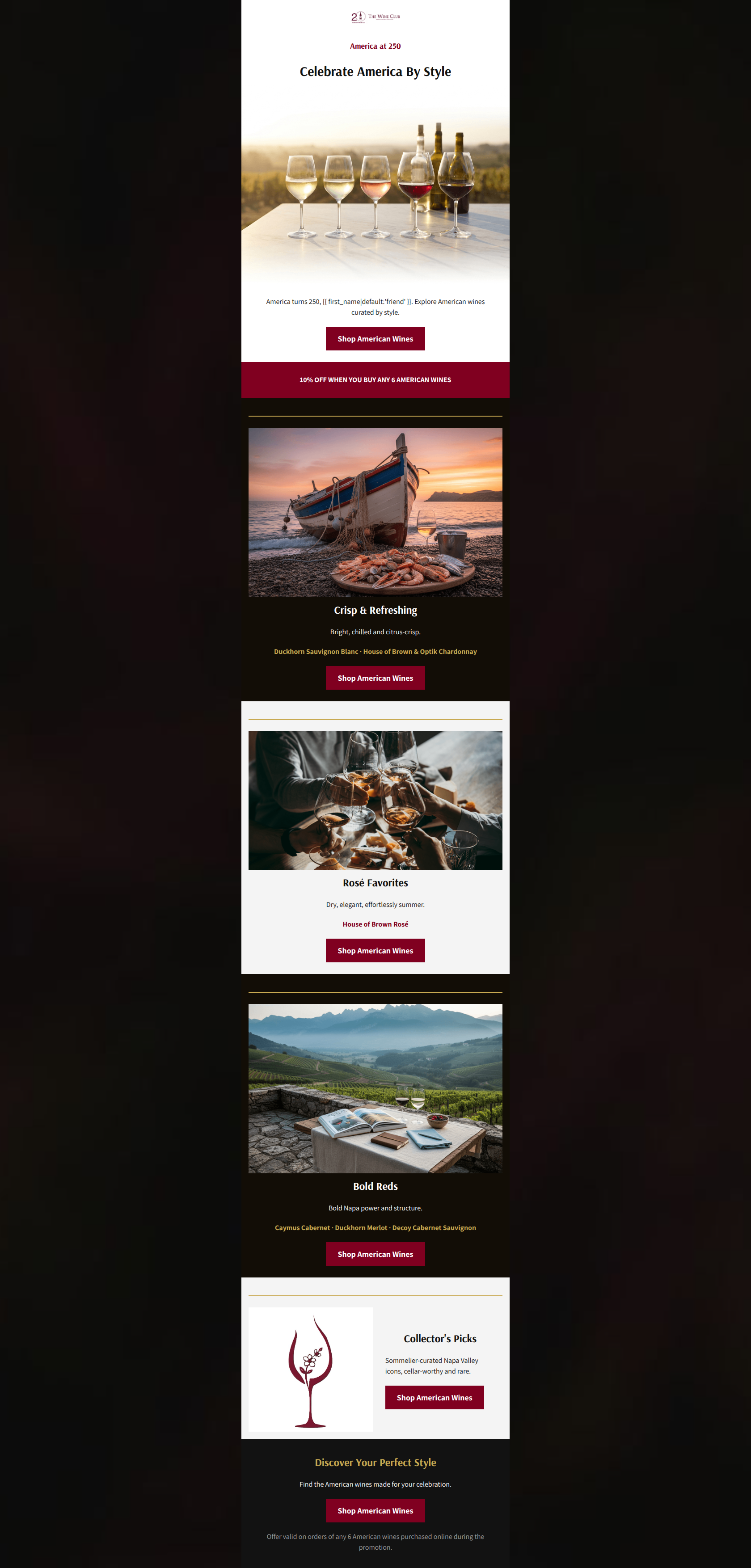
Design Score
81/100This is a structurally sound, visually appealing promotional email that correctly leverages a single, focused conversion goal. The brand aesthetic is well-executed with high-quality, aspirational imagery and a clear, high-contrast color palette. The most significant conversion leak is the placement of the primary volume offer (10% off 6 bottles), which is visually disjointed from the hero section and placed below the initial point of friction (the first CTA). While the repetition of the primary call-to-action is textbook, the repetitive visual layout of the product style sections creates scanning fatigue.
Create Your Own
Generate professional email designs like this one in seconds with Kopi AI.
Email Details
- Subject Line
- Red, White & Rosé: America at 250
- Brand
- The Wine Club
- Industry
- Food & Beverage
- Email Type
- Promotional
- Created
- July 3, 2026
Brand Colors
Email Copy
America at 250
Celebrate America By Style
America turns 250, friend. Explore American wines curated by style.
→ Shop American Wines
10% OFF WHEN YOU BUY ANY 6 AMERICAN WINES
Crisp & Refreshing
Bright, chilled and citrus-crisp.
Duckhorn Sauvignon Blanc · House of Brown & Optik Chardonnay
→ Shop American Wines
Rosé Favorites
Dry, elegant, effortlessly summer.
House of Brown Rosé
→ Shop American Wines
Bold Reds
Bold Napa power and structure.
Caymus Cabernet · Duckhorn Merlot · Decoy Cabernet Sauvignon
→ Shop American Wines
Collector's Picks
Sommelier-curated Napa Valley icons, cellar-worthy and rare.
→ Shop American Wines
Discover Your Perfect Style
Find the American wines made for your celebration.
→ Shop American Wines
Offer valid on orders of any 6 American wines purchased online during the promotion.
Why This Email Works
This is a structurally sound, visually appealing promotional email that correctly leverages a single, focused conversion goal. The brand aesthetic is well-executed with high-quality, aspirational imagery and a clear, high-contrast color palette. The most significant conversion leak is the placement of the primary volume offer (10% off 6 bottles), which is visually disjointed from the hero section and placed below the initial point of friction (the first CTA). While the repetition of the primary call-to-action is textbook, the repetitive visual layout of the product style sections creates scanning fatigue.
Hero (top/initial part) Impact
75/100- High-quality imagery instantly establishes the premium hospitality aesthetic.
- Immediate placement of the primary CTA above the fold.
Content Structure & Flow
80/100- Clear, logical progression from broad to specific.
- Alternating background colors effectively group content into digestible chunks.
Visual Hierarchy & Layout
78/100- Excellent use of the premium brand color palette.
- Headings are consistently larger and bolder than body text, directing the eye.
Call-to-Action Strength
95/100- Flawless adherence to a single primary conversion goal.
- Buttons use the brand's rich burgundy (#800020), providing excellent contrast against both light and dark backgrounds.
Message Clarity & Tone
85/100- Effectively drops high-end brand names to establish authority and cater to the premium demographic.
- Descriptions (e.g., 'Bold Napa power and structure') are evocative and fit the wine enthusiast audience.
Readability & Scannability
82/100- Strong contrast ratios throughout the design.
- Short, punchy sentences prevent 'wall of text' fatigue.
Offer & Value Proposition
72/100- The offer makes strategic sense for a premium retailer aiming to increase Average Order Value (AOV).
- The offer is stated plainly and in bold.
Personalization & Audience Fit
75/100- Curation strategy directly addresses the target audience's shopping behavior.
- Aspirational imagery matches the premium price point.
Copy Conciseness & Word Economy
88/100- Excellent distillation of tasting notes into short, evocative phrases ('Bright, chilled and citrus-crisp').
- No wasted space on long paragraphs; respects the reader's time.
Quick Wins
- Move the '10% OFF' value proposition into the main hero block, positioned above the first CTA.
- Remove the heavy gold divider lines between sections to create a smoother, less interrupted scroll experience.
- Add an urgency driver (e.g., an end date) to the primary offer text.


Create Professional Email Designs
Generate beautiful, on-brand email designs in seconds. Just enter your brand URL and let AI do the rest.