Fitness Promotional Email Template
“Protege sus manos. Impulsa su confianza.”
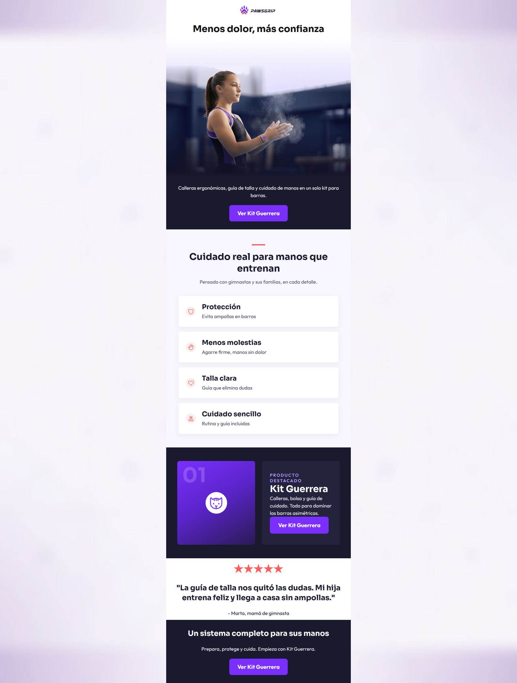
Design Score
82/100This email demonstrates a very strong understanding of its target audience, utilizing excellent copy and structural pacing to address specific pain points (pain, sizing doubts). However, the email's effectiveness is significantly hindered by visual disconnects—most notably, a confusing placeholder image in the core product highlight section that fails to showcase the actual 'system' being sold.
Create Your Own
Generate professional email designs like this one in seconds with Kopi AI.
Email Details
- Subject Line
- Protege sus manos. Impulsa su confianza.
- Brand
- PAWSGRIP
- Industry
- Fitness
- Email Type
- Promotional
- Created
- July 11, 2026
Brand Colors
Email Copy
Menos dolor, más confianza
Calleras ergonómicas, guía de talla y cuidado de manos en un solo kit para barras.
→ Ver Kit Guerrera
★★★★★
"La guía de talla nos quitó las dudas. Mi hija entrena feliz y llega a casa sin ampollas."
- Marta, mamá de gimnasta
Un sistema completo para sus manos
Prepara, protege y cuida. Empieza con Kit Guerrera.
→ Ver Kit Guerrera
Why This Email Works
This email demonstrates a very strong understanding of its target audience, utilizing excellent copy and structural pacing to address specific pain points (pain, sizing doubts). However, the email's effectiveness is significantly hindered by visual disconnects—most notably, a confusing placeholder image in the core product highlight section that fails to showcase the actual 'system' being sold.
Hero (top/initial part) Impact
75/100- Headline immediately addresses the primary customer pain point ('Menos dolor, más confianza').
- Image establishes instant relevance to the sport.
Content Structure & Flow
85/100- Logical progression from problem awareness to product solution.
- Testimonial is perfectly placed to validate the claims made in the preceding sections.
Visual Hierarchy & Layout
60/100- Good use of contrasting background colors to delineate sections.
- Feature cards utilize whitespace well, making them easy to digest.
Call-to-Action Strength
95/100- Perfect consistency in CTA copy and destination.
- High-contrast purple (#7B2FFF) buttons stand out clearly against the navy (#1A1A2E) backgrounds.
Message Clarity & Tone
88/100- Excellent empathy for the customer's specific pain points (blisters, sizing confusion).
- Clear, jargon-free language that is easy for parents to understand.
Readability & Scannability
90/100- Bite-sized feature blocks are perfect for skimming.
- High contrast text on both light and dark backgrounds ensures legibility.
Offer & Value Proposition
70/100- The concept of selling a 'Kit' rather than just 'grips' is clearly communicated in the text.
- Focus on holistic care (preparation, protection, routine) elevates the perceived value.
Personalization & Audience Fit
92/100- Social proof specifically addresses the buyer persona (a parent).
- Directly tackles the two biggest parental objections: sizing confusion and child's pain.
Copy Conciseness & Word Economy
88/100- Ruthless editing; every sentence adds value.
- Feature text is highly distilled.
Quick Wins
- Fix the abstract graphic in the 'Producto Destacado' section to show a real photo of the Kit Guerrera.
- Change the H1 color to the brand's #1A1A2E for visual consistency.
- Unify the hero section background so the image and introductory text are visually connected.



Create Professional Email Designs
Generate beautiful, on-brand email designs in seconds. Just enter your brand URL and let AI do the rest.