Fitness Promotional Email Template

76/100Fair

Pourquoi l'amélioration continue finit par se voir

HoopsTrackR
Share:
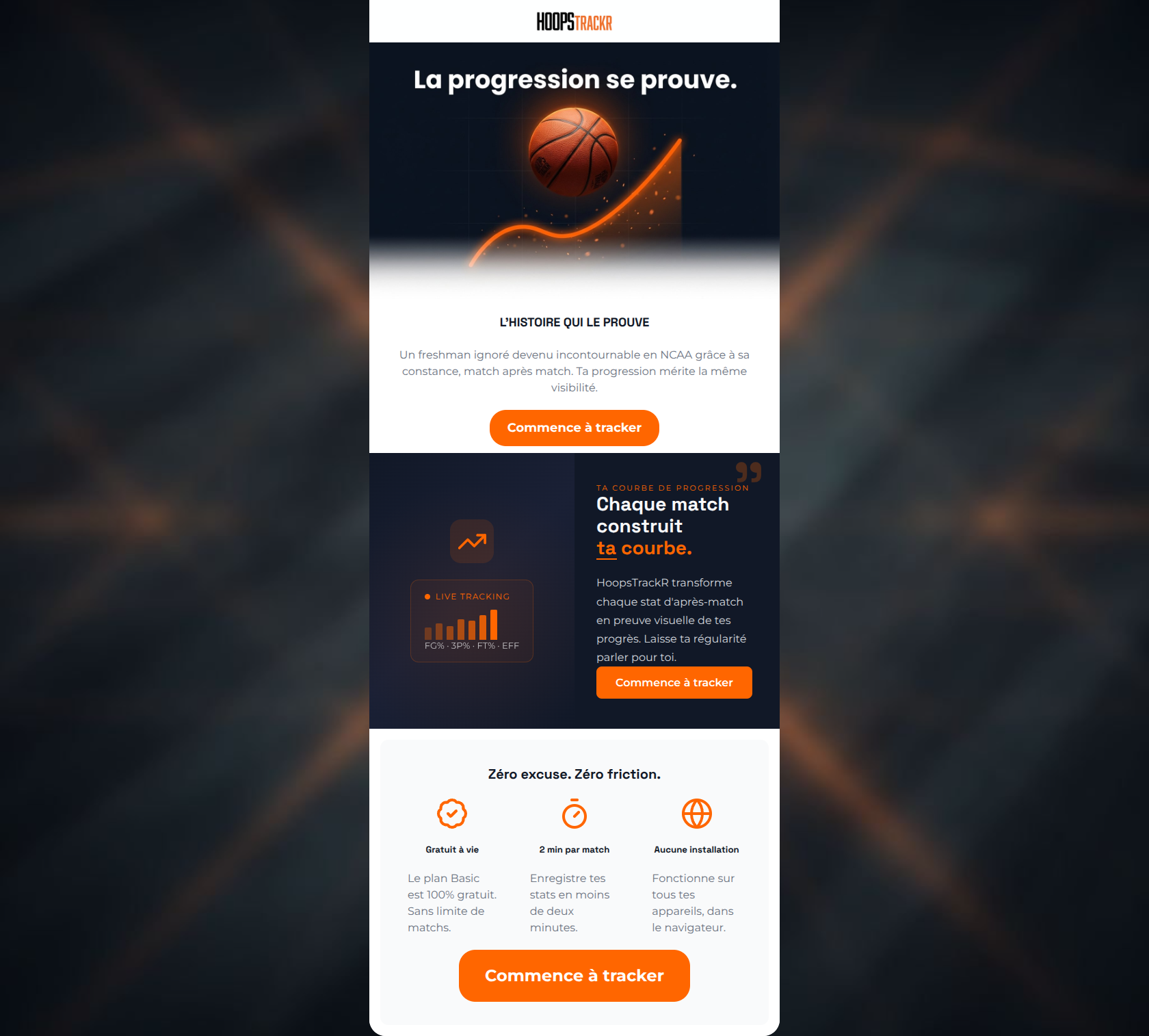
A basketball bouncing over an orange curve with a dark dashboard showing shooting percentages and charts.

Design Score

76/100
C - Fair

Visually, this email is a strong execution of the HoopsTrackR brand: high contrast, energetic, and highly scannable. However, from a conversion standpoint, it suffers from a disjointed narrative. The hero section wastes the most valuable real estate on a vague NCAA storytelling angle instead of hitting the core value proposition. The email asks the user to care about a stranger's story before explicitly stating how the product helps the reader. The bottom section does the heavy lifting for product clarity but is buried too far down. By flipping the narrative to focus entirely on the user's immediate benefit from the first pixel and varying the CTA intent, this email could easily reach the 90+ tier.

Create Your Own

Generate professional email designs like this one in seconds with Kopi AI.

Start Creating

Email Details

Subject Line
Pourquoi l'amélioration continue finit par se voir
Brand
HoopsTrackR
Industry
Fitness
Email Type
Promotional
Created
March 27, 2026

Brand Colors

Email Copy

L'HISTOIRE QUI LE PROUVE

Un freshman ignoré devenu incontournable en NCAA grâce à sa constance, match après match. Ta progression mérite la même visibilité.

Commence à tracker

Zéro excuse. Zéro friction.

Gratuit à vie

Le plan Basic est 100% gratuit. Sans limite de matchs.

2 min par match

Enregistre tes stats en moins de deux minutes.

Aucune installation

Fonctionne sur tous tes appareils, dans le navigateur.

Commence à tracker

Why This Email Works

Visually, this email is a strong execution of the HoopsTrackR brand: high contrast, energetic, and highly scannable. However, from a conversion standpoint, it suffers from a disjointed narrative. The hero section wastes the most valuable real estate on a vague NCAA storytelling angle instead of hitting the core value proposition. The email asks the user to care about a stranger's story before explicitly stating how the product helps the reader. The bottom section does the heavy lifting for product clarity but is buried too far down. By flipping the narrative to focus entirely on the user's immediate benefit from the first pixel and varying the CTA intent, this email could easily reach the 90+ tier.

Hero Impact

60/100
  • Strong visual metaphor combining the basketball and the upward trendline.
  • Clear, high-contrast primary CTA button immediately visible.

Content Structure & Flow

75/100
  • Excellent use of contrasting background colors to delineate sections and keep the reader scrolling.
  • The bottom three-column layout is perfectly structured for quick scanning.

Visual Hierarchy & Layout

85/100
  • CTAs visually dominate their respective sections.
  • The dark editorial section creates a premium 'sports SaaS' feel that elevates the brand perception.

Call-to-Action Strength

68/100
  • Perfect color contrast using the brand's primary orange against both light and dark backgrounds.
  • Buttons are appropriately sized and centrally aligned for easy tapping.

Message Clarity & Tone

70/100
  • Effective use of the 'tu' (informal you) to build a peer-to-peer relationship.
  • The phrasing in the bottom section is punchy, confident, and highly persuasive.

Readability & Scannability

88/100
  • Excellent ratio of white space to text.
  • Headings are distinct from body copy in both size and weight.

Offer & Value Proposition

80/100
  • The three pillars at the bottom perfectly summarize the core differentiators of the product.
  • The messaging clearly overcomes common user objections (cost, time, storage space).

Personalization & Audience Fit

72/100
  • The dark UI mockup immediately signals to the target demographic that this is a modern, serious tool, not a toy.

Copy Conciseness & Word Economy

82/100
  • Zero throat-clearing in the bottom section (e.g., 'Gratuit à vie' instead of 'Nous sommes fiers de vous offrir un plan gratuit').
  • Paragraphs are tight and respect the user's time.

Quick Wins

  • Change the three CTA buttons to have distinct copy (e.g., 'Crée ton profil', 'Voir mes stats', 'Commence gratuitement').
  • Replace the NCAA freshman story in the hero with a direct statement about the product's immediate value.
  • Remove the decorative quotation marks in the dark section.

Create Professional Email Designs

Generate beautiful, on-brand email designs in seconds. Just enter your brand URL and let AI do the rest.

Start Creating for Free