Food & Beverage Promotional Email Template
“Nostalgic candy, minus the sugar crash”
Design Score
81/100This is a strong, brand-aligned email that effectively communicates the 'better-for-you' candy value proposition. The copy is punchy, and the layout uses alternating background colors effectively to guide the eye. However, the visual polish is let down by inconsistent icon styles in the value proposition section and a 'fake button' embedded in the hero image that competes with the actual call-to-action.
Create Your Own
Generate professional email designs like this one in seconds with Kopi AI.
Email Details
- Subject Line
- Nostalgic candy, minus the sugar crash
- Brand
- JOYRIDE
- Industry
- Food & Beverage
- Email Type
- Promotional
- Created
- January 10, 2026
Brand Colors
Email Copy
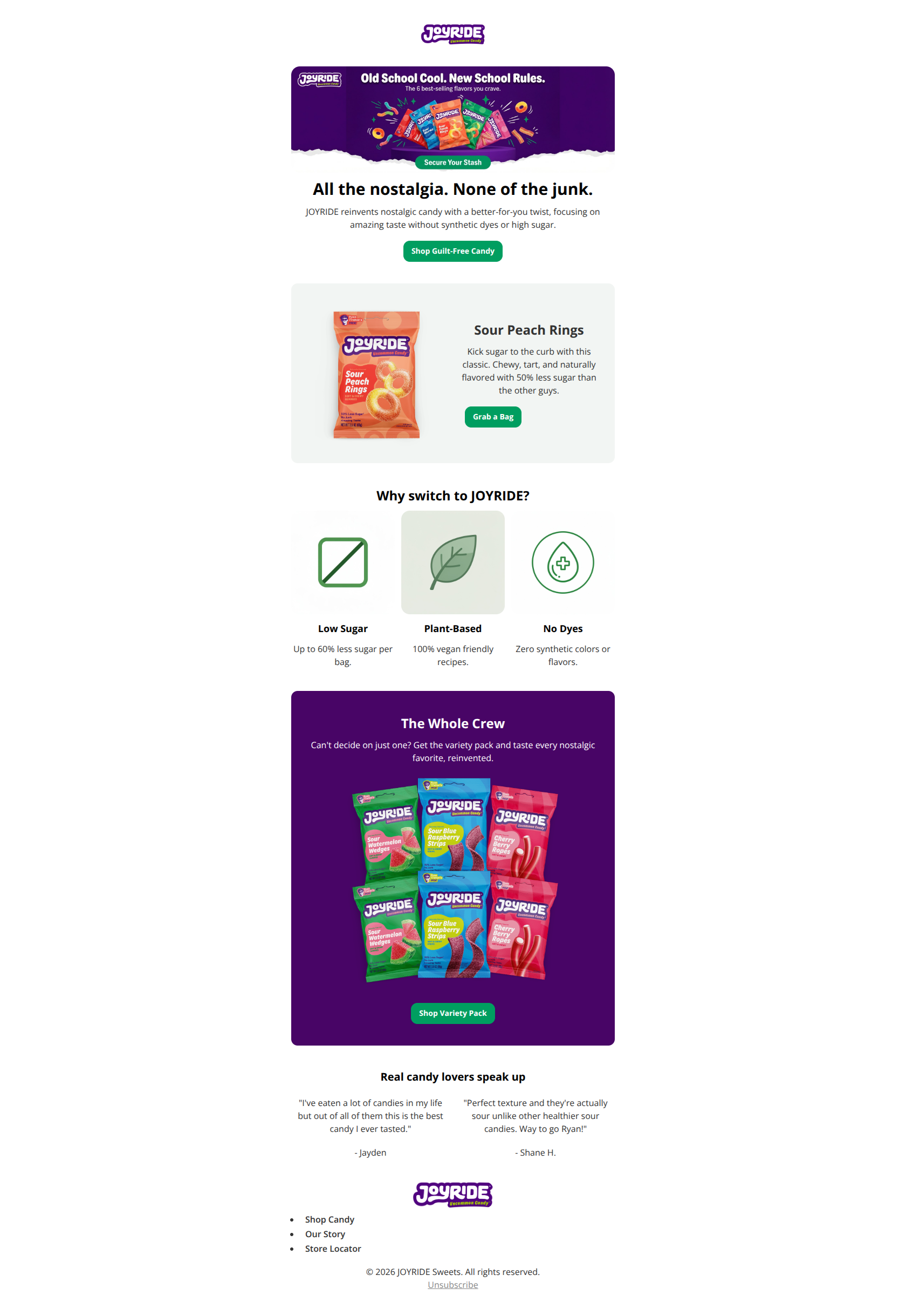
All the nostalgia. None of the junk.
JOYRIDE reinvents nostalgic candy with a better-for-you twist, focusing on amazing taste without synthetic dyes or high sugar.
→ Shop Guilt-Free Candy
Sour Peach Rings
Kick sugar to the curb with this classic. Chewy, tart, and naturally flavored with 50% less sugar than the other guys.
→ Grab a Bag
Why switch to JOYRIDE?
Low Sugar
Up to 60% less sugar per bag.
Plant-Based
100% vegan friendly recipes.
No Dyes
Zero synthetic colors or flavors.
The Whole Crew
Can't decide on just one? Get the variety pack and taste every nostalgic favorite, reinvented.
→ Shop Variety Pack
Real candy lovers speak up
"I've eaten a lot of candies in my life but out of all of them this is the best candy I ever tasted."
- Jayden
"Perfect texture and they're actually sour unlike other healthier sour candies. Way to go Ryan!"
- Shane H.
- Shop Candy
- Our Story
- Store Locator
© 2026 JOYRIDE Sweets. All rights reserved. Unsubscribe
Why This Email Works
This is a strong, brand-aligned email that effectively communicates the 'better-for-you' candy value proposition. The copy is punchy, and the layout uses alternating background colors effectively to guide the eye. However, the visual polish is let down by inconsistent icon styles in the value proposition section and a 'fake button' embedded in the hero image that competes with the actual call-to-action.
Hero Impact
85/100- Headline is excellent: concise, rhythmic, and clearly states the benefit.
- Product photography in the hero is vibrant and appetizing.
Content Structure & Flow
85/100- Alternating background colors (White → Grey → White → Purple) create distinct visual chapters that reduce scanning fatigue.
- The flow from single product to variety pack serves both trial users and bulk buyers.
Visual Hierarchy & Layout
70/100- The purple 'Whole Crew' section pops effectively against the white surroundings, drawing attention to the highest AOV item (Variety Pack).
- Good use of whitespace around the main text blocks.
Call-to-Action Strength
85/100- Button color (#009E60) is distinct and on-brand.
- Copy is specific to the section ('Grab a Bag' vs 'Shop Variety Pack').
Message Clarity & Tone
90/100- The distinction between 'Nostalgic' taste and 'Better-for-you' ingredients is made instantly clear.
- Tone is consistent throughout, avoiding corporate jargon.
Readability & Scannability
90/100- Short paragraphs (2-3 lines max) prevent walls of text.
- Font sizes are appropriate for both desktop and mobile reading.
Offer & Value Proposition
75/100- The percentage reductions in sugar (50%, 60%) are tangible stats that help justify the switch.
Personalization & Audience Fit
50/100- The content is broadly appealing to the target demographic (health-conscious sweets lovers).
Quick Wins
- **Add Star Ratings:** Visually enhance the testimonial section by adding 5-star graphic icons above the review text to make them instantly recognizable as social proof.
- **Remove 'Fake' Button:** Edit the hero image to remove the 'Secure Your Stash' button graphic. It competes with the real button and creates a non-interactive dead zone.
- **Bold Key Benefits:** In the product descriptions, bold the '50% less sugar' and 'naturally flavored' text to make them stand out to skimmers.


Create Professional Email Designs
Generate beautiful, on-brand email designs in seconds. Just enter your brand URL and let AI do the rest.