Food & Beverage Product Launch Email Template
“Nieuw voor Stadspashouders: de Veggie & Fruit Mix”
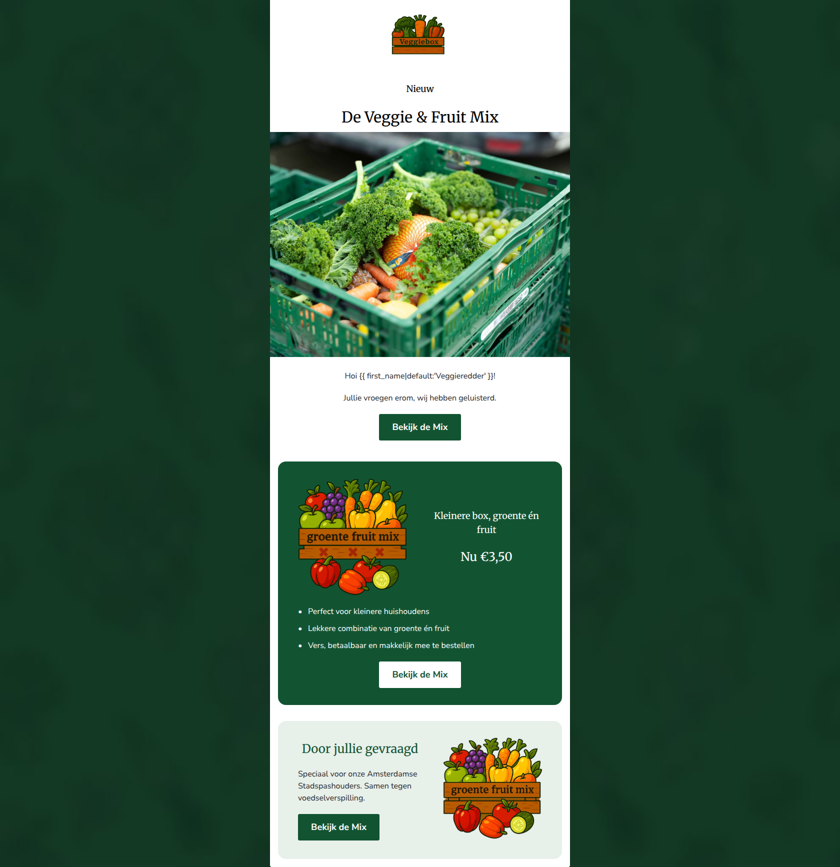
Design Score
86/100This is a strong, well-executed product launch email. It leverages clean, modular design, excellent readability, and a flawless, consistent call-to-action strategy. The primary area for improvement is information hierarchy: the email's strongest selling point—the highly accessible €3.50 price tag and its relevance to smaller households—is buried halfway down the page. Elevating this core value proposition to the hero section would significantly increase immediate hook and click-through rates.
Create Your Own
Generate professional email designs like this one in seconds with Kopi AI.
Email Details
- Subject Line
- Nieuw voor Stadspashouders: de Veggie & Fruit Mix
- Brand
- Veggiebox
- Industry
- Food & Beverage
- Email Type
- Product Launch
- Created
- June 22, 2026
Brand Colors
Email Copy
Nieuw
De Veggie & Fruit Mix
Hoi Veggieredder!
Jullie vroegen erom, wij hebben geluisterd.
→ Bekijk de Mix
Kleinere box, groente én fruit
Nu €3,50
- Perfect voor kleinere huishoudens
- Lekkere combinatie van groente én fruit
- Vers, betaalbaar en makkelijk mee te bestellen
→ Bekijk de Mix
Door jullie gevraagd
Speciaal voor onze Amsterdamse Stadspashouders. Samen tegen voedselverspilling.
→ Bekijk de Mix
Why This Email Works
This is a strong, well-executed product launch email. It leverages clean, modular design, excellent readability, and a flawless, consistent call-to-action strategy. The primary area for improvement is information hierarchy: the email's strongest selling point—the highly accessible €3.50 price tag and its relevance to smaller households—is buried halfway down the page. Elevating this core value proposition to the hero section would significantly increase immediate hook and click-through rates.
Hero (top/initial part) Impact
75/100- High-quality, relevant hero image that immediately shows the product.
- Clear, uncluttered announcement of something 'Nieuw'.
Content Structure & Flow
85/100- Distinct background colors (white, dark green, light green) effectively separate content zones.
- Logical progression of information from awareness to specific benefits.
Visual Hierarchy & Layout
82/100- The dark green product card acts as a strong, high-contrast focal point.
- Layout is balanced and utilizes white space well to avoid clutter.
Call-to-Action Strength
95/100- Perfect consistency in wording and destination across all three buttons.
- Excellent visual contrast on the middle button (white background against the dark green card).
Message Clarity & Tone
85/100- Conversational, approachable tone ('Jullie vroegen erom').
- Clear, direct translation of features into benefits.
Readability & Scannability
92/100- Excellent use of a bulleted list to quickly convey the top three selling points.
- Strong contrast between text and backgrounds ensures effortless reading.
Offer & Value Proposition
88/100- Highly compelling, budget-friendly price point.
- Clear connection between the product feature (smaller size) and the customer benefit (perfect for small households).
Personalization & Audience Fit
90/100- Use of first-name personalization with a clever, brand-aligned fallback ('Veggieredder').
- Directly addresses a specific customer request ('Door jullie gevraagd').
Copy Conciseness & Word Economy
88/100- Zero fluff or wall-of-text paragraphs.
- Every sentence serves a clear purpose in funneling attention toward the CTA.
Quick Wins
- Move the €3.50 price tag out of the middle card and up into the hero section to immediately hook budget-conscious readers.
- Increase the font size and weight of the main headline 'De Veggie & Fruit Mix' for better visual impact.
- Tighten the opening copy by removing 'wij hebben geluisterd' to get the reader to the first CTA faster.


Create Professional Email Designs
Generate beautiful, on-brand email designs in seconds. Just enter your brand URL and let AI do the rest.