Food & Beverage Product Launch Email Template
“Nieuw: de BioBox is hier! 🌱”
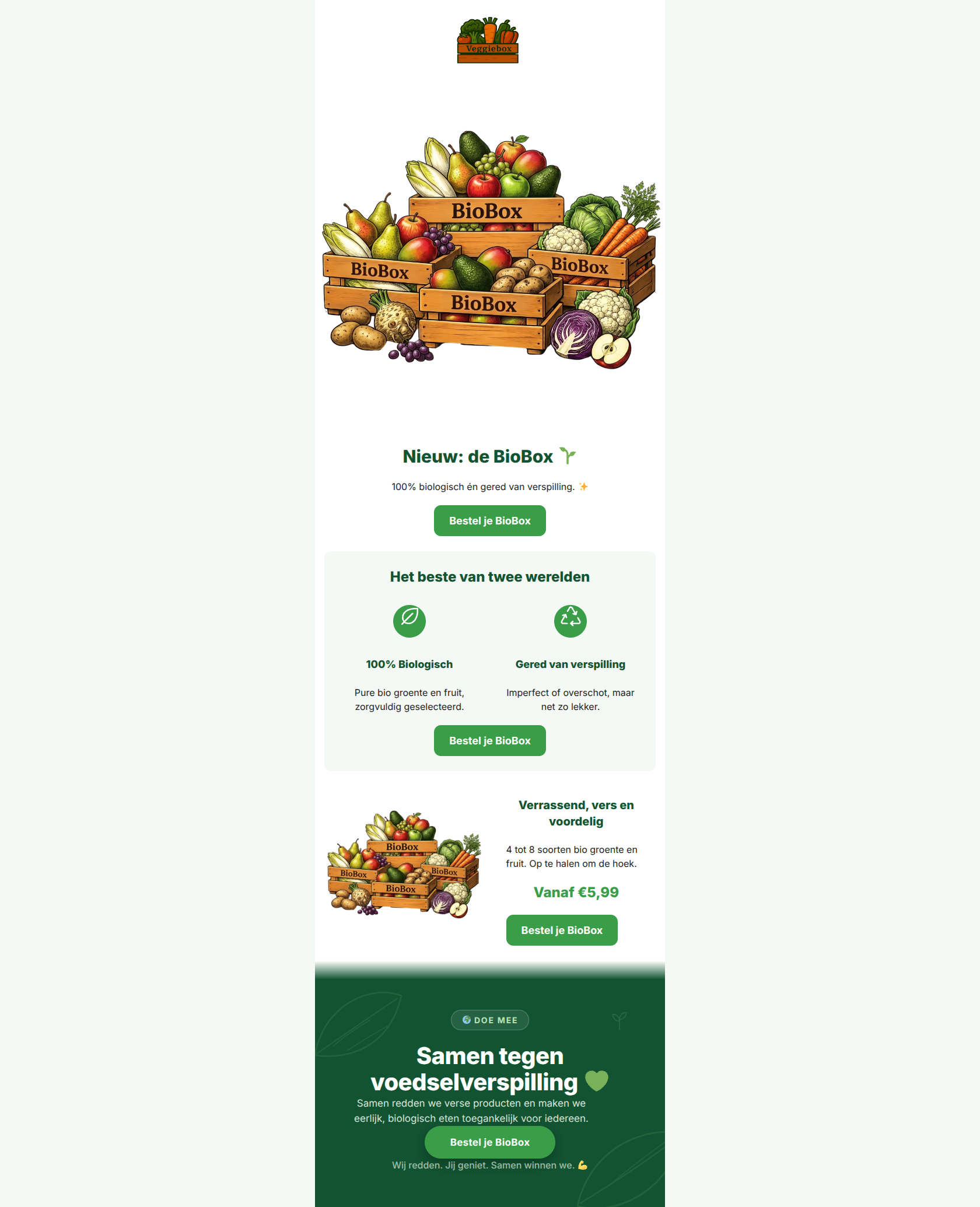
Design Score
90/100This is an exceptionally strong product launch email that deeply understands its target audience. It expertly balances the emotional appeal of sustainability with the pragmatic appeal of affordability. The inverted pyramid structure is executed flawlessly, leading the user from a clear announcement to value propositions, specific pricing, and finally, a mission-driven sign-off. The disciplined, consistent repetition of the primary CTA is a masterclass in conversion-focused design. To push this from an A to an A+, the visual assets need more variety to build deeper authenticity.
Create Your Own
Generate professional email designs like this one in seconds with Kopi AI.
Email Details
- Subject Line
- Nieuw: de BioBox is hier! 🌱
- Brand
- Veggiebox
- Industry
- Food & Beverage
- Email Type
- Product Launch
- Created
- May 18, 2026
Brand Colors
Email Copy
Nieuw: de BioBox 🌱
100% biologisch én gered van verspilling. ✨
→ Bestel je BioBox
Het beste van twee werelden
100% Biologisch
Pure bio groente en fruit, zorgvuldig geselecteerd.
Gered van verspilling
Imperfect of overschot, maar net zo lekker.
→ Bestel je BioBox
Verrassend, vers en voordelig
4 tot 8 soorten bio groente en fruit. Op te halen om de hoek.
Vanaf €5,99
→ Bestel je BioBox
Why This Email Works
This is an exceptionally strong product launch email that deeply understands its target audience. It expertly balances the emotional appeal of sustainability with the pragmatic appeal of affordability. The inverted pyramid structure is executed flawlessly, leading the user from a clear announcement to value propositions, specific pricing, and finally, a mission-driven sign-off. The disciplined, consistent repetition of the primary CTA is a masterclass in conversion-focused design. To push this from an A to an A+, the visual assets need more variety to build deeper authenticity.
Hero (top/initial part) Impact
85/100- Crystal clear announcement of the new product.
- Excellent use of the 🌱 and ✨ emojis to set a positive, fresh tone without being overwhelming.
- Immediate introduction of the primary CTA above the fold.
Content Structure & Flow
88/100- Perfect execution of the inverted pyramid principle.
- Use of the mint background to distinctly group the 'two worlds' value proposition.
- Logical sequencing of information that answers user questions just as they arise.
Visual Hierarchy & Layout
80/100- Strong contrast between sections using brand-aligned background colors.
- Headings ('h1', 'h2', 'h3') are sized appropriately to guide the eye sequentially.
- The dark green footer provides a strong, anchoring visual conclusion to the email.
Call-to-Action Strength
98/100- Flawless repetition of the primary CTA.
- Zero competing secondary actions to distract from the main goal.
- Excellent color contrast using the primary grass green (#3A9D48) against all background variations.
Message Clarity & Tone
92/100- Complex concepts (organic farming, food waste supply chains) are simplified into easily digestible, punchy copy.
- The language feels peer-to-peer and unpretentious.
Readability & Scannability
95/100- Excellent use of icons to break up text and communicate concepts instantly.
- Generous line spacing and readable typography.
- No dense walls of text; every block is bite-sized.
Offer & Value Proposition
94/100- The starting price is displayed prominently and confidently.
- The 'What's in it for me' (organic, cheap) and the 'What's in it for the world' (less waste) are perfectly balanced.
Personalization & Audience Fit
90/100- Directly addresses the audience's core desire: affordable sustainability without guilt.
- The 'Doe Mee' (Join in) footer effectively transforms a transaction into a shared mission.
Copy Conciseness & Word Economy
92/100- Highly distilled messaging.
- Action-oriented language ('Bestel', 'Doe mee', 'Haal op').
Quick Wins
- Swap out the second instance of the BioBox illustration for a real, authentic photograph of the produce to increase visual variety and brand trust.
- Add a brief, charming detail about the 'imperfect' nature of the produce (e.g., 'Kromme komkommers, rechte smaken') to manage expectations and lean into the anti-waste mission.
- Explicitly state that the low price of €5.99 is a direct result of rescuing the food, reinforcing the 'honest pricing' brand pillar.


Create Professional Email Designs
Generate beautiful, on-brand email designs in seconds. Just enter your brand URL and let AI do the rest.