SaaS & Software Promotional Email Template
“Most tools test the variant. We write it.”
Design Score
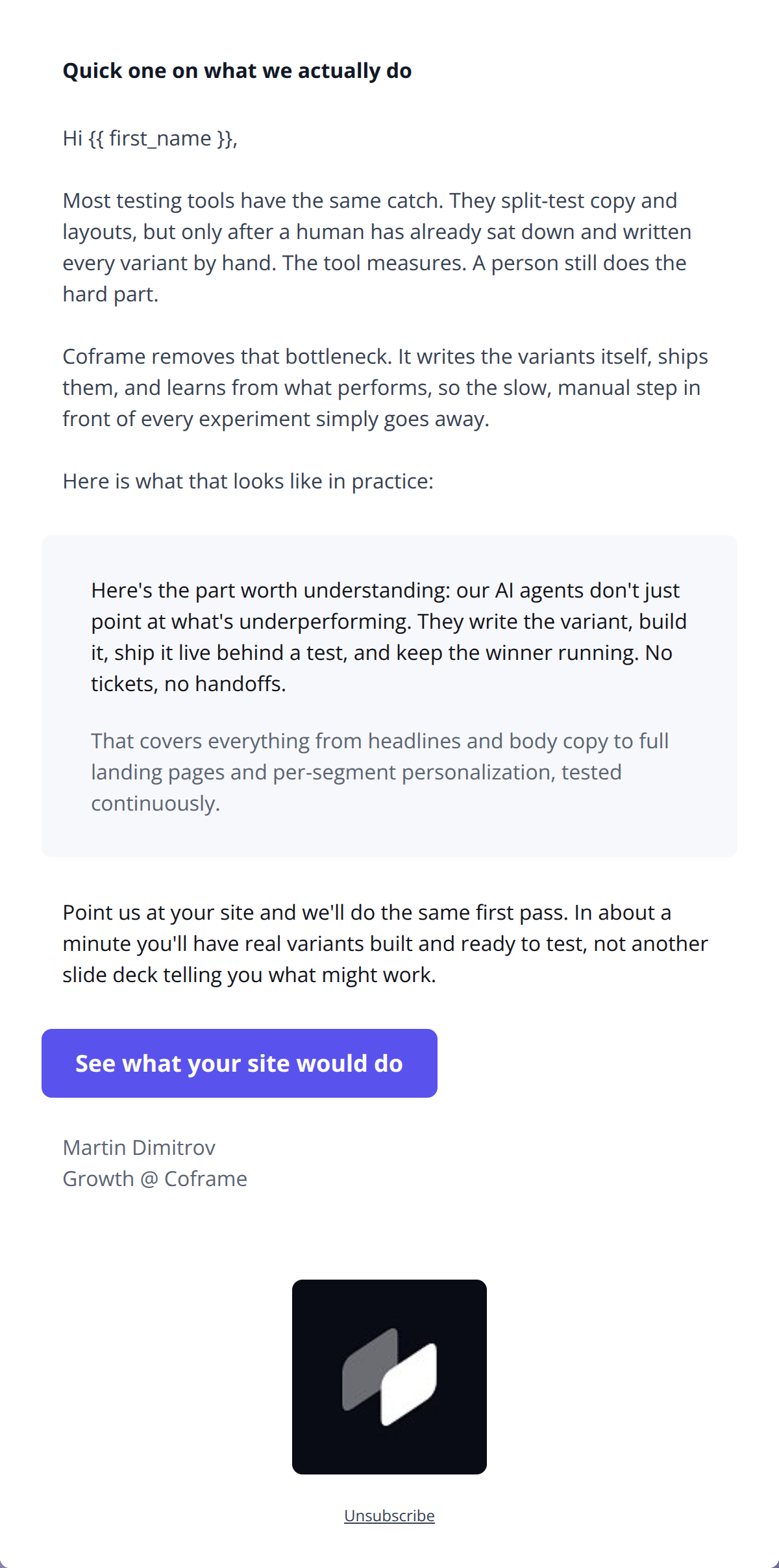
80/100This is a strong, direct email that perfectly captures the brand's 'intelligent and competent' persona while nailing the target audience's operational pain points. The tone is confident, and the value proposition is highly compelling, culminating in a fantastic, low-friction call-to-action. However, the email suffers from a weak, internally-focused opening headline and a noticeable structural flaw: it promises to show 'what it looks like in practice' but only delivers a repetitive text block instead of a visual. Fixing this repetition and delivering on the visual promise will elevate this email from good to outstanding.
Create Your Own
Generate professional email designs like this one in seconds with Kopi AI.
Email Details
- Subject Line
- Most tools test the variant. We write it.
- Brand
- Coframe
- Industry
- SaaS & Software
- Email Type
- Promotional
- Created
- September 4, 2026
Brand Colors
Email Copy
Preview text: Other tools split-test copy a human already wrote. That human is the bottleneck.
Hi ,
A clarification, because it comes up more often than it should.
Most experimentation tools split-test copy a human already wrote. Your throughput is capped by how fast someone can write and build variants, which for most teams is a handful a quarter.
Coframe's agents do that part. They read the page, write the variant, build it, ship it behind a test, and keep the winner.
That covers three things people regularly assume we don't do:
- Headlines and body copy, on any page
- Whole landing pages, generated end to end
- Per-segment personalisation, so different visitors see different pages
If you're using us for one of those and not the others, that's worth five minutes.
→ See everything we build
Martin Dimitrov Growth @ Coframe
Unsubscribe
Why This Email Works
This is a strong, direct email that perfectly captures the brand's 'intelligent and competent' persona while nailing the target audience's operational pain points. The tone is confident, and the value proposition is highly compelling, culminating in a fantastic, low-friction call-to-action. However, the email suffers from a weak, internally-focused opening headline and a noticeable structural flaw: it promises to show 'what it looks like in practice' but only delivers a repetitive text block instead of a visual. Fixing this repetition and delivering on the visual promise will elevate this email from good to outstanding.
Hero (top/initial part) Impact
65/100- The first paragraph immediately drops the reader into a highly relatable problem state without any fluff.
Content Structure & Flow
70/100- Logical pacing from problem identification to solution presentation.
- Use of a grey card effectively breaks up the visual monotony of a text-heavy layout.
Visual Hierarchy & Layout
75/100- Excellent use of whitespace.
- The grey background card effectively draws the eye to key technical details.
Call-to-Action Strength
85/100- Brilliant, value-driven CTA copy.
- Excellent visual contrast ensuring the button is impossible to miss.
Message Clarity & Tone
95/100- Zero jargon.
- Directly addresses the friction of traditional tools ('The tool measures. A person still does the hard part.').
- Authoritative and confident voice.
Readability & Scannability
80/100- Short sentences and clear paragraph breaks prevent cognitive overload.
Offer & Value Proposition
90/100- Clearly articulates the functional difference between Coframe and legacy tools.
- The specific timeframe ('In about a minute') drastically lowers perceived friction.
Personalization & Audience Fit
90/100- Speaks the language of agile development teams flawlessly.
- Uses precise terms ('segments', 'handoffs') that resonate deeply with the target demographic.
Copy Conciseness & Word Economy
68/100- Sentences are active and devoid of filler adjectives like 'amazing' or 'revolutionary'.
Quick Wins
- Rewrite the headline to be user-centric and outcome-driven (e.g., 'Stop writing your own A/B test variants').
- Remove or completely rewrite the text in the grey card to eliminate the direct repetition of the preceding paragraph's core message.
- Shrink the massive, disproportionate footer logo to a standard, unassuming size.
- Bold a core phrase in the body copy (like 'writes the variants itself') to create a cohesive skim-path from headline to CTA.




Create Professional Email Designs
Generate beautiful, on-brand email designs in seconds. Just enter your brand URL and let AI do the rest.