Food & Beverage Promotional Email Template
“Mini's met grote plannen”
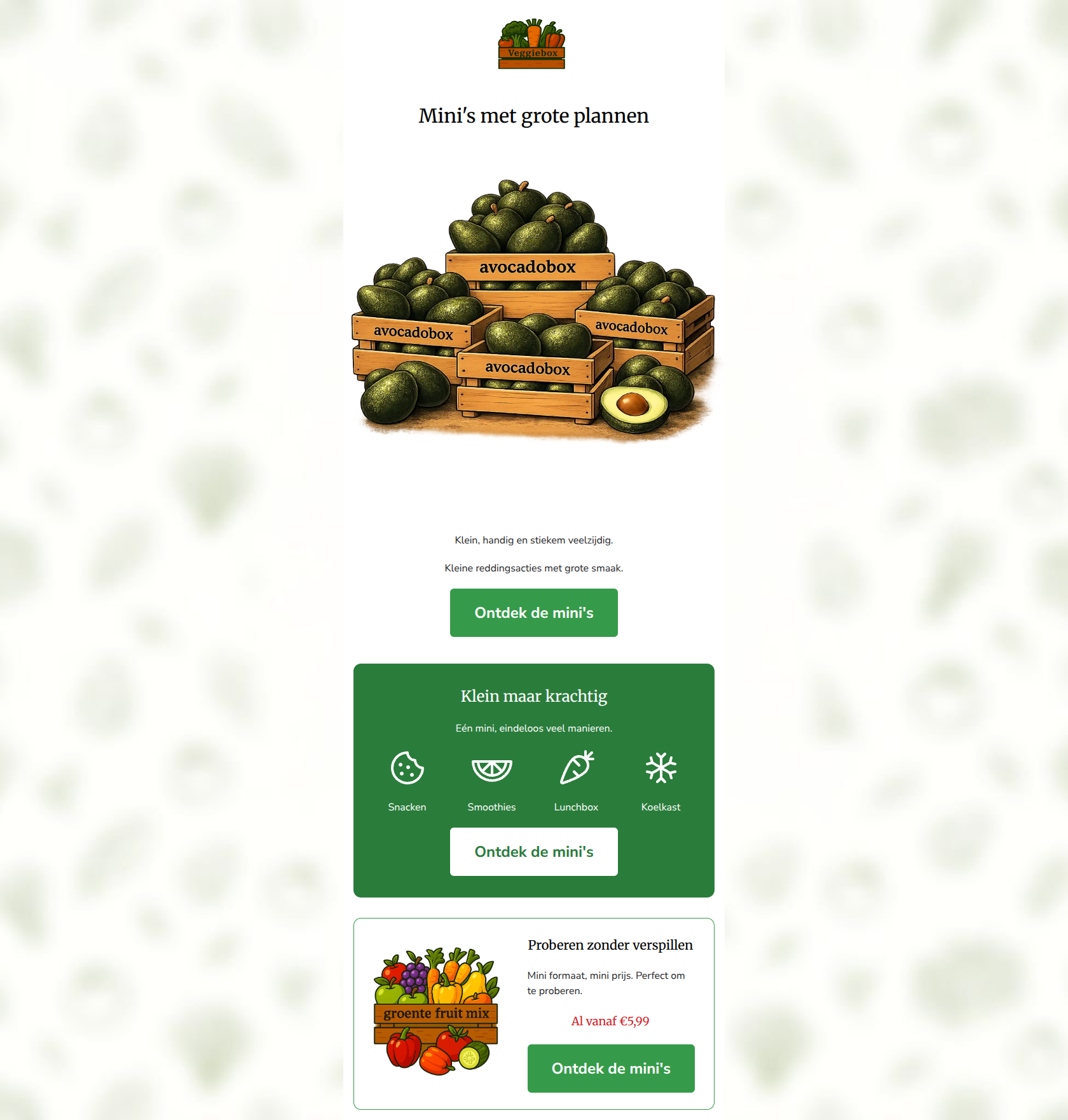
Design Score
82/100This is a strong, highly scannable promotional email that clearly communicates a specific product tier (Mini boxes). The visual hierarchy is solid, the copy is refreshingly concise, and the use of the primary CTA is exemplary. However, the hero section's layout introduces unnecessary friction by separating the headline from its supporting context with a large image, and the core value proposition of 'why choose a mini' relies a bit too heavily on implication rather than explicit statements.
Create Your Own
Generate professional email designs like this one in seconds with Kopi AI.
Email Details
- Subject Line
- Mini's met grote plannen
- Brand
- Veggiebox
- Industry
- Food & Beverage
- Email Type
- Promotional
- Created
- June 18, 2026
Brand Colors
Email Copy
Mini's met grote plannen
Klein, handig en stiekem veelzijdig.
Kleine reddingsacties met grote smaak.
→ Ontdek de mini's
Klein maar krachtig
Eén mini, eindeloos veel manieren.
Snacken
Smoothies
Lunchbox
Koelkast
→ Ontdek de mini's
Proberen zonder verspillen
Mini formaat, mini prijs. Perfect om te proberen.
Al vanaf €5,99
→ Ontdek de mini's
Why This Email Works
This is a strong, highly scannable promotional email that clearly communicates a specific product tier (Mini boxes). The visual hierarchy is solid, the copy is refreshingly concise, and the use of the primary CTA is exemplary. However, the hero section's layout introduces unnecessary friction by separating the headline from its supporting context with a large image, and the core value proposition of 'why choose a mini' relies a bit too heavily on implication rather than explicit statements.
Hero (top/initial part) Impact
75/100- Catchy, engaging headline that fits the energetic brand voice.
- High-quality, on-brand hero illustration.
Content Structure & Flow
85/100- Excellent pacing; the email doesn't ask for the click before explaining the value.
- Distinct, visually separated sections guide the eye effortlessly down the page.
Visual Hierarchy & Layout
80/100- Strong use of the brand's primary green to anchor the middle of the email.
- The bordered card at the bottom effectively frames the specific price offer.
Call-to-Action Strength
95/100- Perfect repetition of a single primary goal.
- High-contrast, prominent button design.
- No competing secondary actions distracting from the main goal.
Message Clarity & Tone
82/100- Tone perfectly matches the 'Samen tegen voedselverspilling!' ethos.
- Playful language ('stiekem veelzijdig') makes the brand feel approachable.
Readability & Scannability
88/100- Excellent use of iconography to replace text.
- Short, punchy sentences that respect the reader's time.
- High-contrast text against all background colors.
Offer & Value Proposition
85/100- Clear, upfront pricing in the final section.
- Positions the product as a low-friction way to try the service.
Personalization & Audience Fit
70/100- The messaging strongly appeals to the pragmatic, eco-conscious target audience.
Copy Conciseness & Word Economy
90/100- Zero filler language or throat-clearing openers.
- Relies on visual layout rather than paragraphs to convey structure.
Quick Wins
- Move the sub-headline ('Klein, handig en stiekem veelzijdig') to sit immediately below the H1, above the hero image.
- Increase the font size of that sub-headline to establish a clearer typographic hierarchy.
- Combine the two introductory sentences into one fluid statement to improve reading rhythm.


Create Professional Email Designs
Generate beautiful, on-brand email designs in seconds. Just enter your brand URL and let AI do the rest.