Health & Wellness Product Launch Email Template
“Members go first. New line open.”
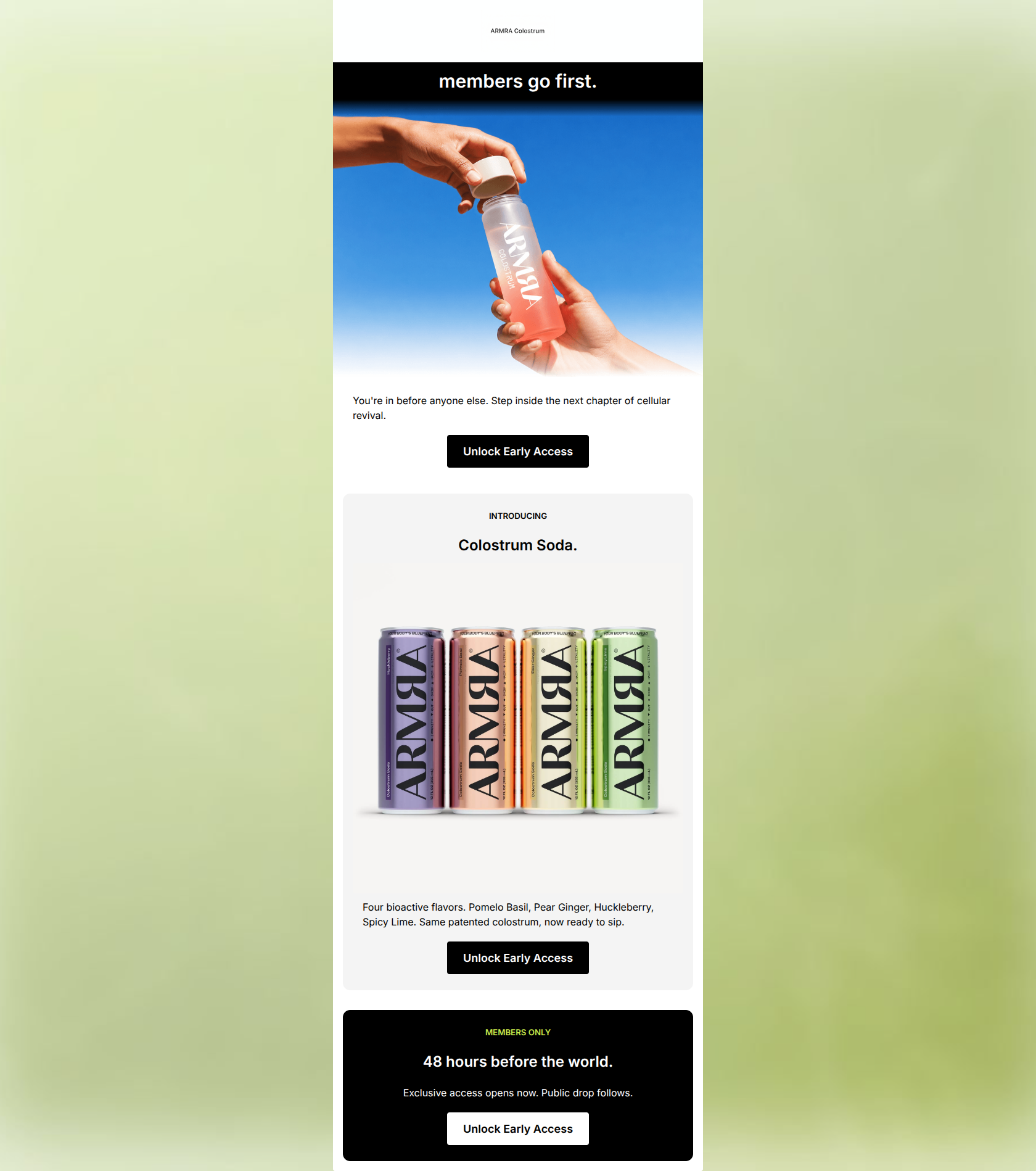
Design Score
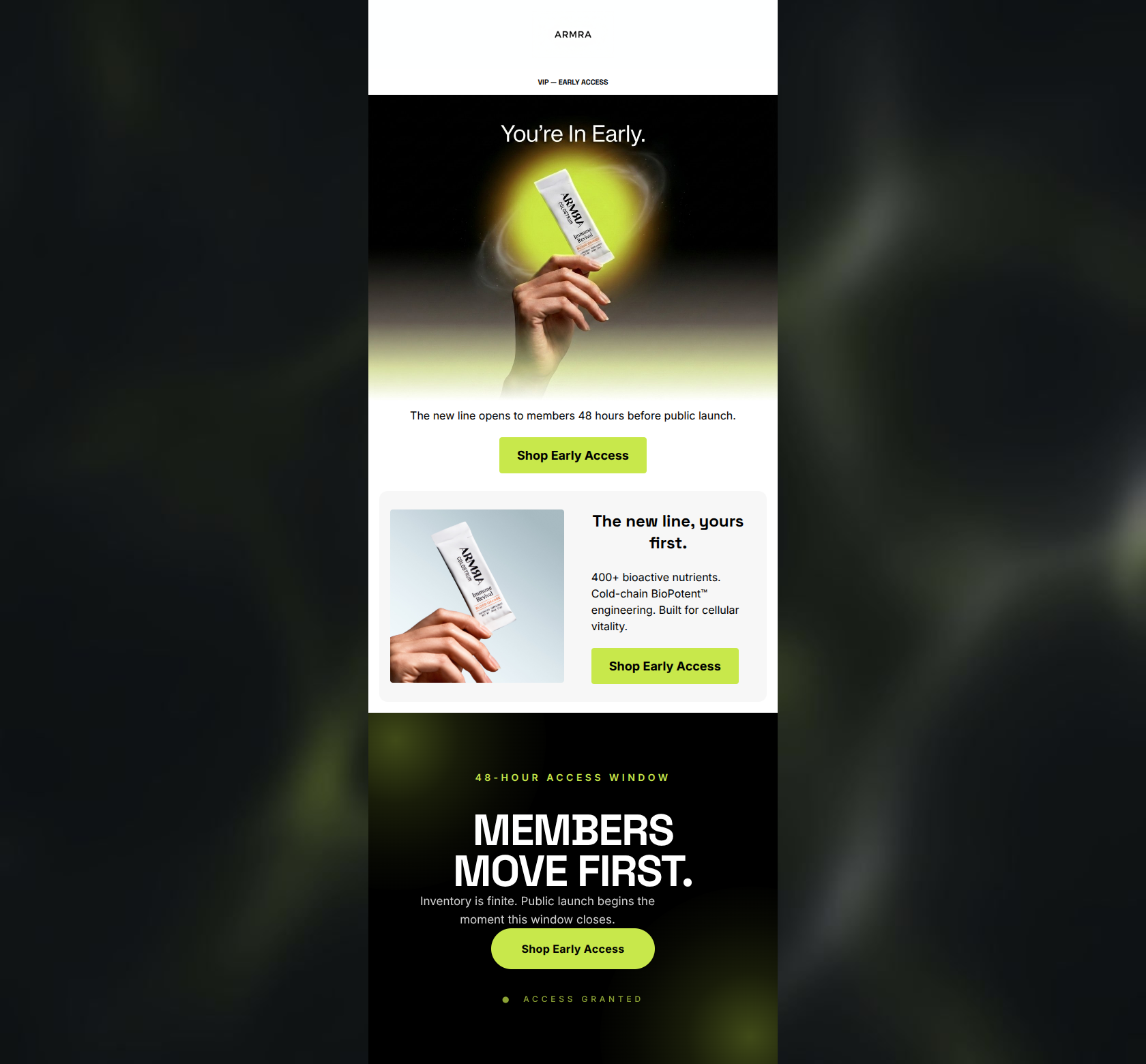
84/100This is a strong, highly stylized product launch email that successfully leverages exclusivity to drive clicks. The brand tone is confident, the copy is refreshingly concise, and the use of a repeated, high-contrast primary CTA is textbook execution for conversion. However, the email suffers from a disjointed visual narrative: the hero section features a glass jar of powder, completely hiding the fact that the 'next chapter' is actually a canned soda until the user scrolls. Aligning the visual tease in the hero with the actual product format, and tightening up the text alignment for a smoother scan path, will elevate this from a good launch email to a great one.
Create Your Own
Generate professional email designs like this one in seconds with Kopi AI.
Email Details
- Subject Line
- Members go first. New line open.
- Brand
- ARMRA [eval-prod 2026-06-04]
- Industry
- Health & Wellness
- Email Type
- Product Launch
- Created
- June 4, 2026
Brand Colors
Email Copy
Preview text: You're in before anyone else. Step inside the next chapter of cellular revival.
members go first.
You're in before anyone else. Step inside the next chapter of cellular revival.
→ Unlock Early Access
INTRODUCING
Colostrum Soda.
Four bioactive flavors. Pomelo Basil, Pear Ginger, Huckleberry, Spicy Lime. Same patented colostrum, now ready to sip.
→ Unlock Early Access
MEMBERS ONLY
48 hours before the world.
Exclusive access opens now. Public drop follows.
→ Unlock Early Access
Why This Email Works
This is a strong, highly stylized product launch email that successfully leverages exclusivity to drive clicks. The brand tone is confident, the copy is refreshingly concise, and the use of a repeated, high-contrast primary CTA is textbook execution for conversion. However, the email suffers from a disjointed visual narrative: the hero section features a glass jar of powder, completely hiding the fact that the 'next chapter' is actually a canned soda until the user scrolls. Aligning the visual tease in the hero with the actual product format, and tightening up the text alignment for a smoother scan path, will elevate this from a good launch email to a great one.
Hero Impact
68/100- Strong, punchy headline that immediately establishes the value proposition of being a member.
- High-contrast black header section instantly commands attention.
Content Structure & Flow
82/100- Logical 'Tease -> Reveal -> Urgency' progression.
- Clear delineation between sections using background colors (black to white to grey to black).
Visual Hierarchy & Layout
85/100- Excellent use of background color changes to separate conceptual sections.
- The product shot of the cans is vibrant and draws immediate focus against the muted background.
Call-to-Action Strength
95/100- Consistent, repeated primary CTA phrasing ('Unlock Early Access').
- High contrast on all buttons (black on white/grey, white on black) ensures they pass the squint test effortlessly.
Message Clarity & Tone
88/100- Excellent use of urgency and exclusivity in the copywriting ('48 hours before the world').
- Tone matches the premium, 'insider' feel expected by the target demographic.
Readability & Scannability
75/100- Use of all-caps kickers ('INTRODUCING', 'MEMBERS ONLY') helps segment information quickly.
- Ample whitespace around text blocks prevents the email from feeling cluttered.
Offer & Value Proposition
80/100- The core offer of 'early access' is highly compelling for a dedicated customer base.
- Flavor profiles and the core active ingredient are clearly stated.
Personalization & Audience Fit
85/100- The framing of the entire email around 'Members Only' status is a strong personalization tactic.
- The aesthetic and tone match the aspirational, bio-hacking demographic.
Copy Conciseness & Word Economy
95/100- Distilled, punchy sentences (e.g., 'Exclusive access opens now. Public drop follows.').
- No repetitive messaging across sections; each text block introduces new, necessary information.
Quick Wins
- Center-align the body text in the second and third sections to create a flush, unified central scan path that aligns with your headings and CTAs.
- Change the hero image to feature the actual cans (even if just a tease or close-up) rather than the glass powder jar, to prevent confusing the reader about the format of the new product.
Create Professional Email Designs
Generate beautiful, on-brand email designs in seconds. Just enter your brand URL and let AI do the rest.