Beauty & Skincare Promotional Email Template
“Meet your skin's new staple”
Design Score
86/100This email is a masterclass in disciplined, minimalist marketing. It perfectly embodies Native's 'clean and simple' brand ethos, utilizing a crisp layout, stark color contrast, and highly economical copy to drive focus toward the product. The rigid adherence to a single primary CTA throughout the email creates a foolproof conversion path. The only areas holding it back from a 90+ score are minor visual alignment shifts and a reliance on slightly generic headline copy.
Create Your Own
Generate professional email designs like this one in seconds with Kopi AI.
Email Details
- Subject Line
- Meet your skin's new staple
- Brand
- Native
- Industry
- Beauty & Skincare
- Email Type
- Promotional
- Created
- May 26, 2026
Brand Colors
Email Copy
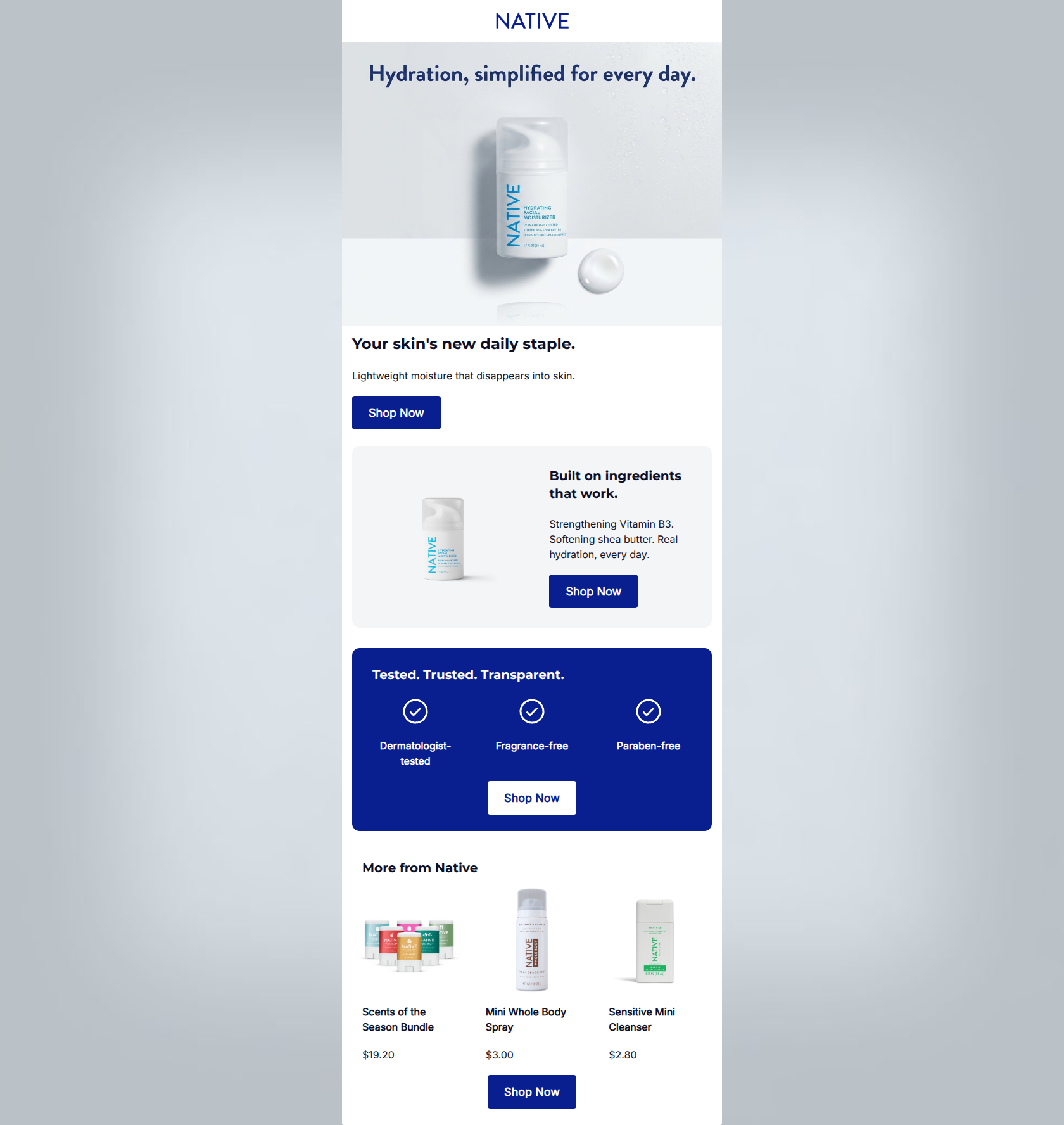
Your skin's new daily staple.
Lightweight moisture that disappears into skin.
→ Shop Now
Built on ingredients that work.
Strengthening Vitamin B3. Softening shea butter. Real hydration, every day.
→ Shop Now
Tested. Trusted. Transparent.
Dermatologist-tested
Fragrance-free
Paraben-free
→ Shop Now
More from Native
Scents of the Season Bundle
$19.20
Mini Whole Body Spray
$3.00
Sensitive Mini Cleanser
$2.80
→ Shop Now
Why This Email Works
This email is a masterclass in disciplined, minimalist marketing. It perfectly embodies Native's 'clean and simple' brand ethos, utilizing a crisp layout, stark color contrast, and highly economical copy to drive focus toward the product. The rigid adherence to a single primary CTA throughout the email creates a foolproof conversion path. The only areas holding it back from a 90+ score are minor visual alignment shifts and a reliance on slightly generic headline copy.
Hero Impact
80/100- Embedded image text clearly states the overarching value proposition.
- High-quality, textural product photography immediately establishes brand quality and product context.
Content Structure & Flow
86/100- Excellent use of distinct background colors (white, gray, navy) to visually chunk the 'what', 'why', and 'proof' sections.
- The narrative builds a strong, logical case for the product as the user scrolls.
Visual Hierarchy & Layout
82/100- Important elements (product shots, CTAs) visually dominate the secondary supporting text.
- The use of negative space in the top half of the email correctly funnels attention downward.
Call-to-Action Strength
98/100- The exact same primary destination and intent is repeated four times, making the next step unmistakable.
- Buttons utilize maximum color contrast (navy on white/gray, white on navy) to ensure they pop in a 'squint test'.
Message Clarity & Tone
85/100- Avoids complex scientific jargon, making the product benefits highly accessible.
- The phrase 'Built on ingredients that work' projects strong, quiet confidence.
Readability & Scannability
94/100- Brilliant use of iconography in the trust section to communicate complex claims instantly.
- Short, punchy sentences and bullet-style formats completely eliminate reading fatigue.
Offer & Value Proposition
80/100- Clearly pairs specific ingredients with tangible benefits ('Strengthening Vitamin B3. Softening shea butter.').
- The inclusion of low-priced mini items in the cross-sell section provides an easy, low-risk entry point for a new customer.
Personalization & Audience Fit
85/100- Directly addresses major customer pain points regarding chemical-laden products by heavily emphasizing 'Dermatologist-tested' and 'Paraben-free'.
- The minimalist, clinical-yet-warm aesthetic perfectly matches the target demographic's visual preferences.
Copy Conciseness & Word Economy
96/100- Zero filler words or throat-clearing openers.
- Phrases like 'Lightweight moisture that disappears into skin' do the heavy lifting of a full paragraph in just seven words.
Quick Wins
- Standardize the text alignment across all sections (either left-aligned or center-aligned) to create a seamless downward scan path.
- Add a brief transitional header (e.g., 'Build your routine') above the 'More from Native' product grid.


Create Professional Email Designs
Generate beautiful, on-brand email designs in seconds. Just enter your brand URL and let AI do the rest.