Food & Beverage Promotional Email Template
“Make memories with pancakes 🥞”
Design Score
75/100Warm, on-brand creative with a clear family theme and distinct CTAs to recipes and mixes. Biggest opportunities are strengthening the primary value message, adding a clear path to purchase (“Where to Buy”), making images (esp. the hero and collage) clickable, and tightening a few content choices that dilute brand/product focus.
Create Your Own
Generate professional email designs like this one in seconds with Kopi AI.
Email Details
- Subject Line
- Make memories with pancakes 🥞
- Brand
- Pearl Milling Company
- Industry
- Food & Beverage
- Email Type
- Promotional
- Created
- November 2, 2025
Brand Colors
Email Copy
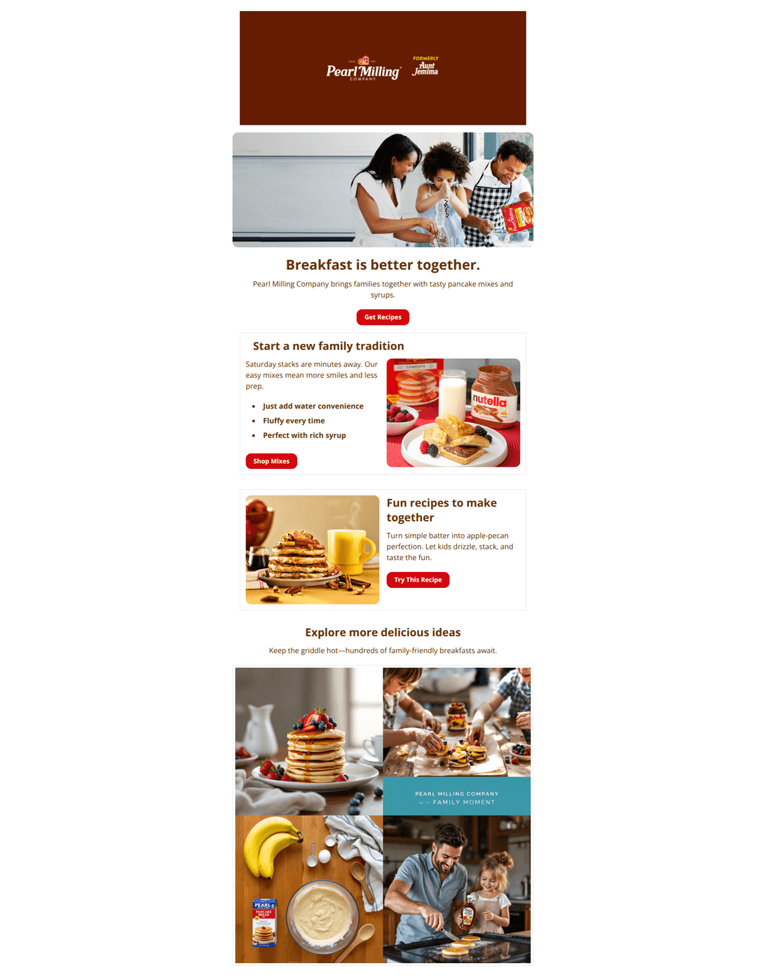
Breakfast is better together.
Pearl Milling Company brings families together with tasty pancake mixes and syrups.
→ Get Recipes
Start a new family tradition
Saturday stacks are minutes away. Our easy mixes mean more smiles and less prep.
- Just add water convenience
- Fluffy every time
- Perfect with rich syrup
→ Shop Mixes
Fun recipes to make together
Turn simple batter into apple-pecan perfection. Let kids drizzle, stack, and taste the fun.
→ Try This Recipe
Explore more delicious ideas
Keep the griddle hot—hundreds of family-friendly breakfasts await.
Why This Email Works
Warm, on-brand creative with a clear family theme and distinct CTAs to recipes and mixes. Biggest opportunities are strengthening the primary value message, adding a clear path to purchase (“Where to Buy”), making images (esp. the hero and collage) clickable, and tightening a few content choices that dilute brand/product focus.
Hero (top/initial part) Impact
78/100- Warm, family-focused image strongly matches brand positioning.
- Clear single primary CTA (“Get Recipes”) avoids distraction at the top.
Content Structure & Flow
80/100- Logical progression from emotional to practical content.
- Benefit bullets in the mixes section keep the product pitch succinct.
Visual Hierarchy & Layout
84/100- Distinct sections and consistent spacing make the email easy to scan.
- High-contrast, brand-red buttons create clear focal points.
Call-to-Action Strength
72/100- CTA language is direct and aligns with each section’s intent.
- Buttons are visually consistent and easy to find.
Message Clarity & Tone
78/100- Friendly, inviting voice throughout.
- Bulleted benefit list communicates convenience and quality simply.
Readability & Scannability
86/100- Concise copy with bullets supports quick scanning.
- Clear section headings break up content effectively.
Offer & Value Proposition
65/100- Benefit bullets (“Just add water,” “Fluffy every time”) communicate a core value quickly.
- Recipe tie-ins demonstrate product versatility, adding perceived value.
Personalization & Audience Fit
55/100- Family-oriented positioning aligns with the brand’s core audience.
- Content is safe and relevant across broad household segments.
Quick Wins
- Make the hero image clickable to the recipes hub.
- Add a closing CTA under the image collage (e.g., “Browse More Recipes”).
- Ensure every image in the collage is linked to a relevant recipe or category.
- Add a “Where to Buy” CTA in the hero or mixes section.
- Replace the Nutella-forward photo in the “Shop Mixes” card with a Pearl Milling–led product shot.


Create Professional Email Designs
Generate beautiful, on-brand email designs in seconds. Just enter your brand URL and let AI do the rest.