Home & Garden Welcome Email Template
“Little device. Big love. 10% off inside.”
Design Score
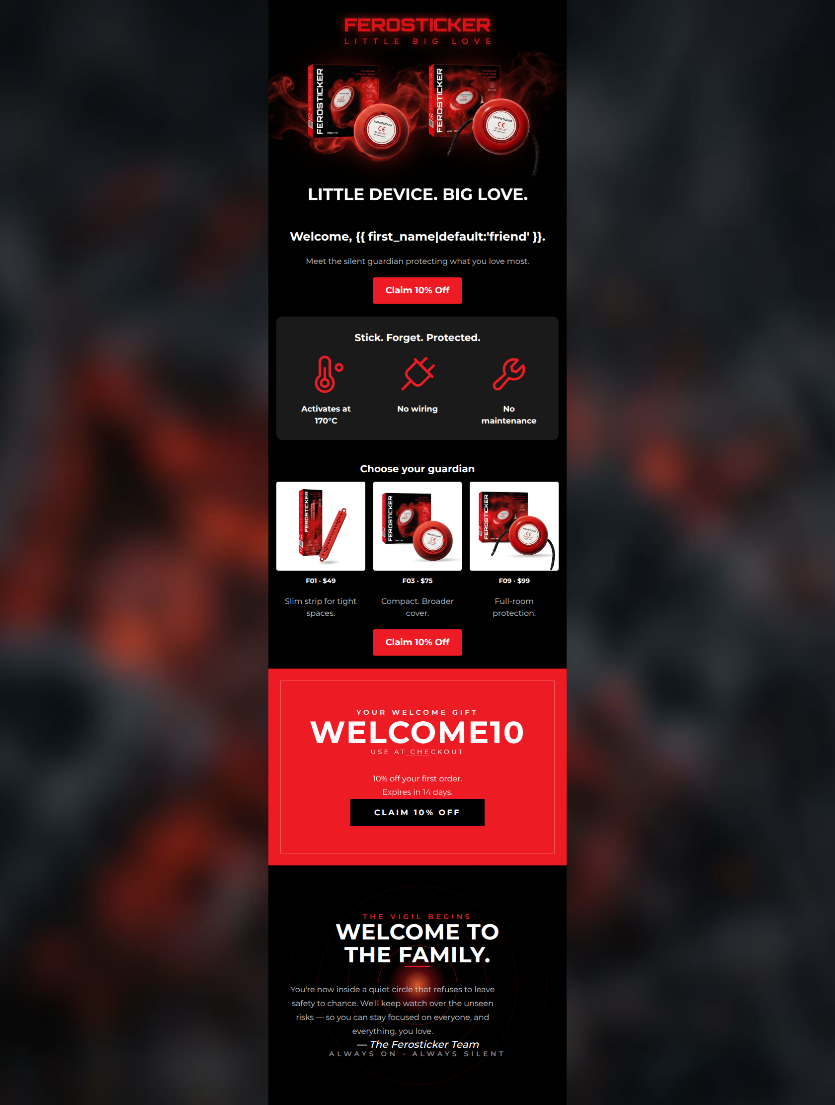
84/100This is a strong, highly scannable welcome email that effectively utilizes the brand's dramatic visual style and protective tone. The inverted pyramid structure funnels attention well, and the copy is generally punchy and concise. However, a significant UX friction point exists regarding the promotion: the primary CTA buttons promise 10% off, but the actual discount code is buried at the bottom of the email. Resolving this disconnect and refining the product imagery will elevate this from a good email to an excellent, high-converting asset.
Create Your Own
Generate professional email designs like this one in seconds with Kopi AI.
Email Details
- Subject Line
- Little device. Big love. 10% off inside.
- Brand
- Ferosticker
- Industry
- Home & Garden
- Email Type
- Welcome
- Created
- May 12, 2026
Brand Colors
Email Copy
Welcome, friend.
Meet the silent guardian protecting what you love most.
→ Claim 10% Off
Stick. Forget. Protected.
Activates at 170°C
No wiring
No maintenance
Choose your guardian
F01 · $49
Slim strip for tight spaces.
F03 · $75
Compact. Broader cover.
F09 · $99
Full-room protection.
→ Claim 10% Off
Why This Email Works
This is a strong, highly scannable welcome email that effectively utilizes the brand's dramatic visual style and protective tone. The inverted pyramid structure funnels attention well, and the copy is generally punchy and concise. However, a significant UX friction point exists regarding the promotion: the primary CTA buttons promise 10% off, but the actual discount code is buried at the bottom of the email. Resolving this disconnect and refining the product imagery will elevate this from a good email to an excellent, high-converting asset.
Hero Impact
82/100- High-quality, dramatic imagery that immediately establishes the brand's premium, serious tone.
- Clear, high-contrast primary CTA placed above the fold.
Content Structure & Flow
85/100- Logical sequencing of information that mimics a landing page conversion funnel.
- Excellent use of a distinct background color (charcoal) to visually separate the core features from the rest of the content.
Visual Hierarchy & Layout
78/100- The bold red promo block at the bottom creates a dramatic visual anchor that demands attention.
- The dark sign-off provides excellent visual breathing room at the end of the email.
Call-to-Action Strength
95/100- Consistent button copy across all primary CTAs.
- Excellent color contrast using the brand's primary red against the dark backgrounds.
- All primary buttons point to the same destination, eliminating decision fatigue.
Message Clarity & Tone
88/100- Nails the 'vigilant guardian' persona without sounding alarmist.
- Translates technical features (170°C activation) into immediate user benefits (no maintenance).
Readability & Scannability
90/100- Excellent use of icons to anchor key technical features.
- Bite-sized product descriptions (e.g., 'Slim strip for tight spaces') remove cognitive load.
Offer & Value Proposition
70/100- Clear, tangible incentive for new subscribers.
- The core product value proposition is unambiguous and highly desirable (no wiring, no maintenance).
Personalization & Audience Fit
80/100- Tone and aesthetic perfectly match the pragmatic, safety-conscious target audience.
- Basic personalization is present in the greeting.
Copy Conciseness & Word Economy
92/100- The three-column icon section uses absolute minimal text for maximum impact.
- Product descriptions are distilled down to their most vital differentiators.
Quick Wins
- Add 'Use code WELCOME10' directly beneath the first and second CTA buttons to eliminate friction for users who don't scroll to the bottom.
- Swap the product imagery in the three-column grid from white-background JPEGs to transparent PNGs to maintain the cinematic dark aesthetic.
- Change the generic 'Welcome, {{ first_name }}' H2 to a more compelling, benefit-driven headline.




Create Professional Email Designs
Generate beautiful, on-brand email designs in seconds. Just enter your brand URL and let AI do the rest.