Other Promotional Email Template
“Let's Explore a Partnership Together”
Design Score
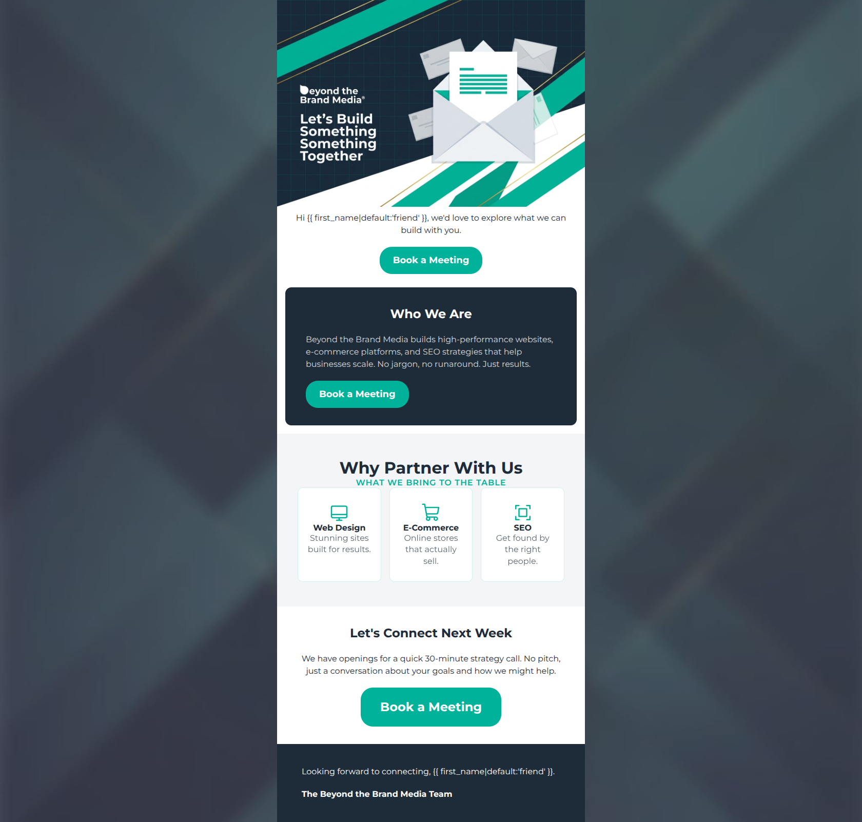
85/100This is a strong, highly competent B2B promotional email that successfully aligns with the brand's 'no jargon, approachable' identity. The layout is clean, the visual hierarchy clearly guides the eye, and the call-to-action strategy is exceptional in its consistency. However, the email leaves some conversion potential on the table by opening with a somewhat vague hero message and relying on a self-centric 'Who We Are' section before firmly establishing the value for the reader. Minor copy tweaks and a critical fix to a typo in the hero image will elevate this from good to excellent.
Create Your Own
Generate professional email designs like this one in seconds with Kopi AI.
Email Details
- Subject Line
- Let's Explore a Partnership Together
- Brand
- Beyond the Brand Media®
- Industry
- Other
- Email Type
- Promotional
- Created
- April 23, 2026
Brand Colors
Email Copy
Hi friend, we'd love to explore what we can build with you.
→ Book a Meeting
Who We Are
Beyond the Brand Media builds high-performance websites, e-commerce platforms, and SEO strategies that help businesses scale. No jargon, no runaround. Just results.
→ Book a Meeting
Let's Connect Next Week
We have openings for a quick 30-minute strategy call. No pitch, just a conversation about your goals and how we might help.
→ Book a Meeting
Looking forward to connecting, friend.
The Beyond the Brand Media Team
Why This Email Works
This is a strong, highly competent B2B promotional email that successfully aligns with the brand's 'no jargon, approachable' identity. The layout is clean, the visual hierarchy clearly guides the eye, and the call-to-action strategy is exceptional in its consistency. However, the email leaves some conversion potential on the table by opening with a somewhat vague hero message and relying on a self-centric 'Who We Are' section before firmly establishing the value for the reader. Minor copy tweaks and a critical fix to a typo in the hero image will elevate this from good to excellent.
Hero (top/initial part) Impact
65/100- Primary CTA is immediately visible above the fold.
- Visual aesthetic immediately establishes the brand's modern, tech-forward identity.
Content Structure & Flow
88/100- Excellent use of color-blocking to separate distinct thoughts.
- Logical progression from brand introduction to a specific, low-friction next step.
Visual Hierarchy & Layout
92/100- Masterful use of negative space to group related elements.
- The three-column service grid is easily digestible and breaks up the vertical flow beautifully.
Call-to-Action Strength
98/100- Perfect adherence to a single, unified conversion goal.
- High-contrast color choice (#00B29A on #1E2C3A and #FFFFFF) guarantees the buttons pass the squint test.
- Consistent button copy eliminates any ambiguity about what happens after clicking.
Message Clarity & Tone
85/100- Excellent de-risking of the conversion action ('No pitch, just a conversation').
- Brand voice ('No jargon, no runaround') is clearly articulated and lived up to in the copy.
Readability & Scannability
90/100- Short paragraph lengths respect the reader's time.
- Headings accurately summarize the sections they introduce.
Offer & Value Proposition
82/100- The offer is highly specific ('30-minute strategy call').
- The copy explicitly removes a common friction point ('No pitch').
Personalization & Audience Fit
80/100- Tone perfectly matches the psychographic profile of a time-strapped business owner.
- Focus on 'results' over 'process' appeals directly to decision-makers.
Copy Conciseness & Word Economy
92/100- Zero filler words in the service descriptions.
- The final pitch ('We have openings for a quick 30-minute strategy call...') is a masterclass in tight, effective B2B copywriting.
Quick Wins
- Fix the glaring 'Something Something' typo in the hero image asset.
- Change the fallback text in the greeting from 'friend' to 'there' to better suit a premium B2B context.
- Change the 'Who We Are' heading to 'How We Help You Scale' to make the copy more reader-centric.




Create Professional Email Designs
Generate beautiful, on-brand email designs in seconds. Just enter your brand URL and let AI do the rest.