Food & Beverage Promotional Email Template
“Kōshū Orange aus Yamanashi – jetzt 10 %”
Design Score
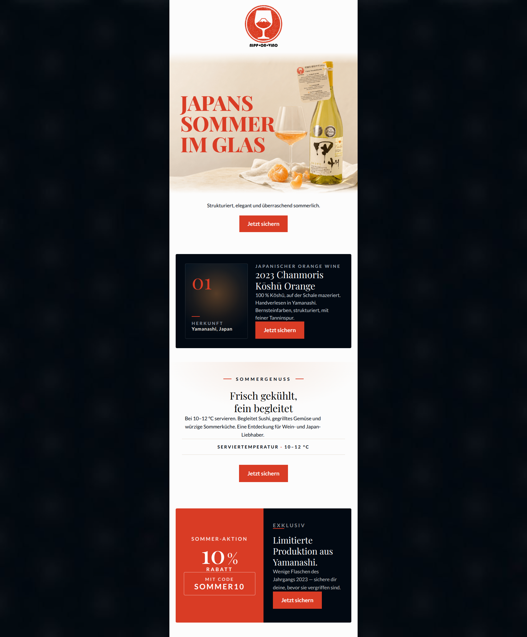
86/100This is a strong, visually striking promotional email that largely succeeds in conveying the premium, artisanal nature of the Nipp-On-Vino brand. The use of color is highly disciplined, with the vermilion red CTAs standing out beautifully against the monochromatic backgrounds. The content structure logically guides the reader from a high-impact visual into technical details, culinary applications, and finally, a compelling offer. The CTA execution is flawless, utilizing consistent messaging and routing to drive a singular action. The main areas for improvement involve elevating the tone in the final scarcity block to better align with the brand's 'quiet luxury' ethos, and improving the narrative connective tissue between the modular sections.
Create Your Own
Generate professional email designs like this one in seconds with Kopi AI.
Email Details
- Subject Line
- Kōshū Orange aus Yamanashi – jetzt 10 %
- Brand
- Nipp-On-Vino
- Industry
- Food & Beverage
- Email Type
- Promotional
- Created
- July 13, 2026
Brand Colors
Email Copy
Strukturiert, elegant und überraschend sommerlich.
→ Jetzt sichern
Why This Email Works
This is a strong, visually striking promotional email that largely succeeds in conveying the premium, artisanal nature of the Nipp-On-Vino brand. The use of color is highly disciplined, with the vermilion red CTAs standing out beautifully against the monochromatic backgrounds. The content structure logically guides the reader from a high-impact visual into technical details, culinary applications, and finally, a compelling offer. The CTA execution is flawless, utilizing consistent messaging and routing to drive a singular action. The main areas for improvement involve elevating the tone in the final scarcity block to better align with the brand's 'quiet luxury' ethos, and improving the narrative connective tissue between the modular sections.
Hero Impact
78/100- The evocative headline 'JAPANS SOMMER IM GLAS' directly on the image successfully bridges the product's origin with the seasonal use case.
- The studio-quality photography perfectly aligns with the brand's high-end, minimalist aesthetic.
Content Structure & Flow
85/100- The 'Z-pattern' or alternating block design keeps the user engaged as they scroll.
- The progression of information maps well to a connoisseur's buying journey: what is it, how is it made, how do I drink it.
Visual Hierarchy & Layout
88/100- Masterful use of the vermilion red (#D93C25) as an accent color for key elements like the '01' marker and the CTAs.
- Generous use of negative space around the text blocks enhances readability and the feeling of luxury.
Call-to-Action Strength
100/100- Consistent use of the compelling, premium-aligned copy 'Jetzt sichern' (Secure now) across all four buttons.
- Every button shares the same destination URL, funneling all intent toward the primary conversion goal.
- High-contrast vermilion buttons ensure the primary action is unmissable on both dark and light backgrounds.
Message Clarity & Tone
82/100- Use of technical winemaking terms ('auf der Schale mazeriert', 'feiner Tanninspur') respects the audience's intelligence and culinary knowledge.
- The tone is generally understated and confident, allowing the product's attributes to shine.
Readability & Scannability
88/100- The metadata row ('SERVIERTEMPERATUR · 10–12 °C') is a brilliant, scannable element that provides immediate, practical value.
- The typography is crisp, and the contrast ratios between text and background are strong throughout.
Offer & Value Proposition
80/100- The offer is presented boldly in the final block, with the code clearly visible.
- The value proposition seamlessly blends the unique product origin (Yamanashi) with a timely use case (summer dining).
Personalization & Audience Fit
85/100- The pairing suggestions ('Sushi, gegrilltes Gemüse') specifically appeal to the audience's epicurean lifestyle.
- The focus on 'Limitierte Produktion' directly targets the audience's desire for rare, non-mainstream discoveries.
Copy Conciseness & Word Economy
90/100- The tasting notes are distilled into three powerful attributes ('Bernsteinfarben, strukturiert, mit feiner Tanninspur'), avoiding overwhelming walls of text.
- The serving instructions are direct and actionable without unnecessary preamble.
Quick Wins
- Refine the scarcity messaging in the final discount block to align with the brand's 'quiet luxury' voice (e.g., change 'bevor sie vergriffen sind' to 'streng limitierte Allokation').
- Increase the font size or weight of the subheadline directly below the hero image to give it more visual prominence.
- Add a subtle visual hook or text at the very top of the email to tease the 10% summer offer so it isn't entirely hidden until the end.


Create Professional Email Designs
Generate beautiful, on-brand email designs in seconds. Just enter your brand URL and let AI do the rest.