Food & Beverage Promotional Email Template
“Klein. Zonnig. Gered. — 15% op de mini's”
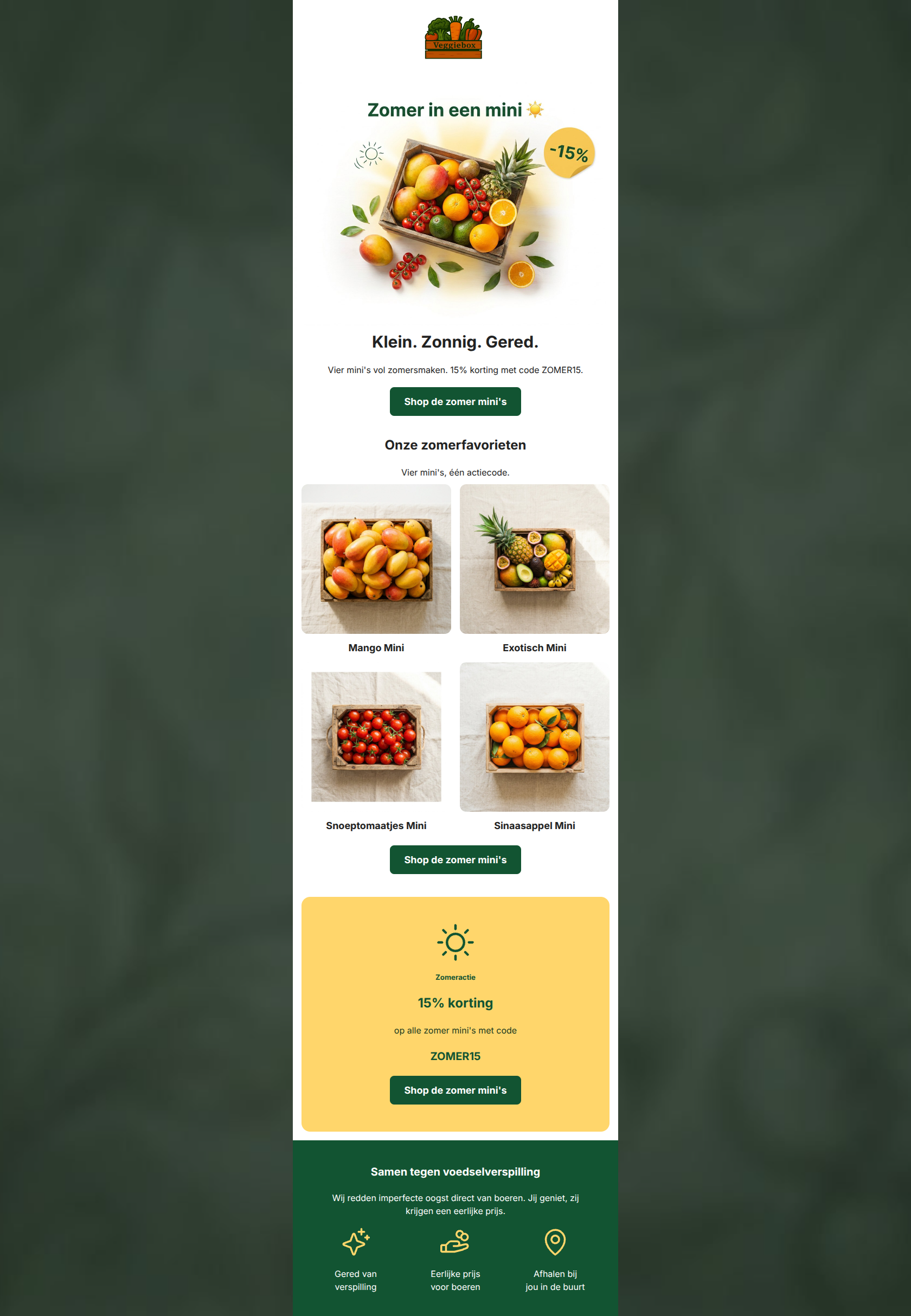
Design Score
86/100This is a strong, highly effective promotional email that aligns perfectly with Veggiebox's brand identity. It executes the basics exceptionally well: a punchy hero, clear product photography, and a prominent, singular call to action repeated logically throughout. The use of an inverted pyramid structure guides the reader effortlessly from the initial hook to the final conversion point. To push this from an A- to an A+, the focus should shift to aligning destination URLs and enhancing the emotional context of the offer.
Create Your Own
Generate professional email designs like this one in seconds with Kopi AI.
Email Details
- Subject Line
- Klein. Zonnig. Gered. — 15% op de mini's
- Brand
- Veggiebox
- Industry
- Food & Beverage
- Email Type
- Promotional
- Created
- May 19, 2026
Brand Colors
Email Copy
Klein. Zonnig. Gered.
Vier mini's vol zomersmaken. 15% korting met code ZOMER15.
→ Shop de zomer mini's
Onze zomerfavorieten
Vier mini's, één actiecode.
Mango Mini
Exotisch Mini
Snoeptomaatjes Mini
Sinaasappel Mini
→ Shop de zomer mini's
Zomeractie
15% korting
op alle zomer mini's met code
ZOMER15
→ Shop de zomer mini's
Samen tegen voedselverspilling
Wij redden imperfecte oogst direct van boeren. Jij geniet, zij krijgen een eerlijke prijs.
Gered van verspilling
Eerlijke prijs voor boeren
Afhalen bij jou in de buurt
Why This Email Works
This is a strong, highly effective promotional email that aligns perfectly with Veggiebox's brand identity. It executes the basics exceptionally well: a punchy hero, clear product photography, and a prominent, singular call to action repeated logically throughout. The use of an inverted pyramid structure guides the reader effortlessly from the initial hook to the final conversion point. To push this from an A- to an A+, the focus should shift to aligning destination URLs and enhancing the emotional context of the offer.
Hero (top/initial part) Impact
90/100- The three-word headline ('Klein. Zonnig. Gered.') is an excellent distillation of the product and brand mission.
- The integrated -15% graphic in the hero image establishes the value proposition instantly.
- The primary CTA is placed above the fold, capturing users who don't want to scroll.
Content Structure & Flow
85/100- The 2x2 product grid is clean and easy to scan, breaking up the vertical flow nicely.
- The dedicated yellow offer block acts as a powerful visual 'speed bump' that re-engages scrollers.
- The footer cleanly separates functional brand pillars from the promotional content.
Visual Hierarchy & Layout
88/100- High-quality, uniform product photography creates a premium yet approachable aesthetic.
- The contrasting yellow background for the promo block successfully breaks the white layout to draw attention.
- Iconography in the footer provides quick visual cues for the brand's core mission.
Call-to-Action Strength
92/100- Excellent repetition of a single, focused CTA throughout the email.
- Button text is highly specific to the offer, reducing ambiguity.
- High contrast between the dark green buttons and the white/yellow backgrounds makes them visually unmissable.
Message Clarity & Tone
90/100- The word 'Gered' in the hero immediately grounds the promotional email in the brand's core mission against food waste.
- The language is straightforward and accessible, avoiding complex jargon.
Readability & Scannability
90/100- Excellent use of short, punchy sentences.
- Text alignment is consistently centered, which works well for this narrow, modular layout.
- High contrast text (#222222 on #FFFFFF) ensures excellent legibility.
Offer & Value Proposition
82/100- The offer is unambiguous: 15% off a specific product category with a specific code.
- The promo code is memorable and highly relevant ('ZOMER15').
Personalization & Audience Fit
75/100- The messaging directly appeals to the audience's desire to fight food waste ('Jij geniet, zij krijgen een eerlijke prijs').
- The product selection is highly relevant for seasonal summer shopping.
Copy Conciseness & Word Economy
88/100- No unnecessary introductory paragraphs; gets straight to the value.
- The footer distills complex brand mechanics (fair pricing, rescuing food) into ultra-concise, three-word phrases.
Quick Wins
- Align all links (buttons and images) to direct users specifically to the '/collections/de-mini-s' page rather than the general '/collections/all' page to reduce post-click friction.
- Bold the promo code 'ZOMER15' in the hero text so it stands out immediately.
- Increase the font size of the connecting text in the yellow promotional block.


Create Professional Email Designs
Generate beautiful, on-brand email designs in seconds. Just enter your brand URL and let AI do the rest.