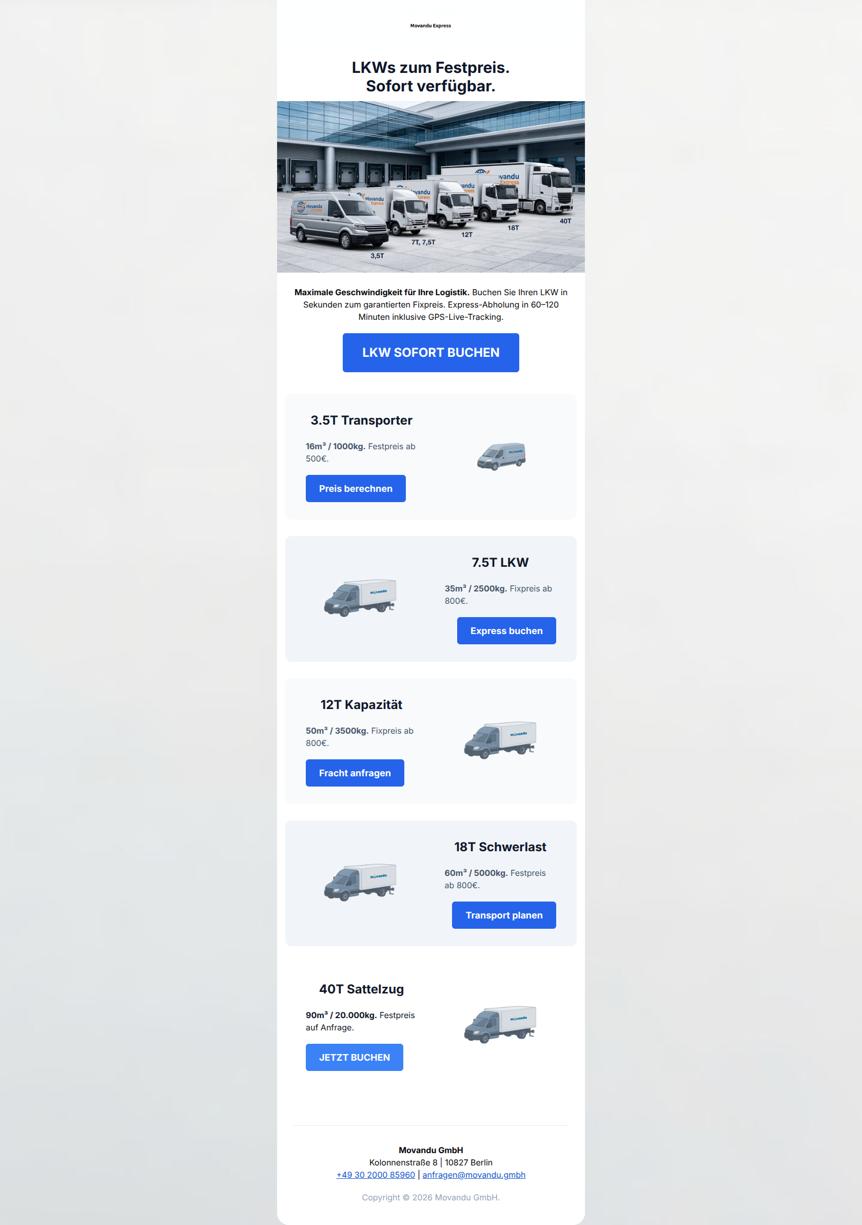
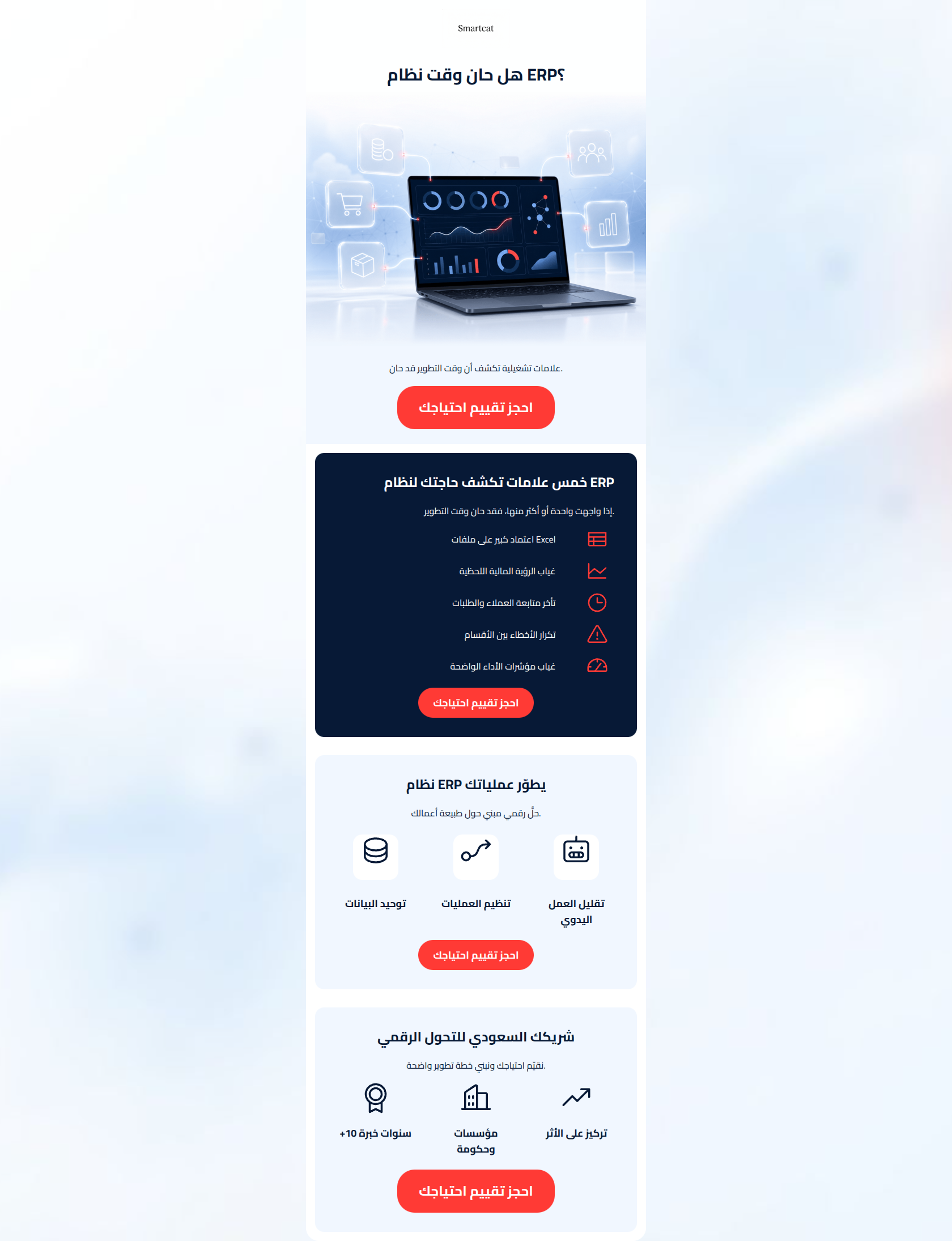
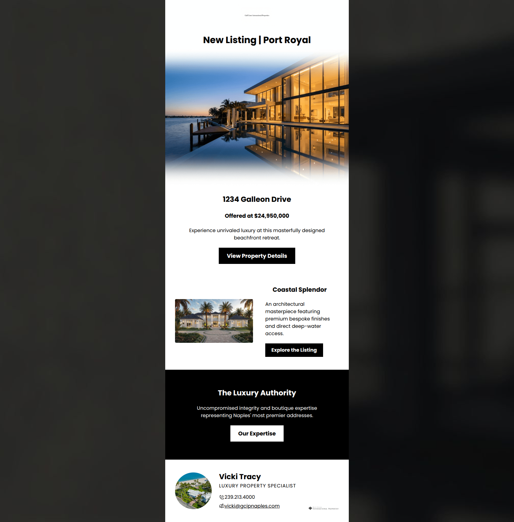
Fitness Product Launch Email Template
“JUST DROPPED: Early access plus 15% off”
Design Score
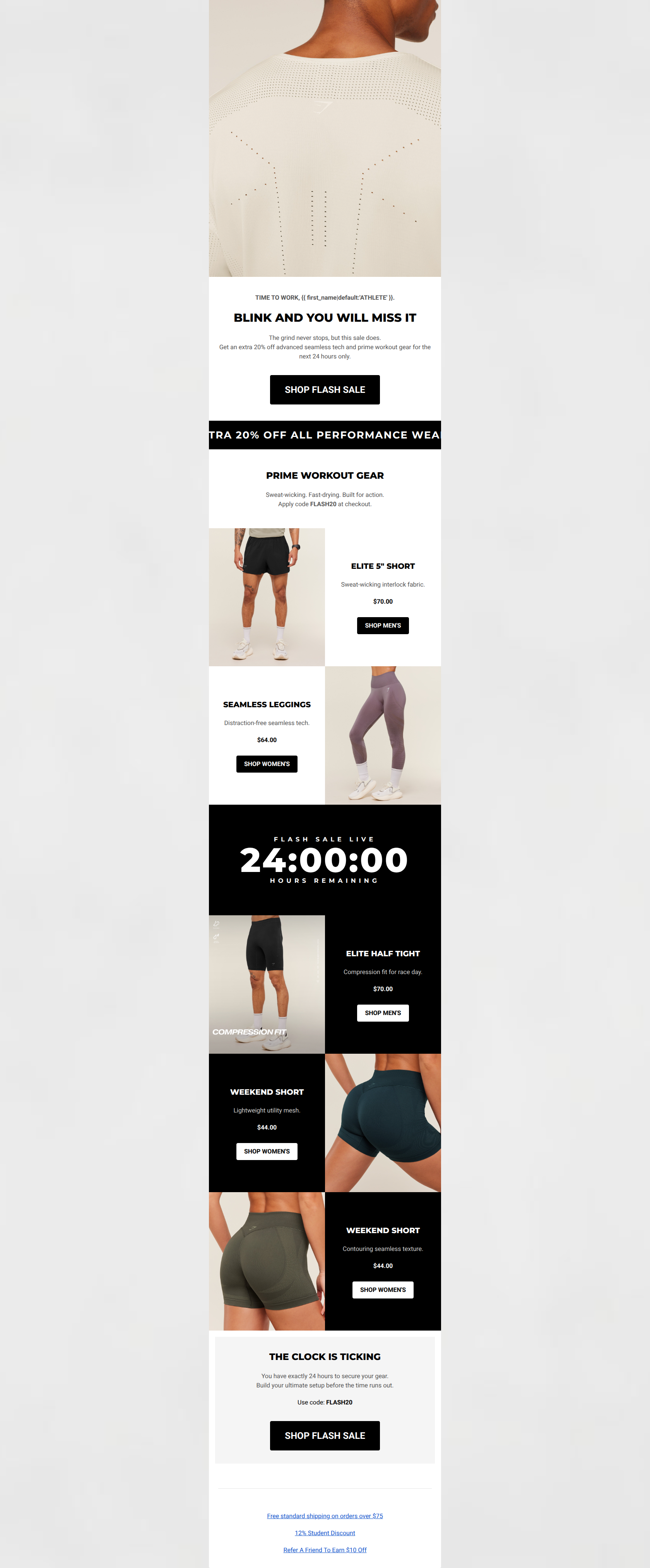
68/100This email fundamentally understands the Gymshark brand voice and visual aesthetic, utilizing stark contrast, bold typography, and a strong, urgent offer (15% off, 48 hours). However, it suffers from a major structural and personalization disconnect: it leads with a prominent female lifestyle image in the hero, but features exclusively menswear in the product grid below. This creates immediate cognitive friction and risks alienating segments of the audience. The layout is clean and scannable, but the lack of cohesive gender targeting severely impacts its potential to convert.
Create Your Own
Generate professional email designs like this one in seconds with Kopi AI.
Email Details
- Subject Line
- JUST DROPPED: Early access plus 15% off
- Brand
- Gymshark
- Industry
- Fitness
- Email Type
- Product Launch
- Created
- March 23, 2026
Brand Colors
Email Copy
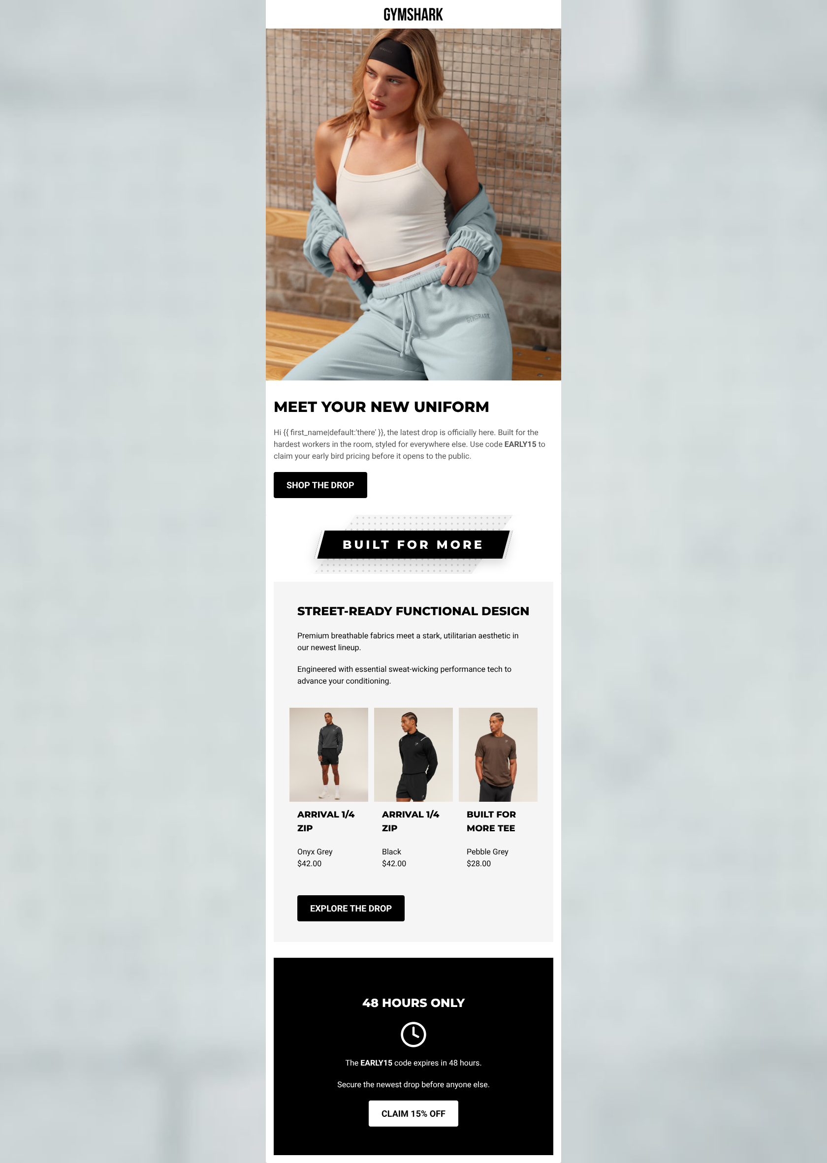
MEET YOUR NEW UNIFORM
Hi there, the latest drop is officially here. Built for the hardest workers in the room, styled for everywhere else. Use code EARLY15 to claim your early bird pricing before it opens to the public.
→ SHOP THE DROP
STREET-READY FUNCTIONAL DESIGN
Premium breathable fabrics meet a stark, utilitarian aesthetic in our newest lineup.
Engineered with essential sweat-wicking performance tech to advance your conditioning.
ARRIVAL 1/4 ZIP
Onyx Grey $42.00
ARRIVAL 1/4 ZIP
Black $42.00
BUILT FOR MORE TEE
Pebble Grey $28.00
→ EXPLORE THE DROP
48 HOURS ONLY
→ CLAIM 15% OFF
The EARLY15 code expires in 48 hours.
Secure the newest drop before anyone else.
Why This Email Works
This email fundamentally understands the Gymshark brand voice and visual aesthetic, utilizing stark contrast, bold typography, and a strong, urgent offer (15% off, 48 hours). However, it suffers from a major structural and personalization disconnect: it leads with a prominent female lifestyle image in the hero, but features exclusively menswear in the product grid below. This creates immediate cognitive friction and risks alienating segments of the audience. The layout is clean and scannable, but the lack of cohesive gender targeting severely impacts its potential to convert.
Hero (top/initial part) Impact
60/100- High-quality, gritty lifestyle imagery fits the brand's streetwear aesthetic perfectly.
- The promo code (EARLY15) and exclusivity ('before it opens to the public') are stated immediately.
Content Structure & Flow
65/100- Logical progression from introducing the value proposition to showing the products, and ending with a strong urgency driver.
- The use of the textured divider graphic effectively breaks up the content zones without adding clutter.
Visual Hierarchy & Layout
80/100- Excellent use of negative space around textual elements to prevent the design from feeling cramped.
- The final section inverts the color scheme (white text on black background), creating a powerful visual anchor that demands attention.
Call-to-Action Strength
75/100- The final CTA ('CLAIM 15% OFF') is excellent because it clearly states the value the user gets by clicking.
- Buttons have maximum contrast (black on white/grey, white on black), passing the squint test perfectly.
Message Clarity & Tone
85/100- Phrases like 'stark, utilitarian aesthetic' and 'advance your conditioning' speak directly to the target audience's psychographics.
- The urgency in the footer ('Secure the newest drop before anyone else') is compelling and drives FOMO.
Readability & Scannability
85/100- The use of bolding for the 'EARLY15' code ensures it is not missed by scanners.
- All text is highly legible against its respective background color.
Offer & Value Proposition
90/100- The exclusivity of 'before it opens to the public' makes the subscriber feel valued.
- The 48-hour deadline creates genuine urgency.
Personalization & Audience Fit
40/100- The aesthetic and tone are perfectly dialed into the millennial/Gen Z fitness enthusiast demographic.
Quick Wins
- Align the gender of the hero image with the gender of the products featured in the grid.
- Remove 'Hi {{ first_name|default:'there' }},' to make the opening punchier and more on-brand.
- Center-align the hero text and CTA button for better visual balance.
- Change the hero CTA copy from 'SHOP THE DROP' to 'SHOP EARLY ACCESS'.
Create Professional Email Designs
Generate beautiful, on-brand email designs in seconds. Just enter your brand URL and let AI do the rest.