Other Promotional Email Template
“Introduction and Collaboration Opportunity”
Design Score
81/100This is a strong, competent B2B promotional email that effectively utilizes brand colors and establishes a clear visual hierarchy. It successfully executes the inverted pyramid structure, moving from a high-level introduction to concrete social proof, culminating in a clear, unambiguous call to action. The repetition of the primary 'Schedule a Meeting' CTA is a textbook example of good conversion architecture. However, the email leaves money on the table through generic opening copy, an overly casual fallback greeting, and some redundancy in the final text block.
Create Your Own
Generate professional email designs like this one in seconds with Kopi AI.
Email Details
- Subject Line
- Introduction and Collaboration Opportunity
- Brand
- Beyond the Brand Media®
- Industry
- Other
- Email Type
- Promotional
- Created
- April 23, 2026
Brand Colors
Email Copy
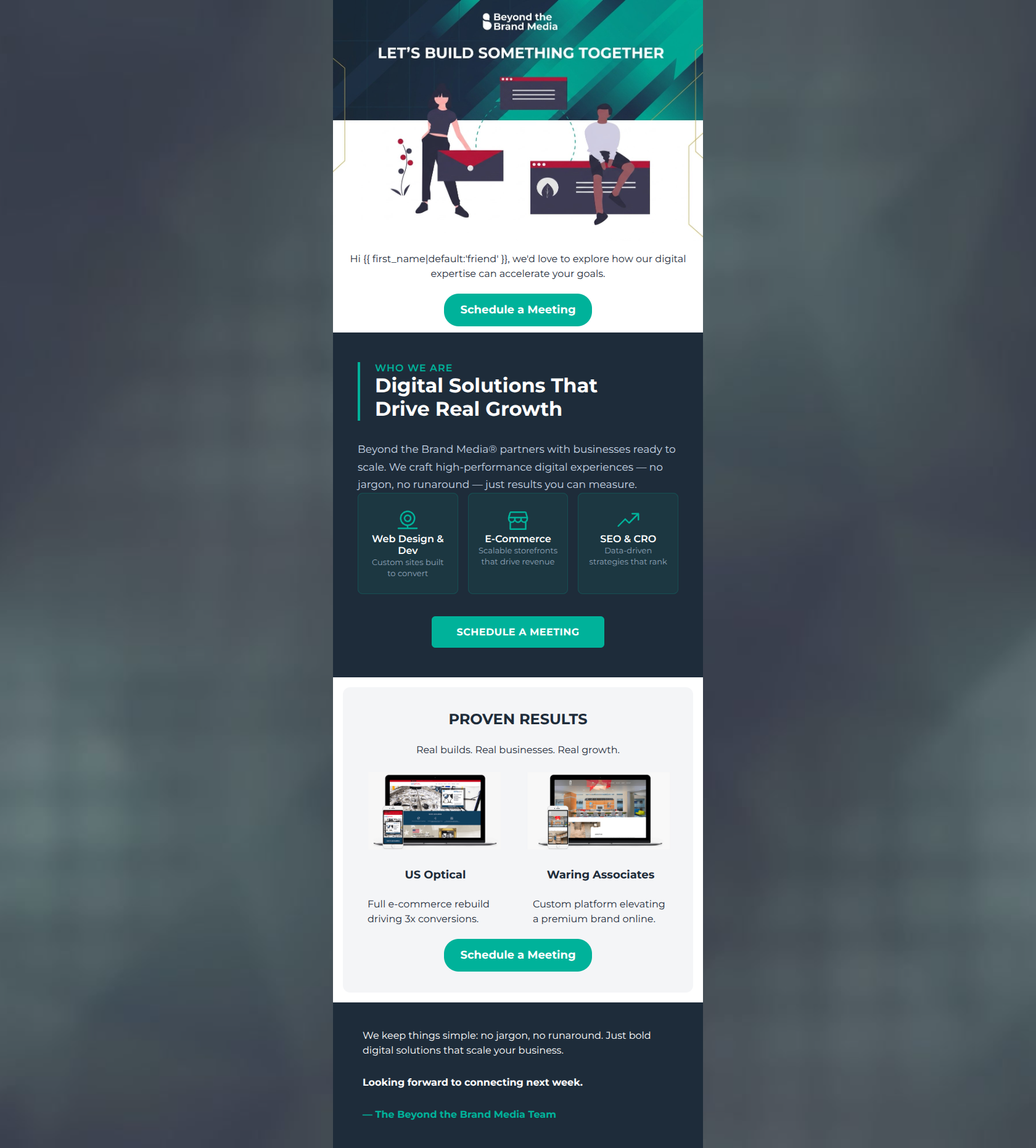
Hi friend, we'd love to explore how our digital expertise can accelerate your goals.
→ Schedule a Meeting
PROVEN RESULTS
Real builds. Real businesses. Real growth.
US Optical
Full e-commerce rebuild driving 3x conversions.
Waring Associates
Custom platform elevating a premium brand online.
→ Schedule a Meeting
We keep things simple: no jargon, no runaround. Just bold digital solutions that scale your business.
Looking forward to connecting next week.
— The Beyond the Brand Media Team
Why This Email Works
This is a strong, competent B2B promotional email that effectively utilizes brand colors and establishes a clear visual hierarchy. It successfully executes the inverted pyramid structure, moving from a high-level introduction to concrete social proof, culminating in a clear, unambiguous call to action. The repetition of the primary 'Schedule a Meeting' CTA is a textbook example of good conversion architecture. However, the email leaves money on the table through generic opening copy, an overly casual fallback greeting, and some redundancy in the final text block.
Hero (top/initial part) Impact
75/100- The 'Let's Build Something Together' header baked into the image establishes an immediate collaborative tone.
- The CTA is placed above the fold, providing an immediate conversion path for high-intent readers.
Content Structure & Flow
85/100- Excellent use of the inverted pyramid: moving from brand level, down to specific services, then to undeniable proof.
- Distinct visual banding (light, dark, grey) clearly separates the narrative stages of the email.
Visual Hierarchy & Layout
88/100- The three-column service grid in the dark section is highly scannable and uses icons effectively to anchor the text.
- Color blocking is used purposefully to distinguish the core value proposition from the supporting case studies.
Call-to-Action Strength
95/100- Flawless repetition of a single, unambiguous conversion goal.
- High-contrast CTA color ensures the buttons pass the 'squint test' effortlessly.
Message Clarity & Tone
82/100- Directly addresses the friction points of hiring an agency ('no runaround').
- Confident, declarative sentences in the service descriptions ('Scalable storefronts that drive revenue').
Readability & Scannability
78/100- Good use of bolding in the footer to highlight the key takeaway and sign-off.
- Short, punchy sentences in the 'Proven Results' section prevent reading fatigue.
Offer & Value Proposition
80/100- Ties technical services (Web Dev, SEO) directly to business outcomes (revenue, rank, convert).
- Uses real-world case studies to substantiate the claims made in the value proposition.
Personalization & Audience Fit
75/100- The messaging aligns well with the psychographics of busy marketing managers who want results without the technical headache.
Copy Conciseness & Word Economy
75/100- The 'Proven Results' descriptions are an excellent example of word economy—conveying what was done and the result in a single, short sentence.
Quick Wins
- Change the fallback term 'friend' in the dynamic greeting to something more suitable for B2B (e.g., 'there' or blank).
- Increase the brightness/contrast of the subtext within the three service cards in the dark section.
- Delete the redundant 'no jargon, no runaround' sentence in the final footer block.




Create Professional Email Designs
Generate beautiful, on-brand email designs in seconds. Just enter your brand URL and let AI do the rest.